Defining Argentine wine

Label design has proved decisive in promoting brands in the fiercely competitive Argentine wine market, as Guillermo Dufranc at design agency Tridimage explains
While Argentine wine is known throughout the world for its high quality, it has only been in the last 25 years that the country has produced a consumer society which supports wines with a wide range of prices, from entry-level to ultra-premium wines.
To better understand the recent changes in the market, it is important to know about its history. Wine is part of the Argentine culture and has always been present when family and friends get together. Twenty years ago choosing a bottle of wine was a simple task, as there were only red or white wine, and big bottles of five liters – known as damajuanas – were very popular. Wine was usually diluted with sparkling water, so the quality was not very important for most consumers.
The market has evolved in the last few years when a wide variety of wines such as Malbec, Cabernet Sauvignon, Syrah, Chardonnay were launched. This segment is well established and today it is stronger than the classic red and white wine. When wine became fashionable, traditional consumers learnt more about wine tasting. Moreover, there was a massive interest in wine from new consumers more open to new varieties.
The graphic style of Argentine wine labels has always been influenced by the heritage of the Old World wines coming from European tradition. The presence of classic typography and sober designs is their most remarkable characteristic, and this has informed today’s contemporary graphic language. In that sense, the Argentine wine market is rather conservative compared to other new world producers.
Consumers have become more selective and careful when choosing wine, thus the label message needs to be very clear and precise, since the graphic design conveys its values. If a label design seems more expensive than its actual price, it could be considered deceitful; the same is said when a wine is more expensive than what its label communicates.
If a brand does not have a story, a story must be created, conceived to fulfill the brand’s strategic objectives. Having defined the brand story, the next step is to find the most suitable concept and graphic universe that will help to tell that story. Design will translate graphically what the brand wants to convey. Every detail needs to be conscientiously thought; typography, color, paper texture, metallic foils, gloss spot and emboss. Every design element must be applied to make a bold and strong brand statement and achieve shelf impact.
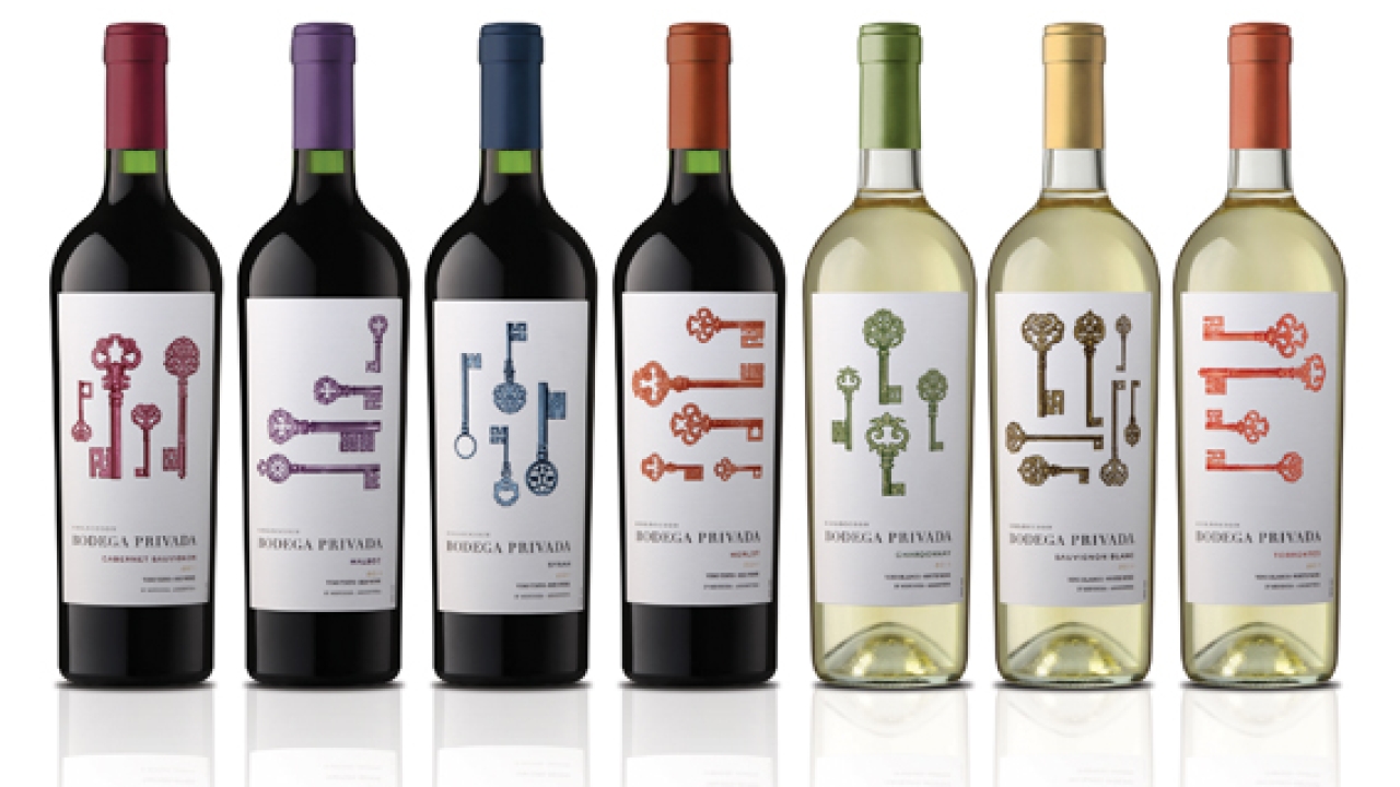
Bodega Privada means ‘Private Cellar’ in Spanish. In this case we were inspired by the idea that these wines are part of a private collection. A kind of club that keeps its secrets locked away. To enter the cellar, the consumer should find the appropriate key. The textured paper contrasts with the relief and brightness of the shinny gloss spot lacquer, highlighting the artwork of the twelve keys that were specially designed for the collection. In every label the keys are combined in a different way. This supports the idea that each wine varietal is unique.
Ricordi is a tribute to the founder of the RPB winery. He was an Italian immigrant, who arrived in Argentina with little more than his dreams, and thanks to his vision, founded a thriving business. The label design should be both emotional and respectful. Italian stamps transport us back to the times when postcards were the only way to be in contact with relatives who remained in their home country. The engravings represent the high quality craftsmanship of the wines and the signature highlights the personality of the founder. The textured paper also conveys a warm and nostalgic feeling.
When creating the brand identity and label design for Callejón del Crimen (Crime Alley), Tridimage's challenge consisted of conveying the particular attributes of the brand. For the Evidencia (Evidence) line, a fingerprint in silver ink becomes a subtle reference to the brand's mysterious story, based on real facts that have taken place near the vineyards. For the ultra-premium Misterio (Mystery) line a chiaroscuro communicates the brand story.
Wine labels are not only elegant logos and nice graphics. Wine brands are built on their values and on the way consumers feel connected with them. This is why it is so important to define a brand story, a concept that defines the product. The absence of concepts leads to a generic label, a graphic template with no personality, without direction. It is not possible to design a wine with personality without having a clear idea of the brand message to convey.
Pictured: A selection of labels for Bodega Privada wine
This article was published in L&L issue 3, 2012
Stay up to date
Subscribe to the free Label News newsletter and receive the latest content every week. We'll never share your email address.

