Royston develops special labels for beauty brand
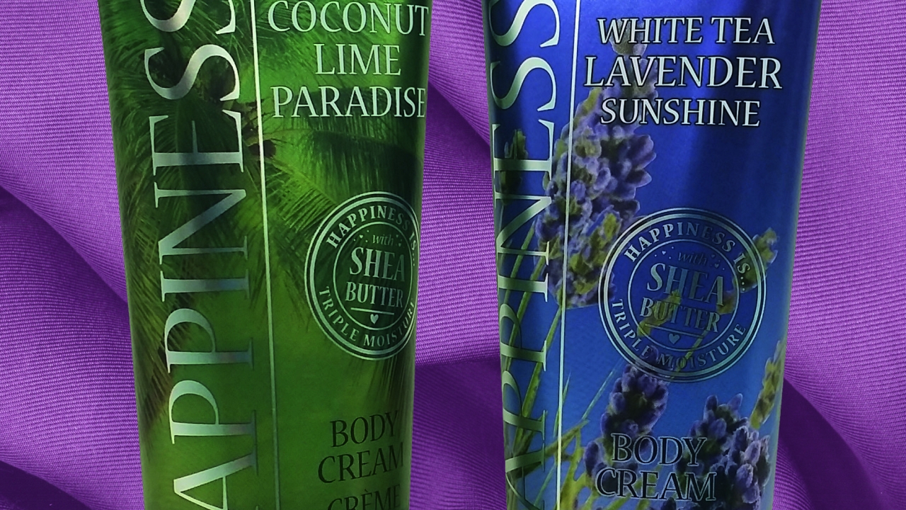
Royston Labels has worked with the Happiness Is brand of beauty and healthcare products to create labels that generate a seamless appearance from the shoulder to the crimp at the top of tubes, and produce an ‘alternative and interesting look to the packaging’.

The Happiness Is labels were created by printing in up to eight translucent colors onto a metallic base material, thereby providing a myriad of metallic effects. A clear element allows the color of the product to be seen, while the printed decoration extends into the crimp area of the tube. This creates an ‘alternative and interesting look to the packaging’, Royston Label said.
The seamless effect has been produced by applying the labels from the shoulder all the way up into the crimp at the top of the tube, with Royston Labels working closely with the brand and the contract manufacturer to develop this technical product.
Paul Clayton, Royston Labels managing director, said: ‘The effect has been achieved by using a modified self-adhesive material that makes the tube look like it has been sleeved, when in reality an overlapping label around the circumference has been used and taken into the crimp area.
‘To achieve this, we worked closely with the contract manufacturer to ensure the labels and tubes are cut correctly to capture the label in the crimp area and create the finish wanted.’
The process has ensured that there are no gaps in the label from the shoulder of the tube up to the very top and end of the crimp.
Stay up to date
Subscribe to the free Label News newsletter and receive the latest content every week. We'll never share your email address.


