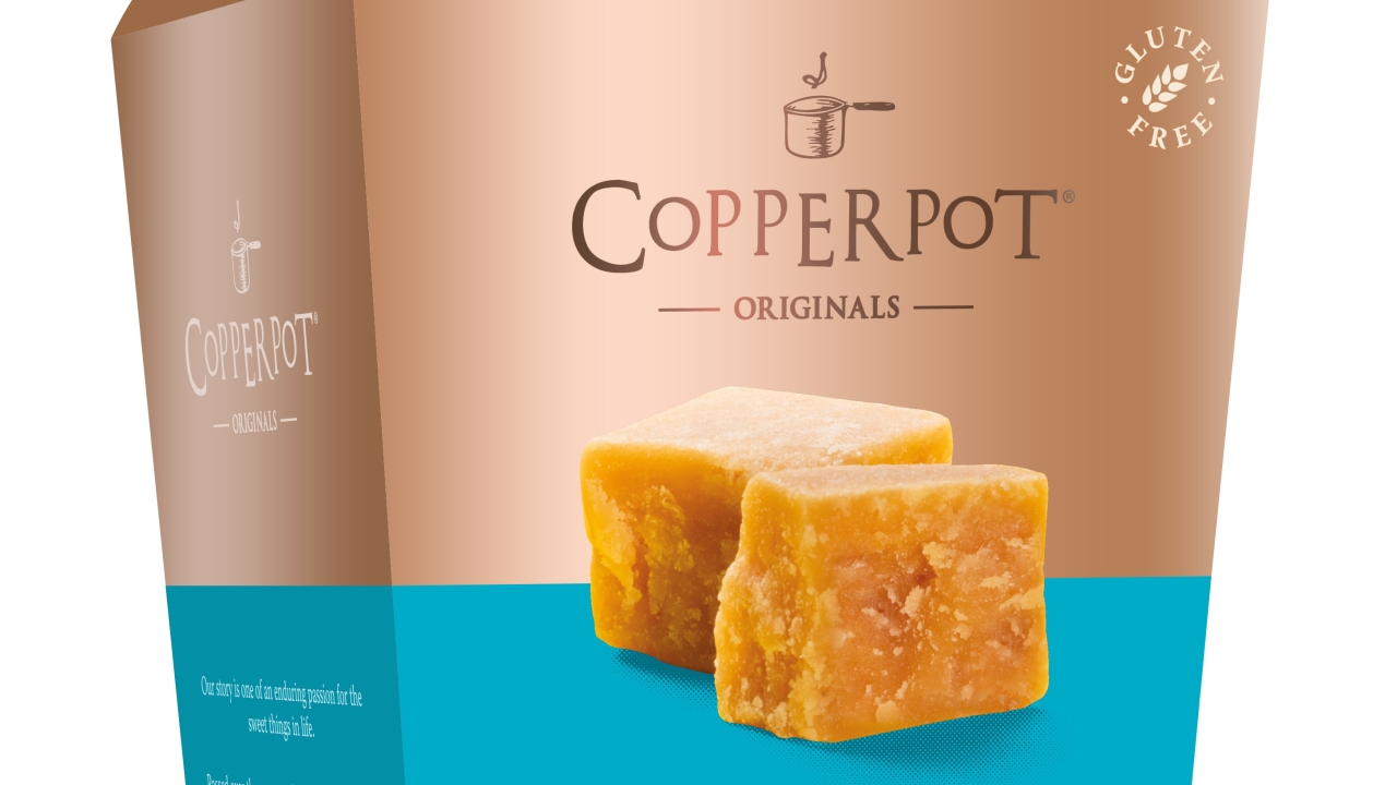
UK confectionery company updates packaging
Copperpot Originals, a Cornwall, UK-based confectionery producer, has introduced new packaging to reflect the premium nature of its products and newly-aligned brand story.

Available across its luxury fudge and honeycomb range, the outer packaging features touchable copper metallic banding. The decision to use metallic inks reflects largely on the history of the Copperpot Originals story, which began in a family kitchen cooking in a traditional copper pan.
The packaging redesign has a strategic aim to target independent retailers and online consumers.
James Beresford, the freelance designer responsible for the new look, explained: ‘When redesigning the packaging for the Copperpot Originals range, I wanted to incorporate the classic elements of the brand; made using a copper pan and a three-generation tried and tested family recipe, but also reflect the modern and innovative flavours that the company produce.
‘The metallic ink adds a visually appealing layer of luxury to the premium products and makes the boxes stand out on the shelf. It is also a very tactile looking box which I think will appeal to customers.’
The packaging was produced by New Vision Packaging.
The new packaging is the next step in the brand’s growth strategy after launching online in June 2017. The company is set to release new flavors in spring 2018.
Mark Brian, commercial director at Copperpot Originals, said: ‘Copperpot Originals was created to showcase the family fudge recipes that have been part of our story since 1978. The new packaging is both eye-catching and enticing and we hope will capture the attention of consumers.’
Stay up to date
Subscribe to the free Label News newsletter and receive the latest content every week. We'll never share your email address.

