B.Ready’s packaging balances aesthetics, function and sustainability
Today’s emerging brands aren’t just focused on product; they’re making sure their packaging reflects credibility, responsibility and trust.
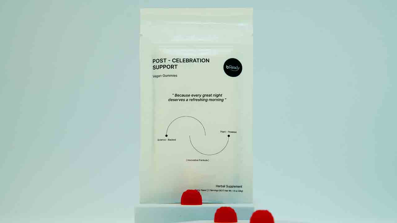
When Chrissy Xu, founder of Chicago, Illinois-based b.Ready Gummies, started her gummy supplement brand designed to support recovery after a night of celebration, she knew the product had to do more than work well. It had to look and feel trustworthy, premium and purposeful.
‘I wanted the packaging to reflect the brand, minimalist yet scientific, with a sense of precision,’ Xu tells L&L. ‘The “post-celebration support” branding was intentional. I avoided using “hangover support” due to FDA restrictions since they classify hangover as a disease, which I find odd. Post celebration feels more positive and aligns with the idea that drinking isn’t inherently bad, it’s about moderation and enjoyment with friends.’
From the start, Xu aimed to build a brand that felt caring, refl ected in clean, functional packaging. ‘It looks like a health product, clean and trustworthy. Bright colors often signal something more recreational, like candy, rather than something designed for healing,’ she says.
Originally, b.Ready’s branding featured a pouch with bright blue and pink. But Xu quickly realized a cleaner, more minimal look was needed to communicate quality and trust.
Xu chose gummies for the product, a rare format in supplements. ‘Capsules aren’t ideal when you’re unwell, and shots taste bad. Gummies are easy, enjoyable, and feel like a treat,’ she says.
There are different levels of sustainability, and to save costs in the first production round, I opted for a recyclable material that needs to be processed at specific facilities
That choice came with complexity. ‘My product was actually more challenging to make from a product development perspective because I have a lot of herbal ingredients packed in it,’ Xu adds. ‘And it’s made with pectin, not gelatin, so it’s vegan. A lot of brands use gelatin because it’s cheaper and easier to work with.’
Packaging development
Sustainability was also a key concern. B.Ready’s current packaging is recyclable through the How2Recycle store drop-off program. ‘I learned so much along the way, especially about packaging materials,’ she says. ‘There are different levels of sustainability, and to save costs in the first production round, I opted for a recyclable material that needs to be processed at specific facilities.’
Xu worked with a consultant on both formulation and to fi nd a packaging converter. Her current format includes two servings per pouch, but she’s exploring a single-serving version for future retail.

‘Retailers prefer single servings for convenience and a lower price point,’ she adds.
Before working with Xu, the converter mainly produced bottle packaging. However, since she wanted pouches, the company invested in a sealing machine to support the demand.
Adding a new machine for pouch sealing came with its challenges. ‘At first, they didn’t have the right machine, so they had to seal the pouches manually, literally counting out gummies by hand. Eventually, they invested in the right equipment, which added to the cost early on,’ she recalls.
Material choices were shaped by manufacturing capabilities. Paper would have required more manual work and added to costs, so decisions were based on what the packaging supplier could support.
The b.Ready pouches are digitally printed. The 12,500 units of pouches are made with Dow’s 3.40 MIL white Retain EVOH PE film, a high-barrier, recyclable single-resin PE structure. This is a sustainable, flexible packaging material for customers with access to drop-off centers.
Color consistency was another learning curve for Xu. ‘We’d do the design first, send it to the printer, and they’d send back a mockup of just the pouch, no product inside. I was worried about the white, since it’s more of a cream color. The digital version looked too bright, and the sample still came out slightly whiter than expected,’ Xu explains.
This caused confusion. ‘Unlike iconic colors like Coca-Cola red, mine was subtle and looked different on every screen,’ Xu says. ‘I wasn’t even sure what the "correct" color was.’
Xu also discovered the nuances of printing techniques and the impact of lighting on packaging perception, which might look different under different lighting.
One of the most time-consuming parts of the process was, simply, waiting.
‘Sometimes it takes two to three weeks just to get something sent over [to the converter]. There’s a lot of back and forth. I have to send the design and guidelines, then wait for them to print and ship. And if I wanted to fix the color, that would mean even more delays. It didn’t feel very easy to make changes,’ Xu concludes.
Stay up to date
Subscribe to the free Label News newsletter and receive the latest content every week. We'll never share your email address.