Imaginative colors

A leading Spanish label designer has set out to demonstrate how Manter’s colored paper range can be used to develop compelling and original label designs. Andy Thomas reports
Manter has released a stunning visual guide to its Imaginative Colours range of premium label papers. The book consists of 22 ‘real world’ label ideas developed by leading Spanish wine label design artist, Xavier Bas, to utilize the color, texture and tactile properties of each label paper.
‘These 22 ‘real’ labels place self-adhesives on the level of a true work of art,’ enthused Christian Galí, export area manager at Manter and a member of its global marketing department. ‘We developed a selection of elegant Fedrigoni colored papers with titles such as Sirio Pearl, Savile Row, Tintoretto and Black Pepper for the most creative and innovative printing ideas. Xavier Bas has developed images which help show designers and label printers how they can be used to best effect.’
What really sets the Imaginative Colours book apart from standard product catalogues, are the in-depth explanations of how each label was designed and printed. This includes descriptions of the print technologies used and the order in which each color and decoration effect was layed down. The labels themselves are object lessons in creative design.
Manter launched its Imaginative Colours set of colored and textured papers in 2007, ‘but it has proven difficult to get designers to move away from the "safe", white paper choices,’ said Gali. ‘We identified the problem that designers did not know how, or dare, to use colored papers to their best effect.’
Manter contacted Bas to put together some ideas. ‘Manter told me that they wanted to change the mentality of the industry,’ said Bas from his studio in downtown Barcelona. ‘Why would you want to white papers when you want your products to stand out among the competition?’
Almost all the papers included in the Imaginative Colours collection are manufactured from colored fibers, not just surface printed. Gali said, ‘This means, for example, that in the case of sticking the label in a glass bottle, the label will show the same color in the front and in the back, when you look through the bottle. Even if the label is damaged during transit, the paper will keep the same color. This doesn’t happen if you print on a white paper.’
Gali also points out that although you can print the surface of a white paper, you cannot print the sides. ‘It means that the sides will be always white! Obviously, it doesn’t happen if all the fibers have the same color.’
Bas worked closely with local label converter Gráficas Vidal Armadans and Manter's marketing director, Juan Gil, on the design concepts. This often required new ways of approaching the label converting process. ‘My idea was to produce a catalogue to show the creative possibilities when using these papers. I have also tried to suggest what kind of product would work best with each paper.’
‘I wanted to speak to designers in their own language,’ continued Bas. ‘Each paper has a communication character of its own, which suggests certain treatments. You can use an ‘ecological’ paper for example to communicate the values of a gourmet product – I have used the example of a premium fish product. There is a direct relationship here between the qualities of the paper and its target market.’
Some papers in the range have attractive finishes – such as pearlescent – which suggest a different communication message.
‘It might also be to do with the texture of a particular colored paper which suggests a treatment and gives an effect quite impossible when the paper is simply printed,’ said Bas. ‘An example is the Tintoretto Cashmere paper, which I have used to demonstrate an expensive Italian wine label design. Again, that effect is impossible to achieve simply by printing a color.’
The Imaginative Colours collection shows Bas’ expertise in international wine label design, showcasing concepts for the different styles of French, Spanish and Australian wines, all matched to different papers.
Bas cites the ‘Tintoretto Angora’ paper as a further example. ‘This suggests wool, something emotional, which I have brought out with the embossed duck graphic.’
The labels are converted using standard in-line print processes – flexo, offset, screen, hot and cold foil stamping, embossing and de-bossing. ‘We were working with the printer to find the best processes – it was like making a puzzle. For example it was a challenge to get three metallic inks to adhere to non-coated stock on the Pimientos label,’ said Bas.
This collaboration demonstrates what can be achieved when designers, like Bas, understand intimately what can be achieved when using high quality papers, a modern in-line press, and are working with technically skilled, imaginative and visionary printers like Armadans.
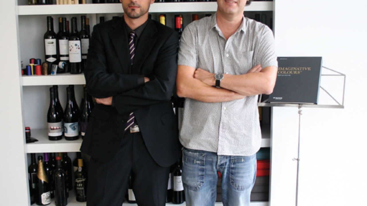
Pictured l-r: Christian Gali and Xavier Bas
This article was published in L&L issue 6, 2010
Click here for more stories about Manter on L&L.com.
Stay up to date
Subscribe to the free Label News newsletter and receive the latest content every week. We'll never share your email address.


