Dieline Awards 2023 winners
Dieline Awards, now in its 14th year, has revealed winners presenting trophies to 143 recipients across 43 categories, along with its 14 overall top winners, Akanksha Meena reports with the Dieline
Sponsored by Neenah and Designalytics, Dieline Awards 2023 recognizes the best and brightest designers and agencies creating product packaging the world over, raising awareness of the enormous value of brand packaging design.
This year, The Dieline received nearly 1,600 entries, with winners hailing from 26 countries. All entries for the awards were judged by a panel of jurors that are experts in their given field. Additionally, awards were evaluated across five categories—creativity, marketability, innovation, execution and on-pack branding, with every entry going through two rounds of rigorous critique and appraisal. Labels & Labeling selected a few winners to highlight. The full list of winners can be found at The Dieline website.
Design For Good Award: Corrections - The Prisoner • Designer: Chris Burnett
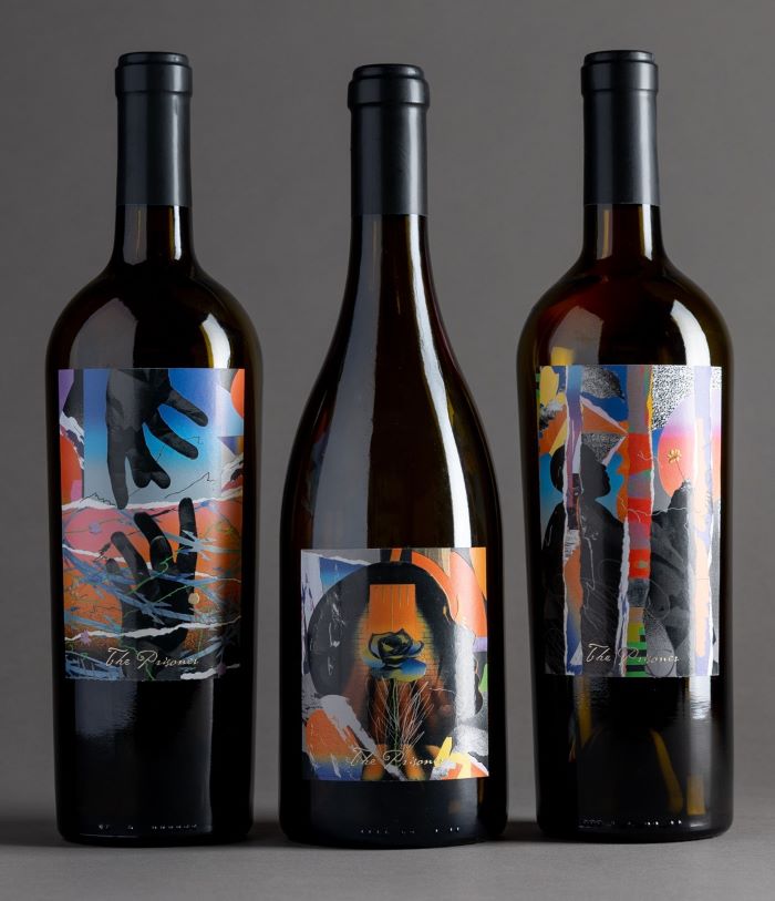
The Prisoner Wine Company is a wine brand that creates bold blends and even bolder labels. The label design is inspired by Spanish artist Francisco Goya’s The Prisoners, a series of etchings consisting of three pieces offering a critique of judicial torture depicting shackled and restrained men in stress positions.
The Prisoner is actively involved in raising awareness and funding support for justice reform. Such efforts include supporting the Equal Justice Initiative, which provides legal representation to the illegally convicted, those serving harsh and unfair sentences, and those facing abuse behind bars.
The latest collection from The Prisoner is called Corrections, a trio of wines (a Malbec, Tempranillo and a Viognier) featuring labels by Los Angeles artist Chris Burnett. The three collages, Finding Flowers, New Hope and The Other Side, invite viewers to look past their own prejudices about inmates.
Burnett’s work aims to highlight the resilience and dignity of incarcerated individuals, inviting viewers to honor the humanity in every person’s story, regardless of their past. Proceeds from the sales of Corrections also supports Rubicon Programs, a San Francisco nonprofit organization focused on ending systemic inequality and fighting poverty.
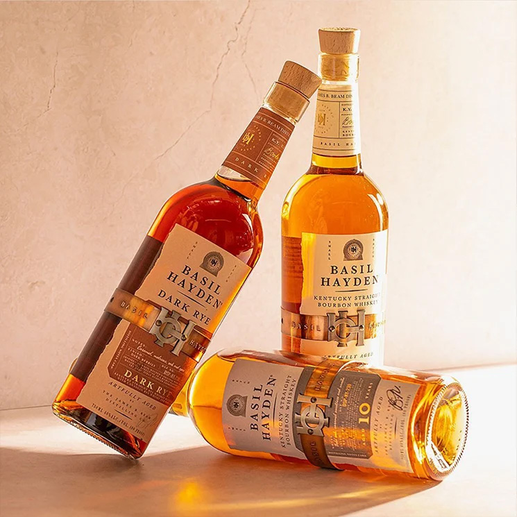
Designalytics Design Effectiveness Award: Basil Hayden • Designer: Design Bridge and Partners
The Designalytics Effectiveness Award was created to help elevate the role of package design by spotlighting the immense financial impact that it can have on consumer brands. Winner selection was entirely data-driven, based on sales performance in the marketplace, as well as rigorous quantitative consumer testing.
The award went to Design Bridge and Partners for its work on the bourbon brand Basil Hayden, where it enlarged the metal belt – the brand’s most memorable asset – and removed the oversized paper label, opting for something more streamlined and pearly white. The new design has also fared better on the shelf and resonated with consumers, with a 71 percent purchase preference over the previous design.
During the six months following the redesign, sales of Basil Hayden increased by 15 percent compared to the same period during the prior year, despite a modest decline in sales for the whiskey category overall. Basil Hayden’s market share also increased by 15 percent.
‘Designalytics has analyzed thousands of redesigns, and the evidence is overwhelming: smart, strategic, consumer-centric design drives brand growth. It’s prompting a sea change in design management right now, and it’s exciting to watch,’ says Steve Lamoureux, CEO and founder of Designalytics. ‘Brands like Basil Hayden are in the vanguard. They recognized that they could leverage design to increase market share and partnered with a proven, forward‑thinking agency in Design Bridge and Partners to
help make it happen. The results speak for themselves.’
First place in the water category: Jinkuang - The Perfect Laminar Flow • Designer: Shenzhen Tigerpan Design

It’s believed that Chinese is the only ethnic group that drinks cool boiled water. It is a unique institutionalized custom for generations. To the Chinese, drinking boiled water is sort of cultural heritage and part of domestic life, the elder showing caring through encouraging the younger generations to drink ‘hygiene boiled water’. This vital part to Chinese daily
life was portrayed perfectly by a treasury Song-Dynasty painting named Riverside Scene at Qingming Festival about a thousand years ago.
The label design here expresses more of the lifestyle than of the function of the water. The highly transparent glass bottle is embossed with a re-creation of the artwork.
Combined with a traditional Chinese layout, the bottle is modernizing the art into our daily life. Twelve bottles stand for 12 earthly branches and 12 themes of the paintings are shown on each, which line up to form a long scroll. As the bottles are customized for high-end meetings and events alike, they communicate culture and leave a premium
impression. After use, it can also function as an artwork or for storage use.
Second place in the dark spirits category: Mona – Rock Bottom Rum • Designer: Demelza Rafferty

Mona’s Void Bar created its rum, and the packaging system is sleek and sophisticated. Because sandstone is rooted within the brand’s foundation, a piece of sandstone is affixed to the bottle’s base. And beyond the bottle’s elegant structure, the label is interesting because it’s attached across the top, creating a new way of viewing a bottle.
The right amount of distinctive styles allows this brand to stand out. The design brief for a rum for Mona’s Void Bar said that the bar sits at the subterranean base of Mona, cut out of the sandstone rock the museum sits on. The packaging for this tiny bottle should be premium, and tie into the Void Bar branding – a long black vertical rectangle –
utilizes the sandstone, and the general dark vibe of Mona.
Demelza Rafferty came up with an oversized tamper-proof seal label, to not obstruct the view of the golden- colored liquid within.
The Void Bar logo is incorporated into the seal. The typography for ‘Rum’ evokes a pirate feel with its cutlass-esque ‘R’ as a nod to the origin and mythology of rum, and to Mona as a rebel brand. The bottle has an actual piece of sandstone affixed to its base; echoing the Void Bar at the bottom of the sandstone museum, a literal rock-bottomed
rum. A custom slide-box was produced to both enhance the premium quality of packaging and for safe shipping.
Second place in the wine and champagne category: Saura • Designer: Maba

The packaging design of Saura wine implements the stone texture within the label design because Saura is a wine fermented in fossil stone tanks. The intricate details, paired with the gorgeous texture, create an immersive design experience that’s entirely unparalleled.
This small winery is located in a unique place, a farm in the mountains in the municipality of Caravaca de la Cruz, which houses in its territory numerous species of fauna and vegetation that coexist with small terraces of vineyards immersed in the forest.
The wine is fermented in fossil stone tanks, and extracted from a surrounding quarry. The proposal for the design of the wine label takes up this wild nature, as if it were a bas-relief sculpted in the stone, to narrate the process of the wine inside it.
The family consists of three wines, Mesias, Cogevientos and Cauro Ventum. The differentiation of the top range is marked by the color sealing as well as a slight darkening of the stone. The most special and limited edition, under the name of Mesias, marks each numbered bottle on its band, sealing the cork with sealing wax in a traditional way.
Cauro Ventum, the entry wine of the range reflects its freshness in a more illustrated narrative, abandoning the reliefs without losing the magic of the place.
Stay up to date
Subscribe to the free Label News newsletter and receive the latest content every week. We'll never share your email address.