Fable Whisky blends art and storytelling with scotch
Scotland-based spirits brand Fable Whisky brings the mesmerizing legend of the Ghost of Clanyard Bay to life with its whimsical design strategy
Opening the Fable Whisky website is like entering a
world of enchanting tales, mystical folklore and playful
imagination. The first thing visitors see on the website is a
captivating black and white animation of Clanyard Bay legend in an art style suited for the Harry Potter movie.
Fable Whisky brand story centers on the Scottish legend of the Ghost Piper of Clanyard Bay, weaving that narrative into the whisky brand experience.
The story is set in a small Scottish settlement near Stranraer where eerie screams echoed on stormy nights by a sea cliff. A hollow cave stood untouched until an old piper and his dog ventured inside. As the piper played, the sound faded, and only the dog returned. Deep underground, the piper persisted despite the fairies’ curses. He reached the cave’s center, still playing. Enraged, the fairies trapped him with mazes. The piper vanished, the cave’s entrance disappeared, but a faint melody of pipes can still be heard from the depths at the cliff’s edge.
The animation fades to black leaving visitors with one question: What happened next to the Ghost Piper of Clanyard Bay?
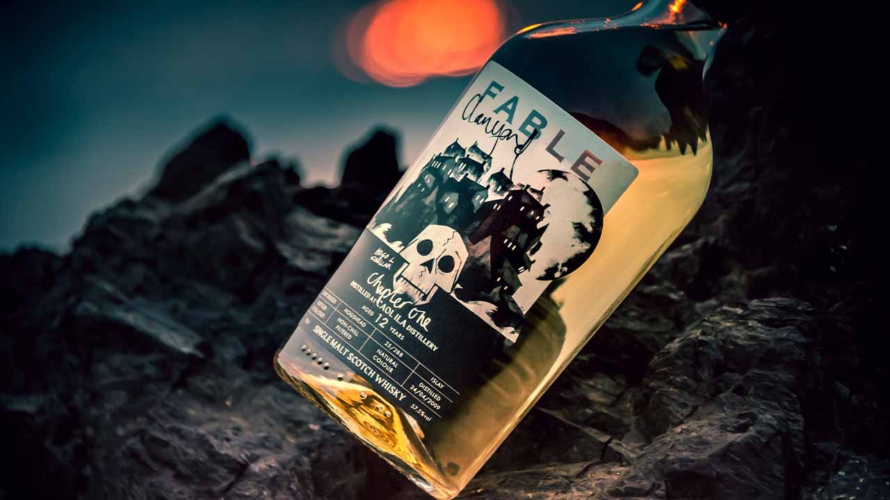
Single-cask and blended malt whisky bottler, Fable Whisky
brings together artists to breathe new life into Scottish myths while offering hand-selected single malts. To know what happened next to the piper, customers have to buy chapters or ranges of whisky.
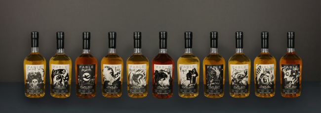
With each range of whisky customers buy, they unlock a new chapter of the Clanyard Bay story. The labels feature characters and references from each chapter.
Old tale with a new twist
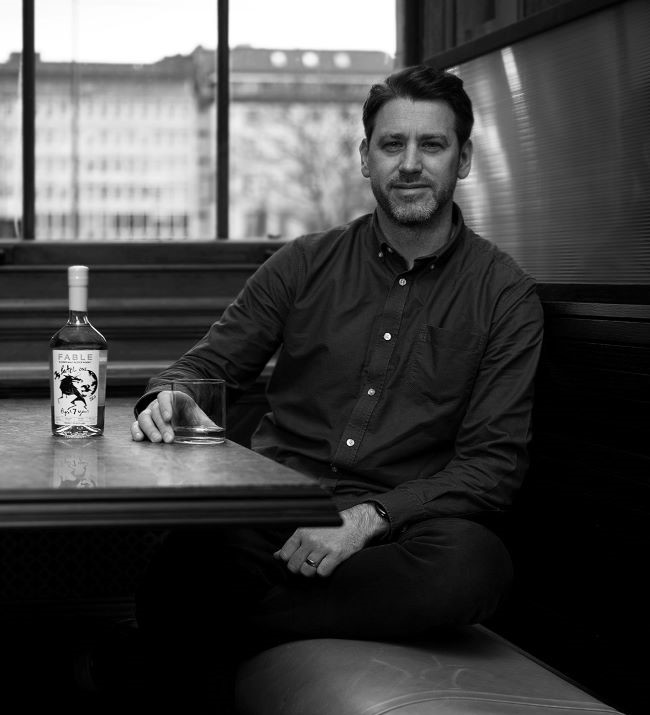
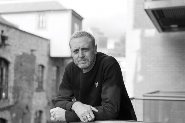
Founders and scotch whisky industry veterans Calum Lawrie and Andrew Torrance worked with London-based design agency gpstudio and collaborated with an exceptionally talented collection of artists to tell the story of The Ghost Piper of Clanyard Bay.
The story is woven seamlessly through the brand, marketing and label designs.
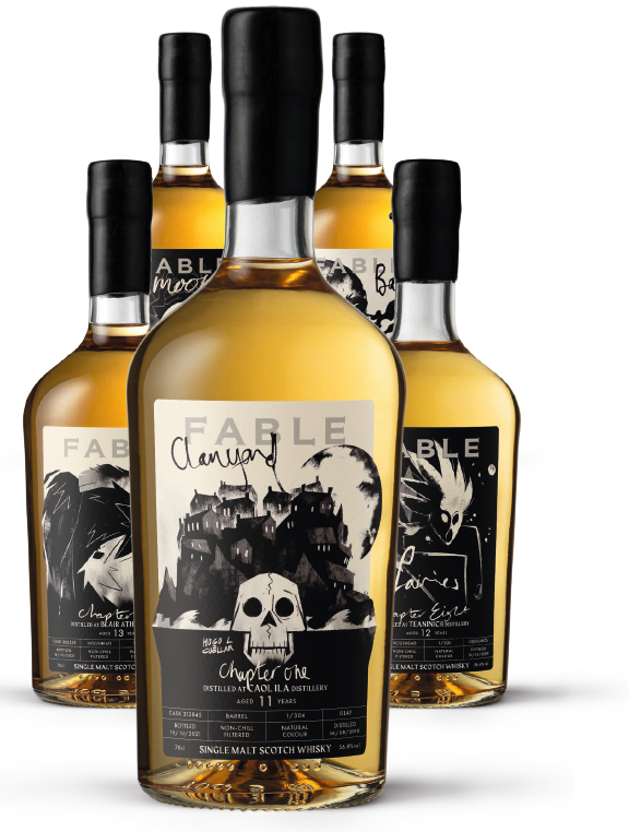
Each of the bottle’s labels features illustrations from chapters or whisky ranges expertly curated by the brand and artists. Each collection takes customers further in the adventures of the Ghost Piper.
Chris Poulton, partner and chief brand director at gpstudio says: ‘We wanted to enhance the idea of sitting around a campfire and telling stories together, every time somebody told a story, it always gets slightly embellished. So, we quite like the idea in terms of, well, why don’t we tell a story about a Scottish myth? But why don’t we then put our own spin on it? We did a lot of research on Scottish myths and we found The Ghost Piper of Clanyard Bay.’
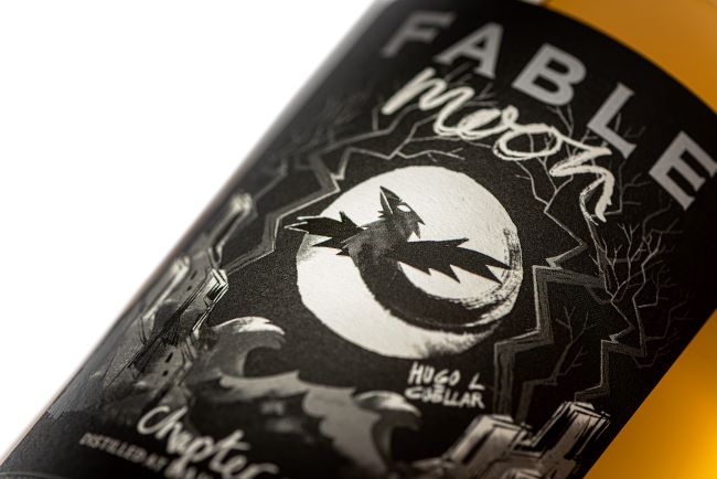
The story was reimagined by brand writer, Des Waddy. The design agency collaborated with visual artist Hugo Cuellar
living and working in London, having arrived from Santa Cruz, Bolivia, via Edinburgh College of Art.
Gpstudio spent around six weeks refining character designs. Actor Jeff Rawle who plays Amos Diggory, in ‘Harry Potter and the Goblet of Fire’ provided the voiceover for the brand’s home page animations.
The agency also worked with composer and sound effects engineers Salvatore Schiano and Simolab Creative AV to create a captivating story that resonates with consumers while making the experience of drinking whisky more engaging. Each chapter of Fable’s corresponds to different distillery releases and stories. The brand strives to disrupt the market, create collectible products and engage customers in conversation about its labels.
Rich storytelling with simple designs
In terms of packaging, the story is printed on an A5 paper that goes around the bottle. The paper appears as if it was ripped out of a book.
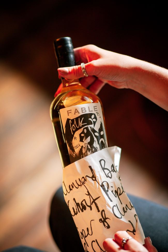
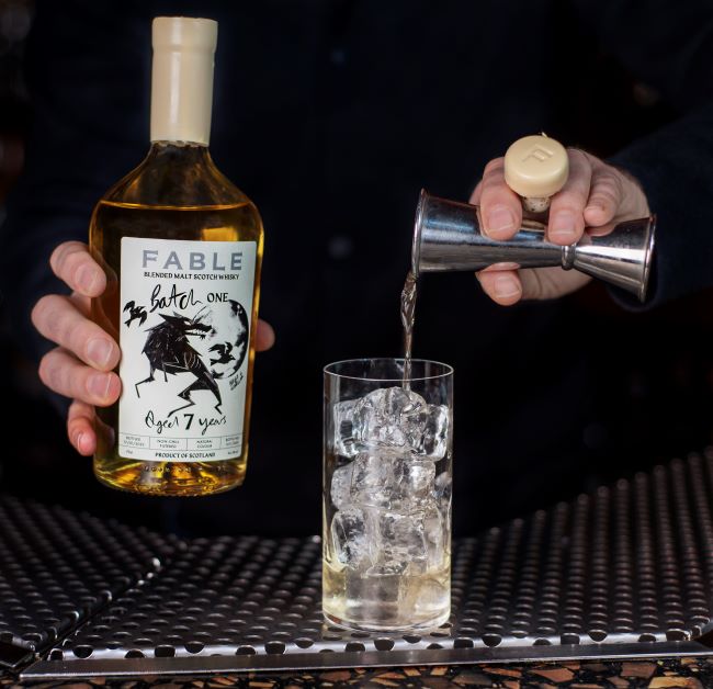
The printed monochrome label on the whisky bottles features characters from each of the Chapter or range. Fable Whisky’s labels are simple in design and color, a deliberate choice.
Lawrie explains: ‘We have this understated, cool product. And we had pulled out a few different Japanese labels, for instance, that are quite simple in form, and I think that can be more powerful than something that’s over-embellished.’
Poulton says that when he started working with Fable, the team had to learn a lot about labeling. The agency reached out to different converters to understand production possibilities and cost limitations. It wanted the labels to have an impactful design while being mindful of the fact it was a startup brand entering a new market. Too many embellishments had to be avoided to manage costs.
However, the design team prioritized design over finishing and incorporated spot foils and QR codes to enhance communication and storytelling through the labels. They aimed to strike a balance between delivering the message effectively without overdoing embellishments. This approach made the story stronger and aligned with the brand’s goal of storytelling.
‘We did not want to deviate from the story and characters. They are what brings the label together. I think when you add all that embellishment, it’s lovely and adds value, but the [website] animation is black and white and we wanted to recreate that on the label, so you felt like you had part of the story in your hand,’ Poulton explains.
Credit where credit is due
Fable, as a brand, is all about promoting the artists and people that put the effort into the product. Everyone involved in the project gets a mention on the website.
The brand releases limited edition prints on labels that are signed and numbered.
‘It’s more about trying to promote a community,’ Poulton says. ‘We believe that everybody should be recognized for what they do. So that’s why we said “Hugo, you have to sign the labels. Because that’s unique to you and we don’t have any issues in promoting who you are.”’ Poulton adds.
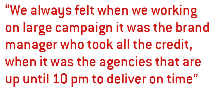
Lawrie and Torrance have worked with some of the leading
whisky brands. ‘We always felt when we were working on large campaign it was the brand manager who took all the credit, when it was the agencies that are up until 10 pm to deliver on time,’ Lawrie highlights.
The label has a QR code with a call to action that takes
customers to the website. The complete brand experience is like a spider’s web woven around the Scottish myth and everything ties back to it in digital and printed form. The retelling of the story by individuals creates engagement and interest, sparking conversations and intrigue.
Creating from a blank slate
When gpstudio embarked on its first whisky label project for Fable, there were no boundaries for the agency. ‘Looking at other brands and their labels, we see their beauty and embellishments, but they are constrained by their established style and framework. It was refreshing for us to have a blank slate and consider packaging from a different perspective, drawing on our experience with fashion labels, food products, and the retail space,’ Poulton explains.
Fable’s brief was open-ended: they simply wanted to make a whisky. With that freedom, gpstudio brainstormed and presented its ideas, which were enthusiastically embraced.
The brand originally wanted to create five to six labels for its whisky but as it developed, it now has more than 15 label designs.
The packaging design and illustration used for the brand’s
messaging are both simplistic and content rich. Whether they are displayed on a large billboard or as an Instagram post, the design elements seamlessly work across various media platforms.
As the complete branding process took place during Covid, the whole team found creative ways to get the work done.
‘During Covid, we were contacting suppliers and having
packaging materials sent to everybody’s home addresses. Everyone involved had to have the same set and we would hold online meetings with an array of bottles, papers and stoppers then decide which ones we liked. I was quite glad to clear out my house when the project was finished because we accumulated a lot of materials,’ Lawrie recalls.
The team took each decision with care when it came to label type, materials and bottles. The labels are digitally printed with screening varnish and foiling. The Fable cartons are printed in two runs, first, the standard design is printed and variable data is printed in the second run.
Due to the impact of Covid, the release of Fable whiskies were launched at different times in different geographies.
‘It’s interesting to observe how the social media response varies in different regions at different times,’ Lawrie says. ‘It’s like a moment of excitement when we see the brand gaining popularity in specific countries. We realize that they are experiencing it for the first time, whereas we have been involved with it for a while.’
‘Recently, we’ve noticed a surge in interest from places like Korea and Japan, particularly in the independent cocktail bars of Osaka. Witnessing our brand resonate in such locations is truly remarkable, and it speaks to the exceptional presentation by gpstudio. While the quality of the liquid itself is excellent, I’ve worked with other brands that haven’t achieved such rapid growth, even with outstanding products.’
The fusion of brand identity and storytelling in Fable has
resonated well with customers, Lawrie says. It is appealing to a wide range of demographics. The unique approach has made Fable stand out in the whisky market, and the brand’s visually attractive packaging has garnered attention and interest. The customers’ positive response has led to inquiries about collecting the full set of Fable whiskies.
Overall, the brand has been well-received and has
found success in several venues, including high-end establishments and airports in UK, US and Asia.
Stay up to date
Subscribe to the free Label News newsletter and receive the latest content every week. We'll never share your email address.