Brava delivers the best kind of bottleneck
Lisbon-based design studio Brava developed the concept project to showcase the studio's creativity
Medronho brandy is a beloved spirit native to Portugal. The fruit brandy comes from arbutus berries that grow on Medronho trees (sometimes called the 'strawberry tree'), which also happens to be a climate-friendly tree as they are known for rapidly recovering when exposed to fire.
Those same berries serve as the inspiration for Corta-Fogo Brandy, Dieline April 2023 Pack of the Month. Lisbon-based design studio Brava developed the concept project to showcase the studio's creativity, and it won Dieline readers over with its clever bottleneck label. Dieline spoke with Brava designer and creative director Sandra Costa about dreaming up the fictional brand and how mistakes can make for happy accidents.
Dieline: Walk us through the design process that you went through for this project.
Sandra Costa: The creative process at Brava is fluid and dynamic, with a non-linear approach. I started the project with a clear vision, and the final design stayed true to the original sketch. The bottle was the starting point and the first element designed, making it an interesting ride for the label creation process. Naming, on the other hand, was delayed until the end of the project when I stumbled upon a newspaper article about how medronho trees prevent fires in Portugal.
D: What was one of the biggest goals you set out to achieve with Corta Fogo's packaging, and how did you accomplish it?
SC: Medronho brandy has been a longstanding tradition in Portugal, but it has often been overlooked and undervalued. Corta-Fogo wants to push the boundaries and revolutionize this perception, demonstrating that creativity can bring it one step further by taking risks and unlocking new possibilities. Also, the story and visuals of a brand must engage in a dialogue that speaks to the consumer, and I believe Corta-Fogo does that beautifully.
D: What was the most challenging part of this project?
SC: The typographic composition of the label was probably the most challenging part of the process, choosing the right typographies and making sure they worked together harmoniously. In general, the creative process was remarkably smooth, almost like pulling a string. For me, the ease and fluidity of ideation are often signs of a strong concept, so I just had to be open to whatever was coming in.
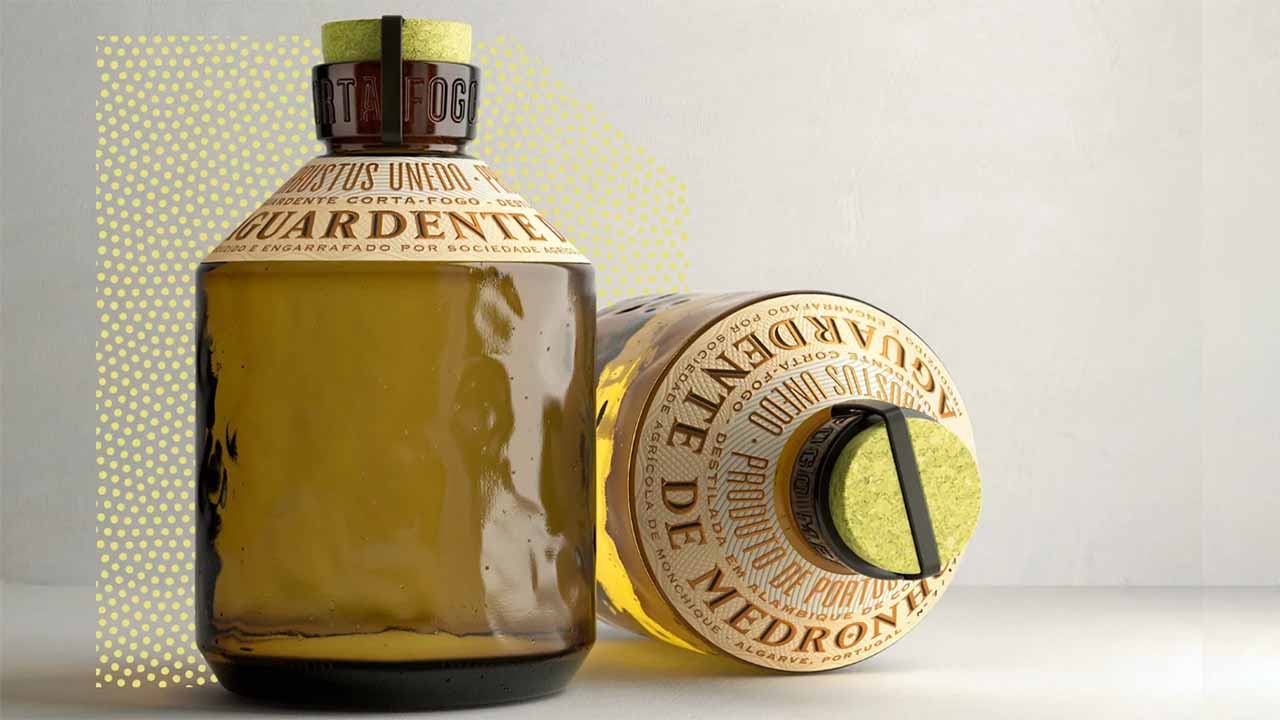
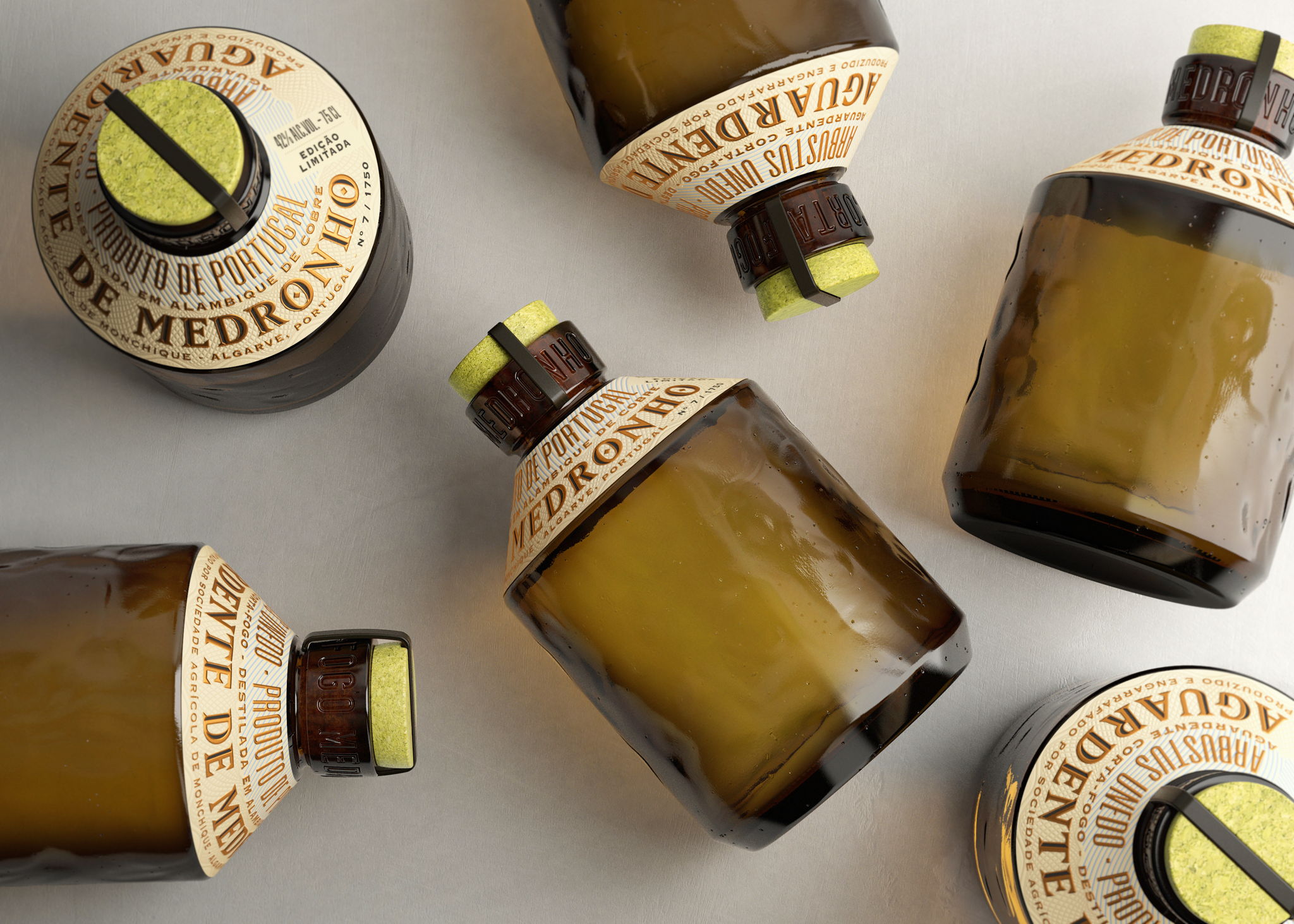
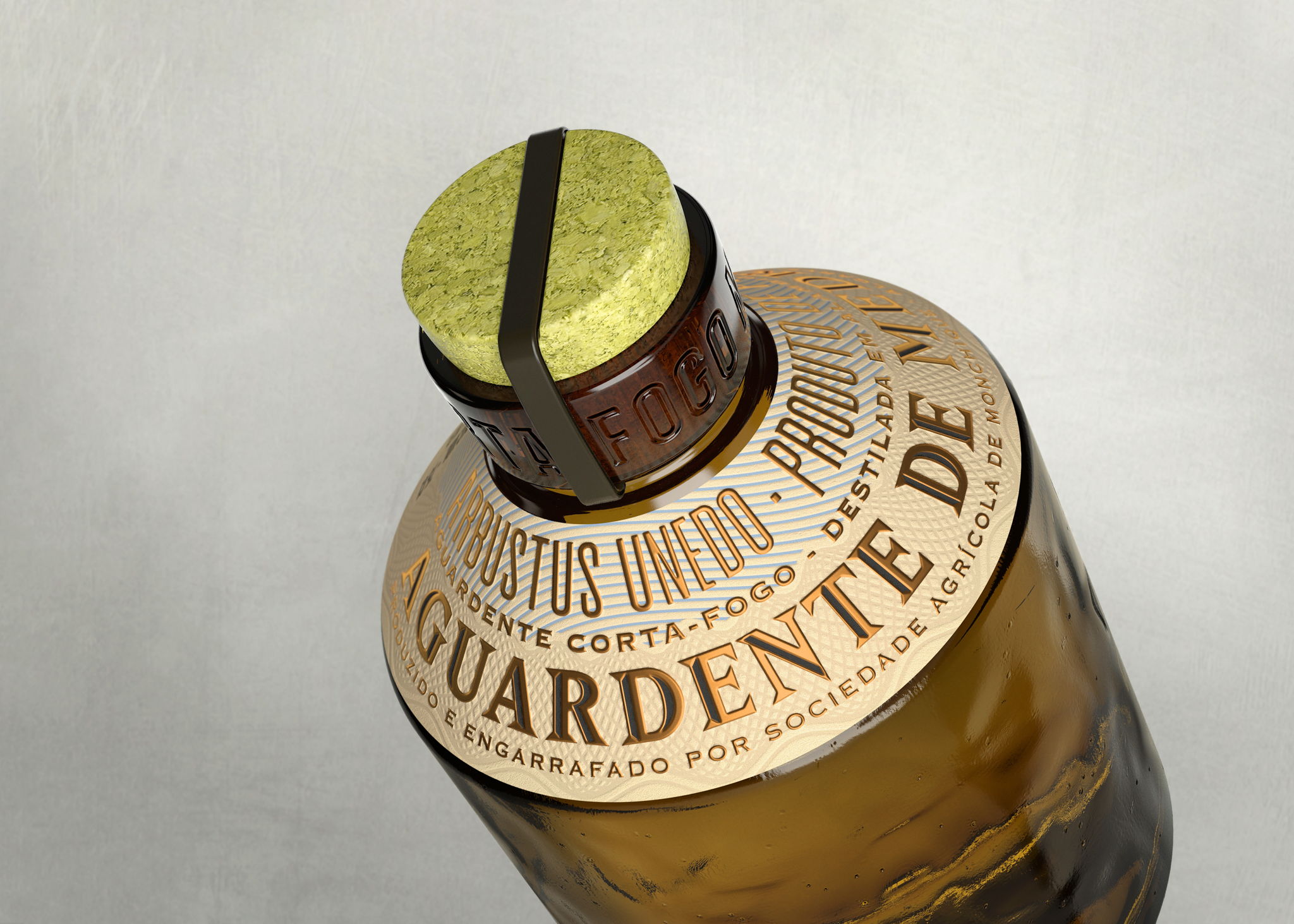
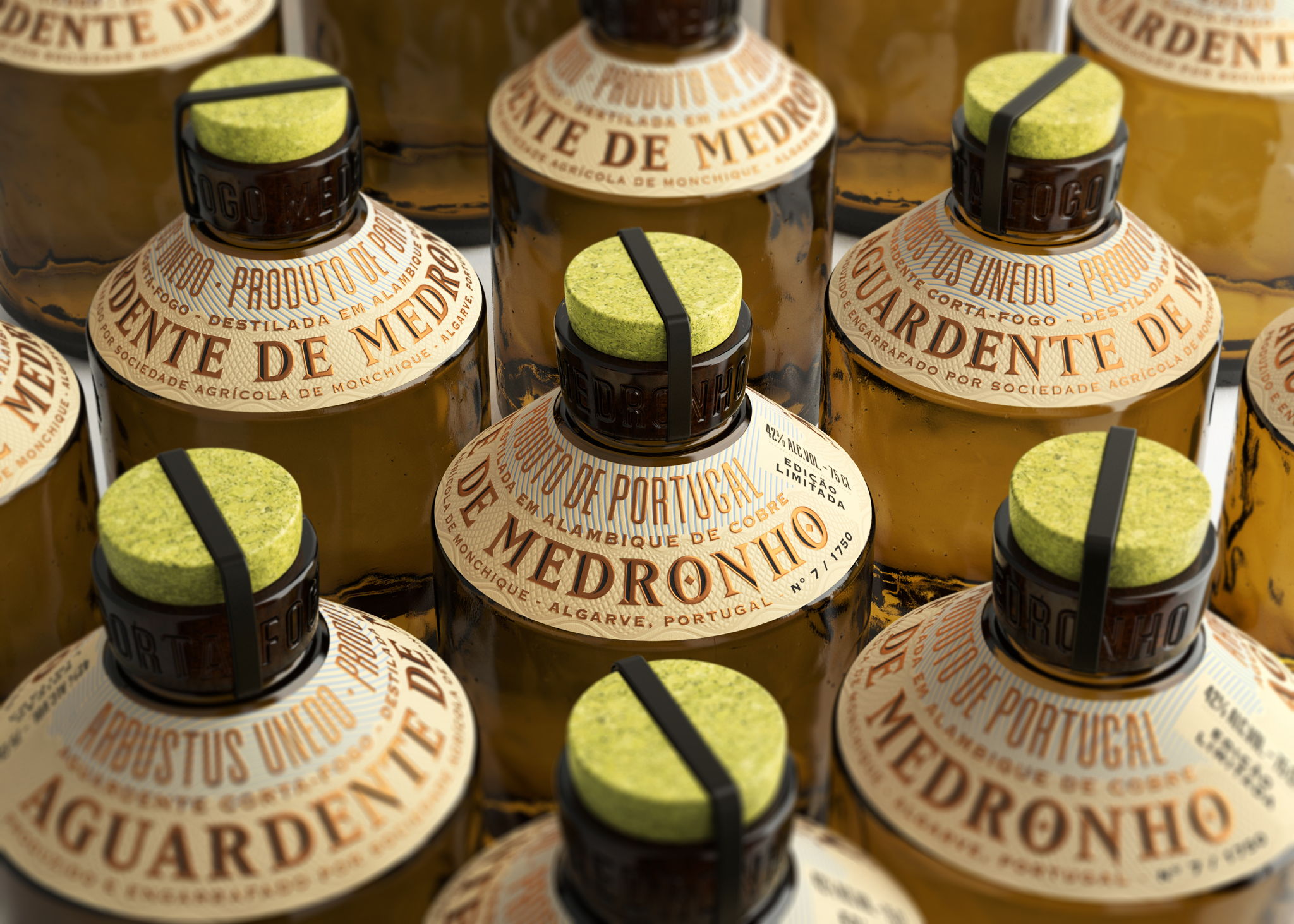
D: Why did you put the label on the neck and leave the rest of the bottle naked?
SC: I wanted the organic texture of the bottle to stand out for its nakedness, conveying the connection to nature and the craft production of Medronho. During the creative process, it became clear that the label required an unusually designated space to avoid competing with the bottle. It was surprising to discover that when we removed the label from the obvious spotlight, it became an even stronger design element.
D: The cork and the metal staple are excellent touches. Can you explain the decisions behind using them?
SC: The intention was to contrast the natural texture of the cork with the sleekness of the metal, adding a distinctive touch to the closure. Cork speaks directly to the Portuguese heritage, making it the ideal choice for the stopper, and its green color gives a modern twist to tradition, creating a fresh and contemporary look. The metal staple found inspiration in the vintage champagne bottles that used this kind of closure before the muselet became a more common choice.
D: If you could pick one aspect of the finished design you like the most or feel especially proud of, what would it be and why?
SC: It's hard to single out one aspect of the design because I believe it's always the overall impression that resonates with the audience. The details and intricate layers add an unmeasurable value to the brand, but the whole is definitely greater than the sum of its parts in Corta-Fogo. From the feedback I received, people seem especially drawn to the label's unusual placement, but the green cork stopper is my favorite touch.
D: Share one lesson that you learned while developing the finished product.
SC: Errors can lead to beautiful results. In Corta-Fogo it happened with the color of the cork when an accident showed me the way! It’s a recurring lesson because I have made mistakes that have had surprising outcomes. It’s essential to be open to error—it can show us creative paths that weren’t visible before.
This article was sourced from Dieline and published with permission.
Stay up to date
Subscribe to the free Label News newsletter and receive the latest content every week. We'll never share your email address.
