Please Bottling Co. balances simplicity and whimsy
Syrup brand's label is mostly neutral, yet the pop of color in the sticker-inspired stamp
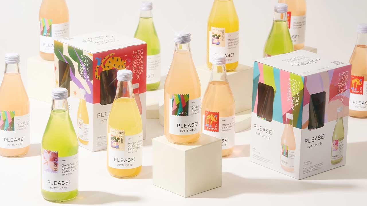
Utilizing homemade syrups and tinctures with a small-batch bottling process, Please! is a brand about leaning into the spontaneous. Best Studio designs the brand's packaging system, and the label leans into the brand's free-spirited mindset.
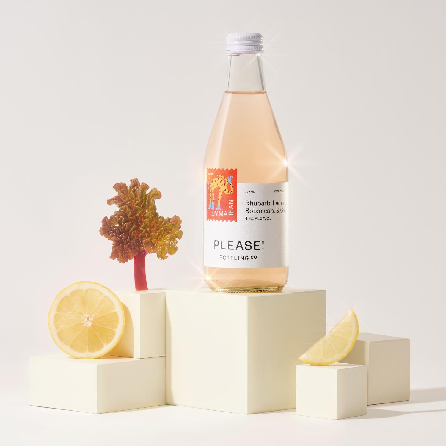
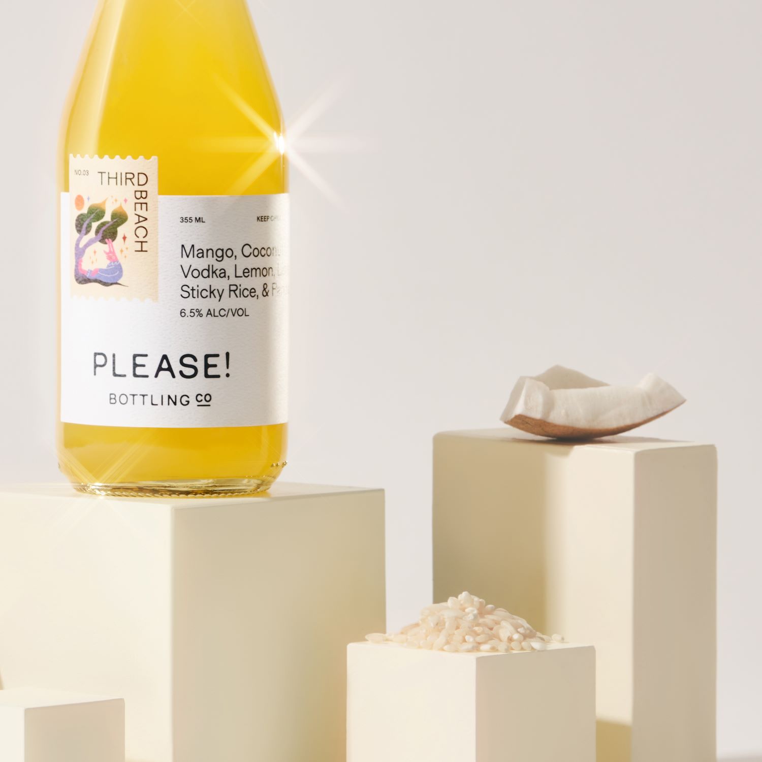
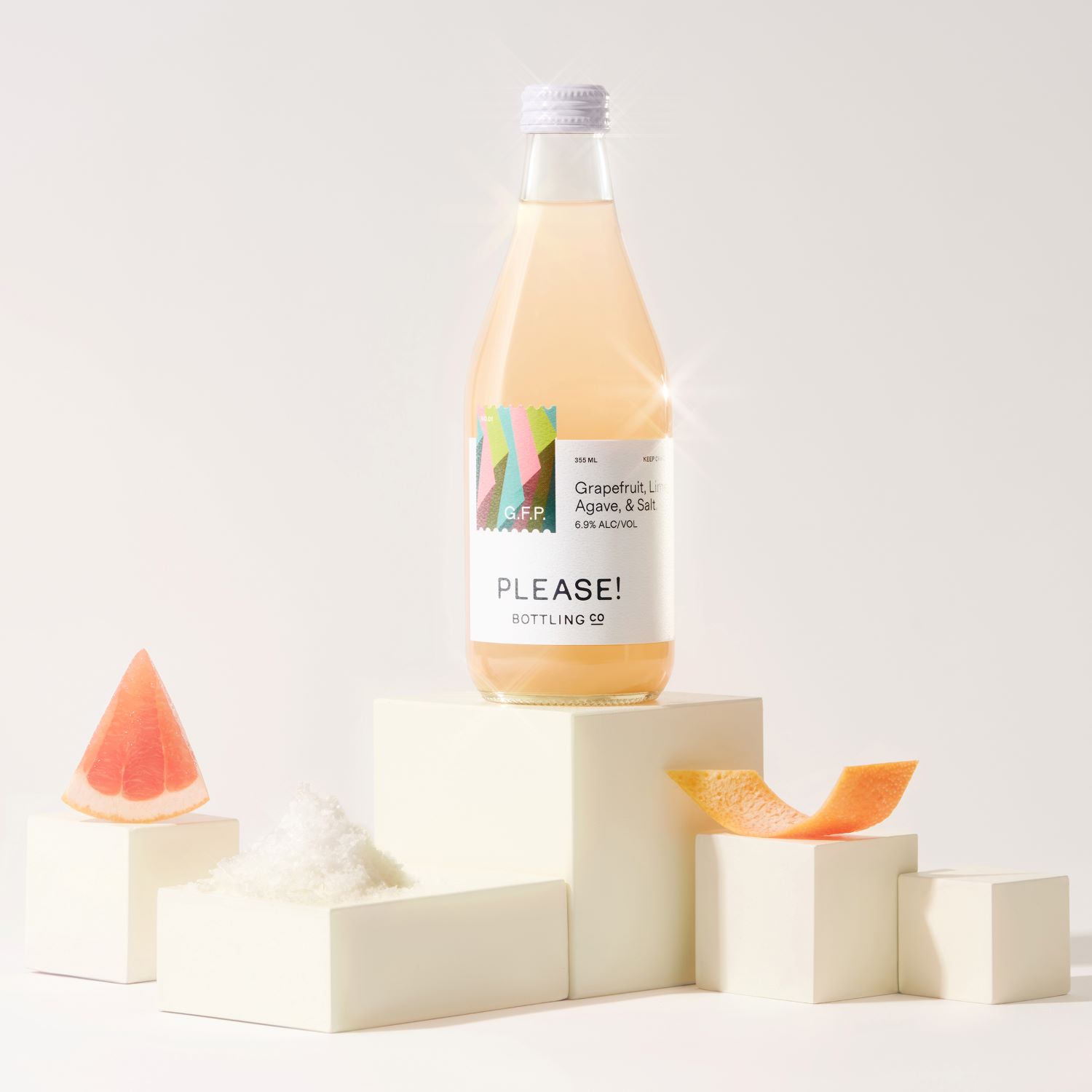
The brand's label is mostly neutral, yet the pop of color in the sticker-inspired stamp adds the perfect amount of whimsy and playfulness while keeping the brand's name and the beverage's flavor front and center.
Pleasant Drinks for Kind Spirits. Welcome to the world of Please – where the brand pours heart, passion, and imagination into the potions of our dreams. Please Bottlings Co. did a fair share of bar-hopping and searched far and wide to source the finest organic spirits and ingredients. From fresh-squeezed mixers and house-made tinctures, to locally-grown herbs and botanicals, the brand take special care in sourcing local and building community in its own backyard.
Right down to the label, each bottle is a labor of love featuring original artwork from emerging artists across the globe. At Please Bottling Co. you’ll discover premium crafted small-batch concoctions you won’t find anywhere else. And, rotating based on seasonality and playful spontaneity, you’ll never drink the same thing twice (unless you really want to). The brand cordially invites you to enjoy the kinds of cocktails that conjure up sweet memories, shake up old routines, and blend communities, one bottle at a time. It keeps things interesting by crafting each recipe with seasonality and availability of local ingredients in mind.
Plus, spontaneity is its not-so-secret ingredient. All of its cocktails are proudly made in-house, with low sugar, full flavor, and natural ingredients. From homemade syrups and tinctures to our small-batch bottling process – the method to our madness is one you can taste.
Best Studio said: 'Please! Bottling Co. came to us wanting to do something very different. These aren’t your average cocktails so they wanted the branding to reflect that. It needed to feel fun, artful and playful. The look and feel needed to be elevated but approachable and pleasant but not preachy.
We've taken inspiration from old vintage liquor bottles back in the day, when there were no labels, just embossed type. The wordmark is inspired by these embossed letters on glass bottles. Each letter is completely custom, each curve, crossbar, and counter was carefully designed to not look too soft, but have just the right amount of roundness to it. We wanted the lettering to be soft without feeling overly friendly. The labels are printed on a thick uncoated, textured label stock for an elevated feel. Each cocktail is paired with a custom illustration from illustrators all around the globe.'
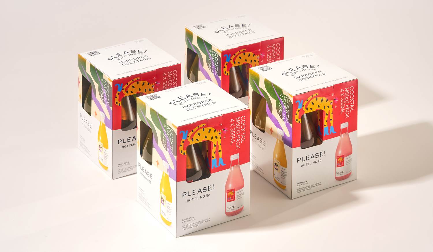
Engaging with the arts community was important to Please! so bringing emerging artists illustrations into the labels themselves felt like a nice way to highlight the arts community, while adding a bit of playfulness back into the labels. The designers kept the actual brand colors neutral, sticking to only black and white but allowed the illustrations to bring the color into the brand when needed.
This article was sourced from Dieline.
Stay up to date
Subscribe to the free Label News newsletter and receive the latest content every week. We'll never share your email address.
