Holyrood Distillery’s texture-rich labels
From the height of Arthur’s Seat to the depths of the Scottish seas,The Touch Agency designs Holyrood Distillery’s spirits labels, blending design and textures with Edinburgh’s brewing heritage.
Located in the oldest quarter of Edinburgh, Scotland, Holyrood Distillery has a special connection to the city’s iconic volcanic hill. It has been strategically situated at the hill’s base, as the city circles around this prominent landmark full of history and cultural importance.
The Touch Agency crafted the brand’s product identities that align seamlessly with its significance and offerings.
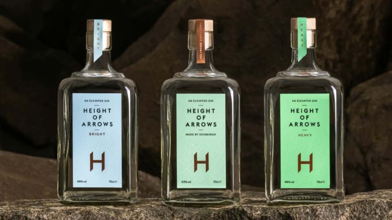
Height of Arrows
Gin is a vast and competitive market. To stand out in this category, Chris Logan, designer at The Touch Agency and his team took inspiration from the rich distilling history of Edinburgh.
The Distillery sits in the shadow of the mountain Arthur’s Seat, which stands 251 meters above Edinburgh’s old town.
The Gaelic name for the hill is ‘Àrd-Na-Said’, which translates to ‘Height of Arrows’ as the mountain was believed to be the furthest distance any archer could shoot an arrow.
This idea struck a chord with the brand, mirroring the founders’ hard work and determination to excel in whisky brewing. Logan’s design identity for the Height of Arrows gin incorporates a slight angle on the bottom of the ‘H,’ which mirrors the angle an arrow needs to be fired to reach the top of Arthur’s Seat.
Holyrood’s gin is infused with just three ingredients: juniper, beeswax and sea salt.
The simple recipe inspires a clean and uncomplicated label design instead of the heavily ornate and intricate approaches in many gin labels.
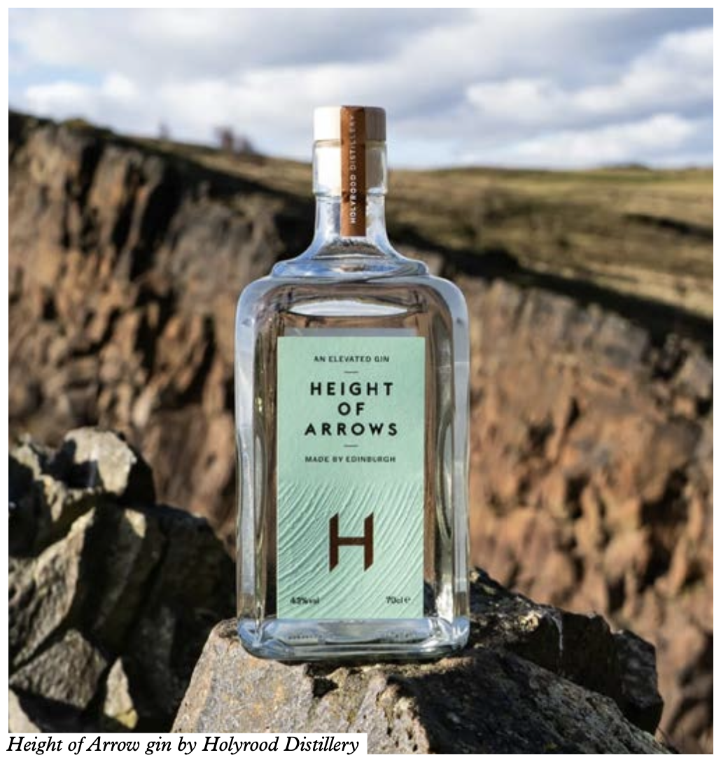
It was also crucial to translate the drink’s textures into labels. Logan and his team photographed the mountain to give the flavor of the place that inspires the brand. The rock also has geological significance with its interesting formations.
Explains Martin Naylor, owner of The Touch Agency: ‘Texture is a key part of the brand’s production technique. It’s all about texture, which needs to be integrated into the product’s labeling. We tried to mirror the way Hollyrood makes gin or spirits. It’s to try and get that texture.’
To achieve this effect, the label was produced using five or six processes, but without making it feel complicated.
‘It is still minimal,’ says Logan. ‘But it has little tactile details, which work nicely. The bottle is quite nice. It is a standard bottle with two finger points on the side so that you can clutch it. We are working on bespoke glass for the next phase, which is very exciting.’
New Make spirit
Another product from Holyrood is the New Make spirit, which needs to be aged before it can become a whisky.
Each of the brand’s New Make spirits uses different ingredients not commonly seen in modern distilling, including heritage barleys, specialty malts and a diverse range of yeast strains.
New Make is a more extensive project because the range
comprises 20-25 varieties. Unusually, the ingredient details are on the front label.
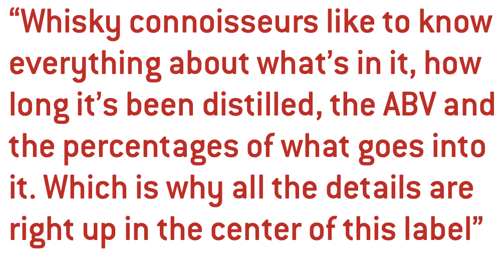
‘Whisky connoisseurs like to know everything about what’s in it, how long it’s been distilled, the ABV and the percentages of what goes into it. Which is why all the details are right up in the center of this label,’ Logan adds.
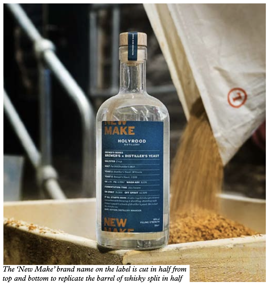
Logan replicated the image of a whisky barrel with its top taken off through intelligent typography.
The New Make name on the label is cut in half from the top and bottom to replicate the barrel split in half. The label shows the product details, including fermentation time, malts used, and product series name, with a comment on the product from the distillery manager.
The designers used colors to differentiate 20 whiskies in the range. This label incorporates textured special effects, achieved with high-build UV varnish.
Charmed Circle
The Distillery is located close to Charmed Circle, a district of Edinburgh with a water source supporting several breweries.
To create Charmed Circle, the brand creates a New Make Spirit using special heritage barley.
However, instead of placing it into barrels for aging, it blends it with neutral grain spirit and water. This process intensifies the barley’s natural flavors and unveils its unique character. The resulting spirit is reminiscent of vodka with sweet and creamy malted barley flavors.
The label is simple in design and ties together the notion of the Charmed Circle with the product name in the center of the circular emblem.
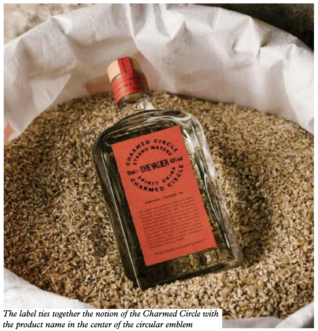
The label also carries a narrative about the historical significance of the brewing process and the geographical location.
The Touch Agency chose a typical beer paper for this label to tie back to the beer brewing history of the circle. The text on the label is debossed for texture – a common thread that runs through all of Holyrood’s label designs.
‘Throughout all the products, there is an idea of texture and that Hollyrood makes all its products with a whiskey maker’s mind. So, we have tried to create texture in the pattern or the debossing with foil blocking on the label,’ Naylor adds.
Elizabeth Yard
Located just outside of Edinburgh, Elizabeth Yard is an old naval base dating back to World War I, which serves as the inspiration for Holyrood’s Elizabeth Yard rum label design. Logan and the team referenced the captivating ‘dazzle’ patterns used to camouflage naval ships during the war.
In contrast to the typical gray or monochrome appearance of naval vessels, these patterns come together on the labels as vibrant geometric forms with foiling and colors.
Elizabeth Yard port was used for transporting and storing goods during the war. Holyrood’s whisky warehouse was once a naval rum store, so naturally, the brand stocks its sherry and bourbon octaves there.
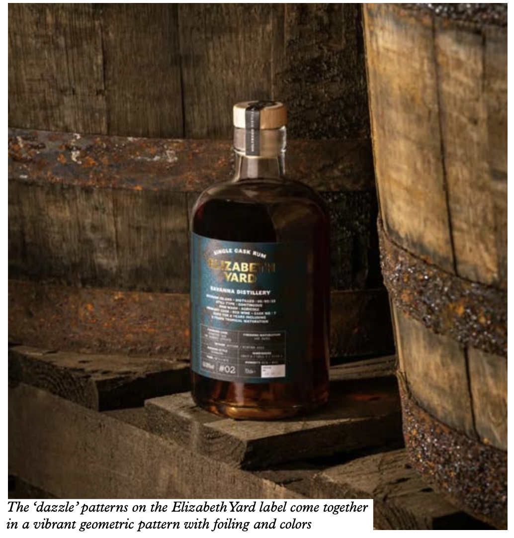
The designers switched colors and information on the label to differentiate between product varieties.
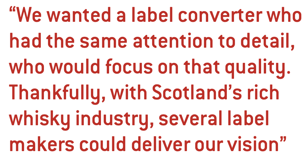
The short-run labels were printed using flexo presses in Edinburgh.
‘We wanted a label converter who had the same attention to detail, who would focus on that quality. Thankfully, with Scotland’s rich whisky industry, several label makers could deliver our vision. They’re expensive labels and are well produced, but the audience in this market demands quality,’ Naylor concludes.
Stay up to date
Subscribe to the free Label News newsletter and receive the latest content every week. We'll never share your email address.