Packaging design that inspires devoted following
Packaging designer Leigh Chandler designs packaging for brands that cultivates devotees rather than just attracting customers.
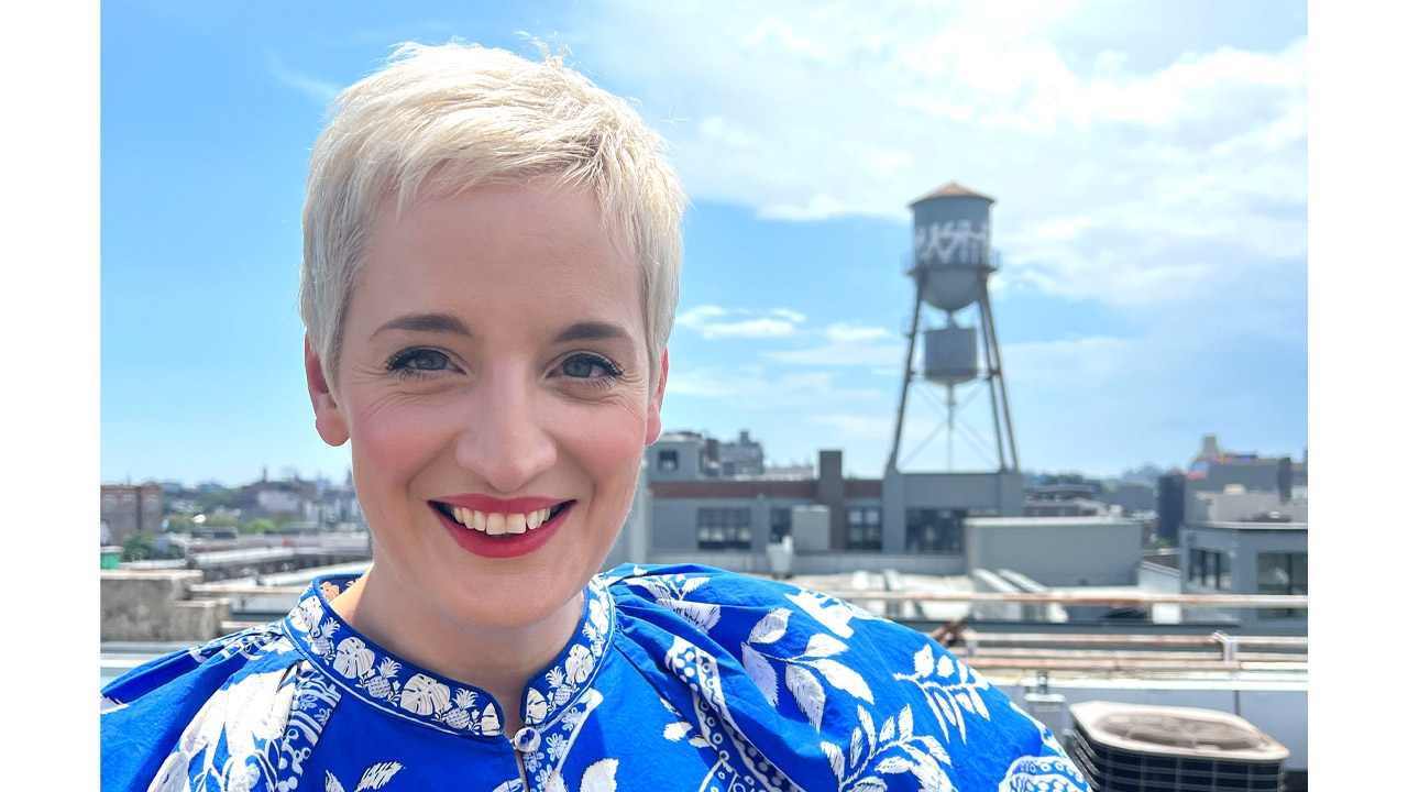
With over two decades of experience in the packaging design industry, Leigh Chandler has established her own design agency Sister Mary based in New York to create packaging that cultivates devotees rather than just attracting customers.
Chandler began her journey in branding and design at Fitch in London, where she focused on large-scale environmental graphics. Transitioning to Vault49 in New York in 2014, her focus shifted toward spirits and packaging. Working with Diageo, a dream client for Chandler, opened doors to innovation. Collaborating with the North American innovation team, she worked on new spirits brands such as Shady Fruit and Grind.
However, it was her work with Baileys that truly sparked creativity. Tasked with reinventing the brand, she along with her team delved into new printing technologies and full sleeve wraps for the brand. One standout project was Bailey’s Strawberries and Cream variant where they transformed the traditional black bottle into a vibrant symbol by wrapping it in a baby pink sleeve.
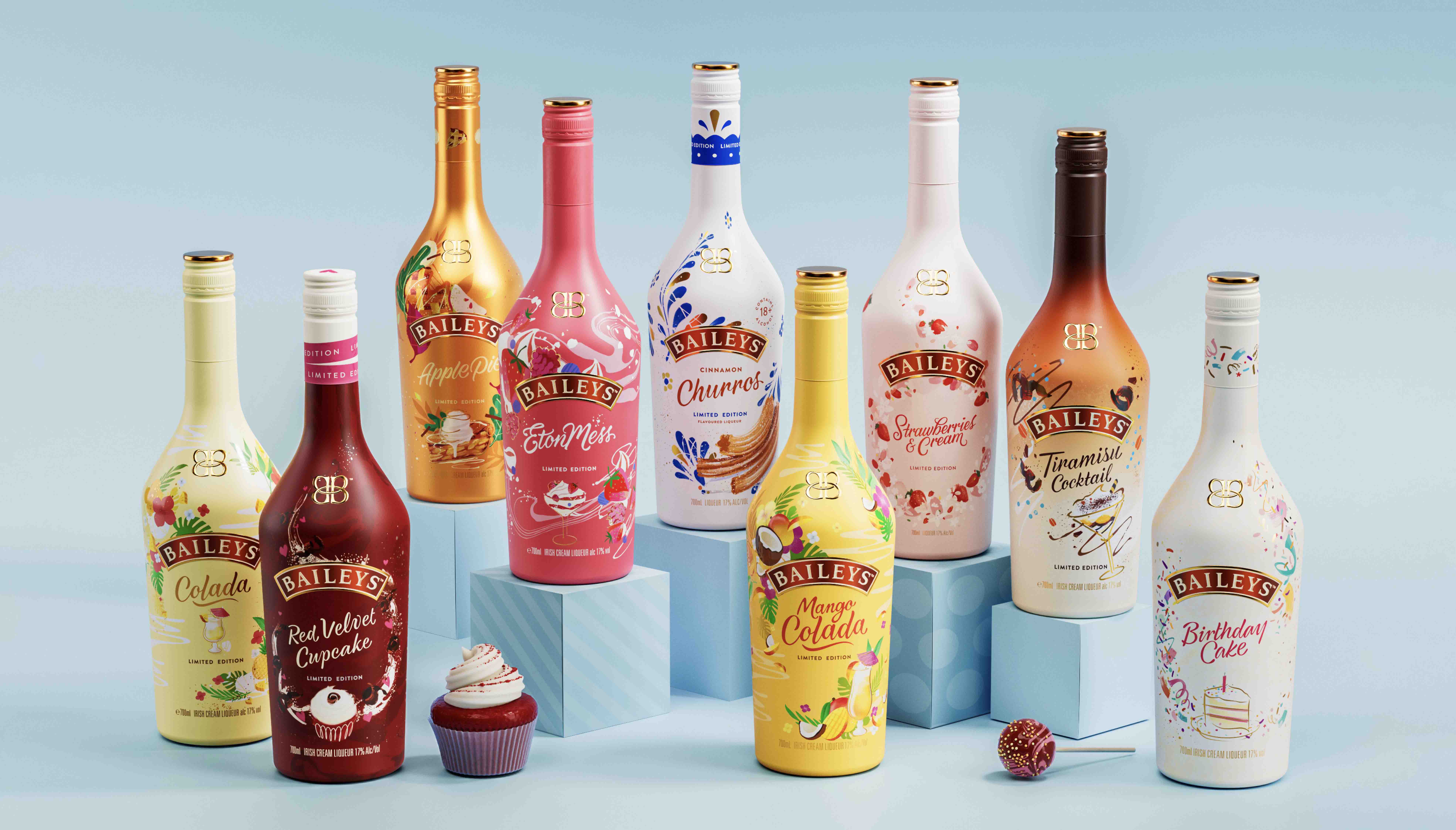
Now, the brand's lineup boasts flavors including Apple Pie and Pumpkin Spice, each with a striking sleeve. With each new design, Chandler and her team pushed the boundaries of printing technology, using shrink sleeves to create a dynamic canvas for the brand. This transformation has made Baileys relevant beyond Christmas and traditional occasions, breathing new life into the brand.
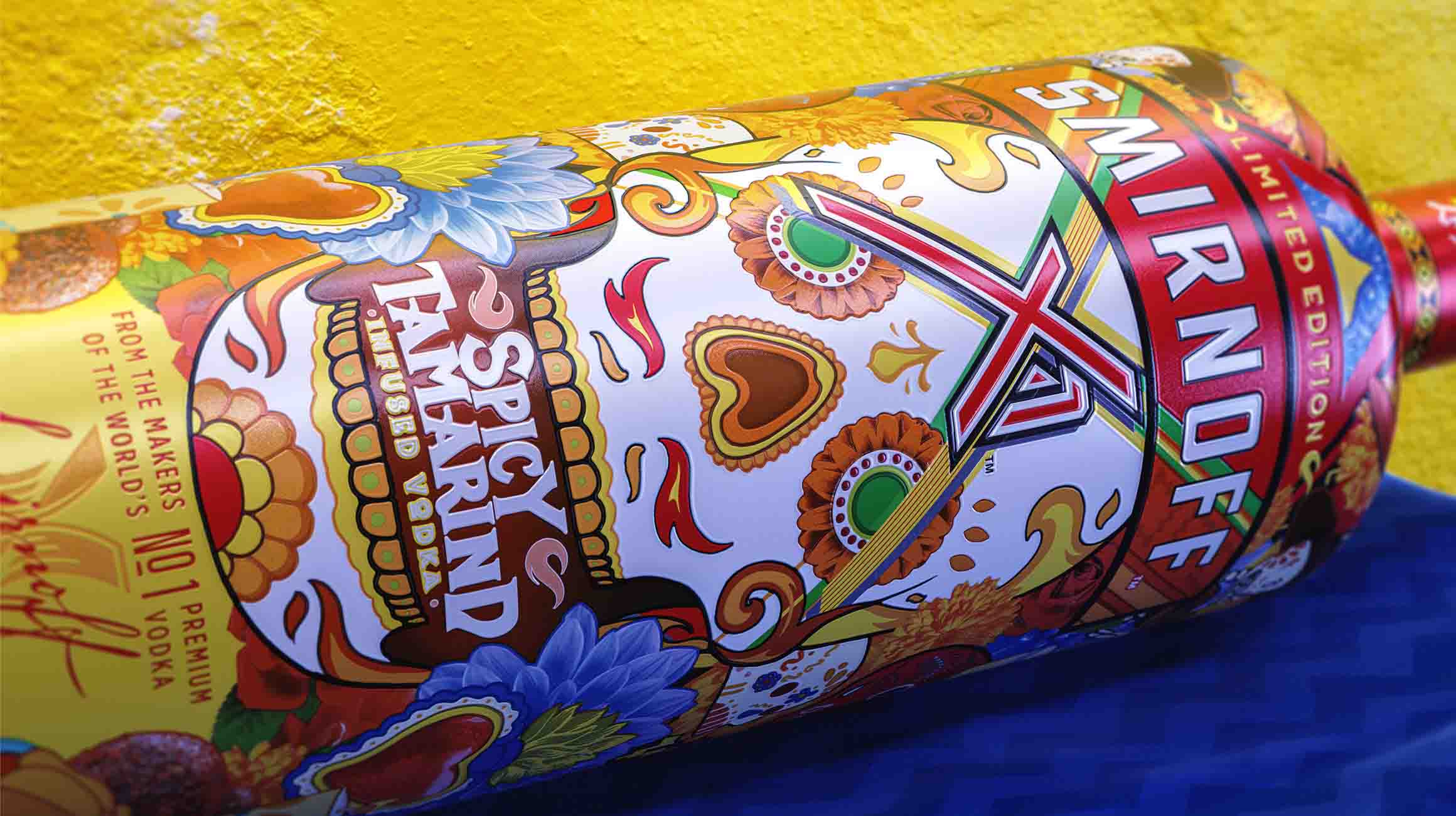
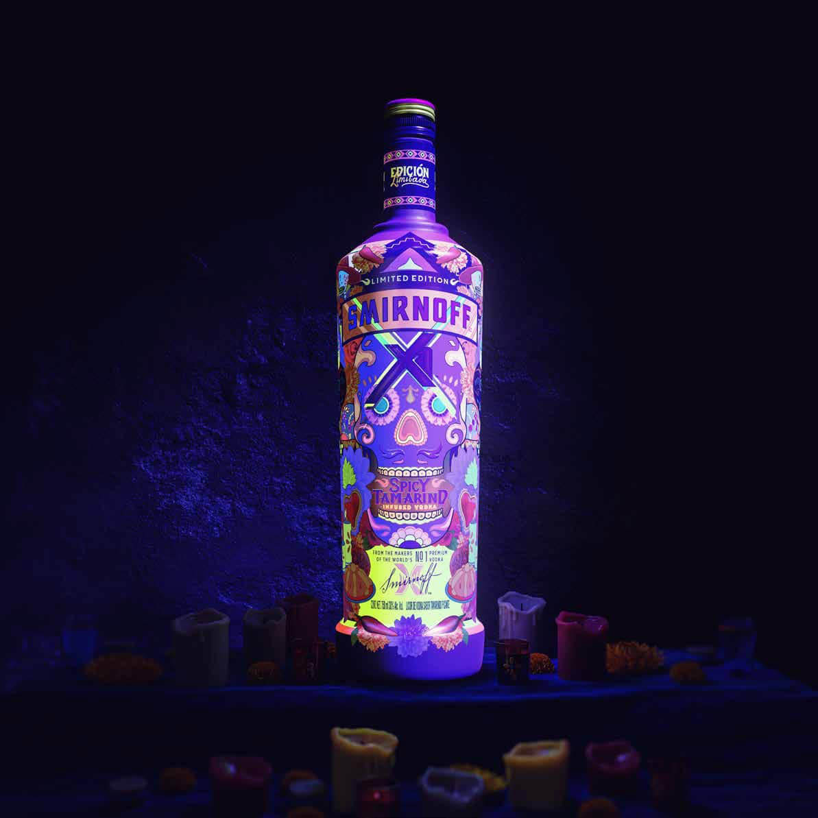
‘It truly underscores the transformative power of printing, colors, tactility and finishes in brand evolution. My time at Vault49 expanded my expertise in packaging, emphasizing the profound impact these elements have on brand identity. Over the past decade, I collaborated with Baileys, crafted stunning limited-edition packs for Smirnoff, and contributed to the branding of Captain Morgan and Guinness,’ she adds.
Paving way for women-led agencies
However, her recent departure from Vault49 stemmed from a realization that only 1 percent of creative agencies are owned by women. An advocate for industry equality, she launched Sister Mary to pave the way for more women-owned agencies. With a focus on spirits and a passion for cannabis, beauty and wellness, she aims to craft brands that evoke desire and love through thoughtful packaging design.
‘I find it intriguing to delve into what truly sets brands apart, regardless of their size or status. Rather than chasing fleeting trends, my focus lies in uncovering each brand's unique essence and catering to the desires of its target audience. It's essential for every design to not only reflect the brand's identity but also to stand out amidst its competitors,’ she explains.
This approach involves understanding the brand, meeting consumer needs, and differentiating within the market. While strategy lays the groundwork, Chandler believes that there is an element of magic that often stems from collaboration with artists.
‘Take, for example, a project I hold dear, created alongside Mexican artists Raul Urias and Alan Rodriguez. Their creative input elevated the design. By blending innovative ideas with raw artistic talent, we crafted something truly extraordinary. My aim is not to follow trends but to set them.’
Collaborating with converters
Chandler has found that involving the packaging production team early in the creative process often leads to the best outcomes. While designers may have a vision, collaborating with production managers opens a realm of possibilities.
‘From die-cuts to holographic foils, each printing technique can enhance the creative message in unexpected ways.
Some designers may fear that production limitations will dilute their vision, but I have always seen it differently. In reality, navigating the production process tends to refine and elevate the initial concept. Of course, having both a skilled production team and a client with the budget to support innovative finishes only adds to the impact of the final product,’ she explains.
She highlights that when starting a project, it is important to know the rules. ‘For example, when designing for Guinness cans, we had to stick to five colors and avoid overlapping. We would always start the creative process knowing that we can only use five colors. However, for spirits with more design freedom, like bottle sleeves, then really the world is our oyster.
You can have windows, foils, varnishes, holographic finishes. It's all about adapting to each project's needs.’
Chandler has built strong connections in packaging production, particularly with renowned converters such as CCL who handle projects for popular brands.
‘I work very closely with a man called Kevin Chop, who manages all of the production for Diageo, and they really have acted as like my advisers. They would often come into the studio with the latest technologies and finishes. These partnerships with top production houses keep us informed about the latest trends and possibilities,’ she says.
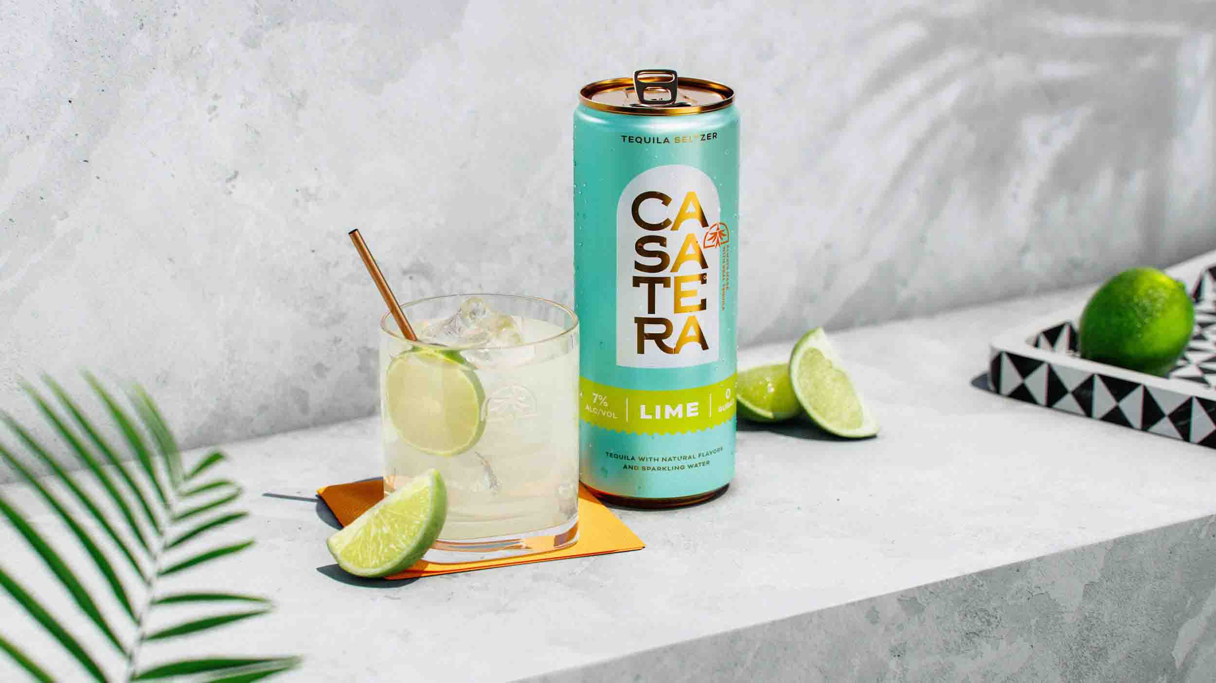
Startup brands often look to designers such as Chandler for guidance. For instance, with the launch of Casatera, a new tequila soda brand, she had to consider different production methods. ‘Initially, for their limited run, we opted for digitally printed labels on the cans. As they grow, we could explore options like shrink sleeves and direct-to-can printing. Each method has its own production process, but consistency in color was crucial, especially since their unique light turquoise shade had to match across all packaging types.’
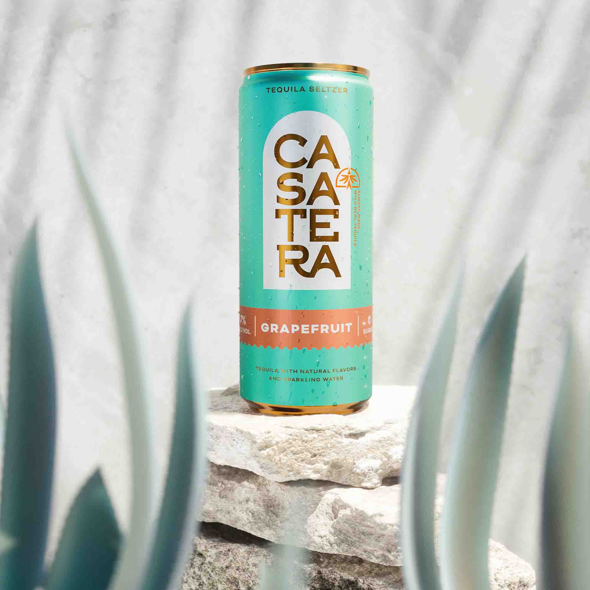
This complexity required close collaboration with CCL to ensure color consistency. Chandler’s goal is not only to achieve the best visual result but also to recommend techniques that align with the brand’s budget and stage of business growth.
Crafting brand personality with packaging
Throughout her career, Chandler has always viewed brands as personalities, each with its own behaviors and characteristics.
‘When I dive into designing for a brand, I build a deep connection with it, almost falling in love with its essence. This relationship enables me to understand what feels true to the brand and how it should express itself, whether on packaging or in experiential settings. Some brands simply serve a function, while others evoke genuine desire and adoration, becoming what I call "love brands." Spirits brands often fall into this category, eliciting devotion from consumers,’ she explains.
Chandler’s goal with Sister Mary is to create or evolve brands that inspire this kind of affection, brands that win hearts and have devotees rather than mere customers. ‘You can tell when a brand achieves this status when you find yourself reluctant to part with its packaging, long after the product is gone, keeping it as a cherished memento.’
She believes that before a label becomes part of a package, it should first resonate deeply with the brand's concept and the needs of its audience. It is about breaking free from the norms, tapping into unmet needs, and knowing cultural trends.
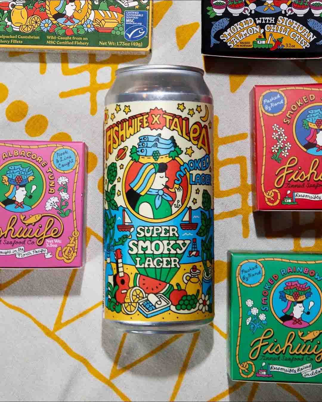
Chandler highlights as an example, Fish Wife, a brand that has transformed the mundane tinned fish into something captivating with its beautifully illustrated, vibrant packaging. Recently, it collaborated with Talea, a beer brand, to create a limited edition Super Smoky Lager. The result? A visually stunning label that combines the essence of both brands and has caught the attention of consumers. This collaboration, spearheaded by women-owned brands, celebrates creativity, meets consumer demands, and reflects current cultural trends.
The designer has always harbored a deep passion for collaborating with artists. With Sister Mary, she sees an opportunity to unite artists from diverse corners of the globe, blending their creativity with strategic insights to create impactful designs.
‘I firmly believe that when compelling ideas meet exquisite artistry, brands have the potential to transcend mere consumerism and cultivate devoted followings. My goal is to foster brands that inspire genuine affection. Central to this mission is staying attuned to cultural trends,’ she says.
‘That is why Sister Mary will have its headquarters in New York because New York is really a melting pot of culture and different kinds of cultural influences. But I want to collaborate with artists in Mexico, Brazil to Africa because it is so important for brands to be able to resonate in different markets and be culturally relevant. I'm looking forward to building this network of collaborators and helping brands to build cultural connections around the world using that kind of powerful formula of ideas and raw artistic expression.’
Stay up to date
Subscribe to the free Label News newsletter and receive the latest content every week. We'll never share your email address.


