From niche to mainstream: Design paved the way for SkyPop
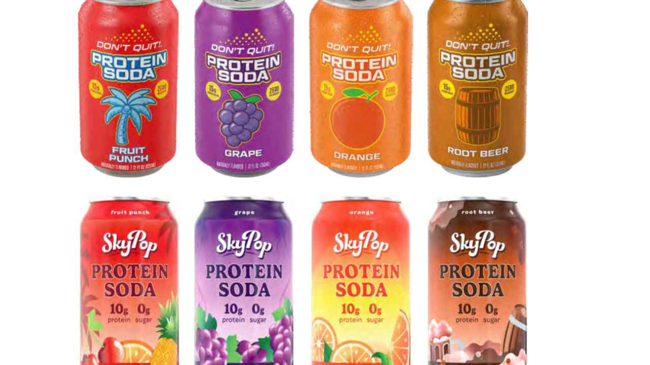
Explore the before-and-after packaging transformation
story of a powerhouse protein soda, featuring twists, technical hurdles and lessons learned
Let’s be clear: Designers don’t design for design’s sake.
In the high-stakes world of consumer packaged goods
(CPG), we design to drive business growth. We design to
secure shelf space, increase sales and ultimately, impact the
bottom line.
For proof that design is a growth engine (in addition to being a problem-solver), look no further than the transformation of SkyPop.
Who’s doing protein’s PR?
You’ve probably noticed that protein is having a moment, showing up in all sorts of products from popcorn and gelato to candy and cookies. One of the newest market entrants is the world’s first protein soda, under the sports nutrition brand, Don’t Quit.
Until recently, Don’t Quit was primarily sold in health food
stores, gyms and a few national retailers. It catered almost
exclusively to fitness-focused men. But the brand had bigger
ambitions. To drive real growth and expand its footprint into more national retailers, it needed to shift from a niche fitness product to a broad-appeal lifestyle brand. To achieve this, the company needed to refine the formula, introduce new flavors and expand its target audience. The problem was that the drink’s packaging and branding were decidedly masculine and no-nonsense, creating a disconnect with its ambitious goals. So, Don’t Quit hired me to design a brand makeover that would align its branding and packaging with its sales goals.
“In the high-stakes world of consumer packaged goods, we design to drive business growth. We design to secure shelf space, increase sales and ultimately, impact the bottom line”
The strategic pivot
The Don’t Quit brand set its expansion goals by talking with a
dozen or so top retailers about what it would take to get its protein soda on their shelves. Retailers were excited right out of the gate, but said that the packaging needed to change. To reposition itself as an alternative soda rather than a protein recovery drink, the brand needed to become a lifestyle brand, one that could compete in the market with brands like Poppi and Olipop (two prebiotic soda brands).
The brand’s creative brief was clear. The new target audience
was younger, modern, health‑conscious and fun-seeking. This
wasn’t just about recovery; it was about enjoyment and function. The brand needed a visual identity with flair, whimsy and cheer. A stark departure from its utilitarian roots. What an opportunity for a packaging designer. And that’s exactly what I created. Same name, same logo, but a completely different packaging design.
Adding personality
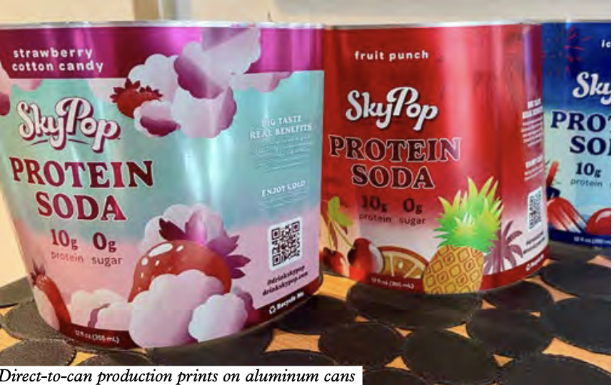
We moved quickly. The new design concept was built on color: variations, nuances and gradations to infuse personality, playfulness and whimsy onto the can. There are colorful fireworks exploding; there’s foam floating and fruit flying around; there are squishes and squirts of popsicles, cherries and strawberries. The identity embraced a touch of fantasy that speaks to the new flavors as well as to the broader audience: new professionals, young parents and fitness enthusiasts who want their protein with a side of joy.
My client loved it. More importantly, the retailers and buyers
loved it.
For the print nerds among us, the nuances in the colors were
intentional, designed to match the design’s new vibrancy and
movement. I knew we could achieve the look and smooth
gradations because the cans would be produced on a shrink sleeve using CMYK.
The production curveball
The design concept was approved, the buyers love it, and we were finalizing our designs, when my client says: ‘We need to change the production method.’ Why? Well, the buyers were so excited about the new design that the projected production run skyrocketed. We went from planning for hundreds of thousands of cans to millions. We’re talking Walmart, Target, Kroger, CVS and more.
In the CPG world, volume can make or break everything. When you move to that level of scale, unit costs become the primary driver. The leadership team made the call to switch from CMYK shrink sleeves to direct-to-can printing.
And why that choice? Margins. Printing direct-to-can is
significantly less expensive per unit than applying a shrink sleeve. When you’re producing millions of units, those pennies add up to massive profit margins. It was a smart business decision, so how could I be upset?
“In the CPG world, volume can change everything. When you move to that level of scale, unit costs become the primary driver”
The new product projections were a great compliment to the
design, and my client was thrilled, but I had concerns. The designs would go from printing CMYK, where I can achieve millions of colors pretty easily, to printing direct-to-can, which only allows five Pantone colors plus white.
That’s it.
If you’re not familiar with direct-to-can printing, which I was
not, it is a completely different process. So now we have a design that everyone loves, but a production method that is not conducive to it. I’m worried that we won’t be able to print the multitude of shades or achieve the new energy and vibrancy.
After my first call with the new production team (I’ll let you
imagine what that conversation was like), I say to my client: ‘We may have to change the design.’
And they say: ‘No, we’re not changing the design. We love the
design. The retailers want that design on their shelves. We’re not changing it.’
Of course, I bring up my concerns with the printer, and
surprisingly, the team leader says they can work with it. They
have expert color separators, and they will make it happen. But it’s going to take some ingenuity to achieve my vision within their production capabilities.
Identity crisis
Okay, so now you’re all caught up. Let’s go back to where I was when I turned in the artwork: the fresh, whimsical, fruit-exploding design paired with the masculine, determined Don’t Quit logo and brand name.
I’m guessing some of you may have an inkling about what
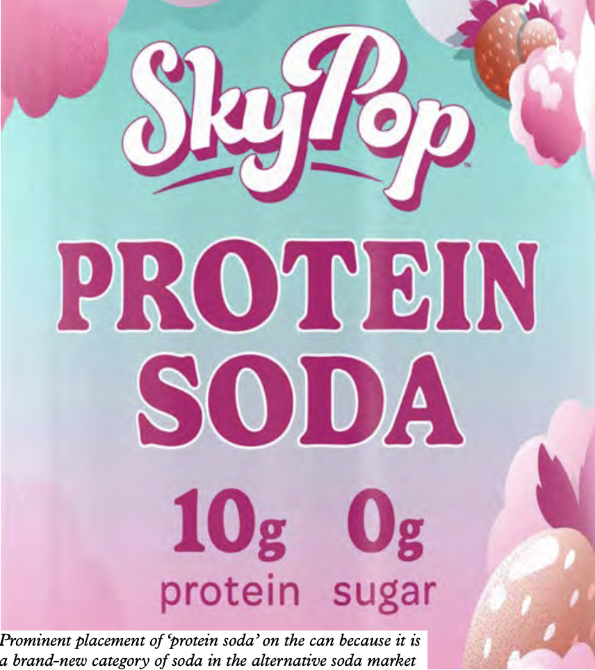
happened next. While everyone loved the new visual identity, there was now a disconnect between the name, logo and logotype and the packaging’s fresh energy.
And that’s when my client says: ‘We want to change the name.’
We had debated a name change at the start of the project, but it was not viable then. Sometimes you must go down that road with a client so they can see it. I call this a step process. They simply could not envision the need until they saw the new design. The packaging evolution forced a brand identity evolution.
We were already on a tighter-than-tight schedule: Retailers needed the product in their stores within five months. It had
been two months since I started working on the project. A renaming project typically takes months of brainstorming, trademark research, URL hunting and approvals. After just four weeks, my client lands on a name that embraces the lifestyle of their broader audience, their new flavors and the
alternative soda market: SkyPop.
Now they needed a new logo for the new name. Did I mention we were on a short timeline? The good news is, we already
had a packaging design that captured the brand’s personality: pizazz, fun and joy. Now I had to translate it to the new logo.
We questioned how to narrow the scope to meet the new deadline with the can manufacturer: Is it a hand-drawn typography or something simple and slightly customized? Is it a logo, a mark or an icon? Is it just a mark, and the type is secondary? In the interest of time, we decided on a unique logotype without a mark or icon.
Once the SkyPop logo was approved with flying colors (pun intended), I revised the label design to accommodate it. The
old logo was triangular, and the graphics on the can flowed around that shape. The new logo was horizontal and curvy. Every explosion of fruit and splash of foam had to be shifted and rebalanced.
Let’s get technical
Back in production, I worked with the separator to identify Pantone colors that best matched the CMYK nuances of my
original design. And we had to account for the substrate: Pantone colors look different on aluminum than they do in my fandeck, which is printed on white-coated paper. Additionally, we could specify some colors to be transparent, so they have a metallic sheen from the aluminum, but I wondered if they would lighten the look? Or darken it? Some colors are brighter on aluminum than others. And then we needed some colors to be ‘neck-friendly’, because aluminum bends, and the ink in those spots needs to be forgiving of that movement, so
it doesn’t crack.
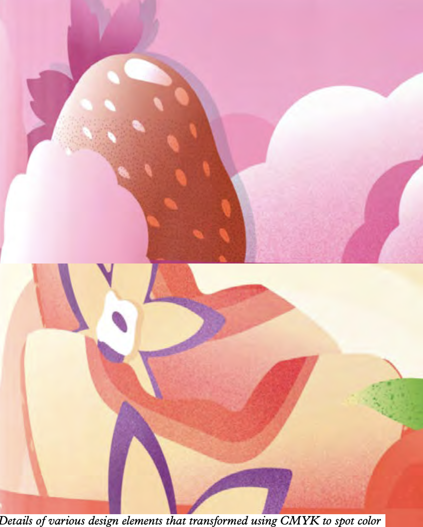
Wait, there’s more. Printing on aluminum is a ‘wet-on-wet’ process. So, on a can, the inks cannot touch while wet. If you take a loupe to a direct-printed can, you will see tiny aluminum hairlines between colors. No two colors ever touch. Contrast that with CMYK printing, where we layer cyan with magenta, yellow and black to achieve millions of color nuances.
The separation phase was very time-consuming. We went through the artwork piece by piece, for seven flavors, seven
different designs and five sets of Pantone colors. That gave us 35 colors, plus white, to cover the full range of color shades,
gradations and nuances.
As I worked with the color separator, he took elements of each design and adjusted them for the production process. We used stochastic screening in the gradients for a better continuous tone. We used optical mixing to create new colors from our limited palette.
“Sometimes you must go down that road with a client so they can see it. I call this a step process. The packaging evolution can force a brand identity evolution”
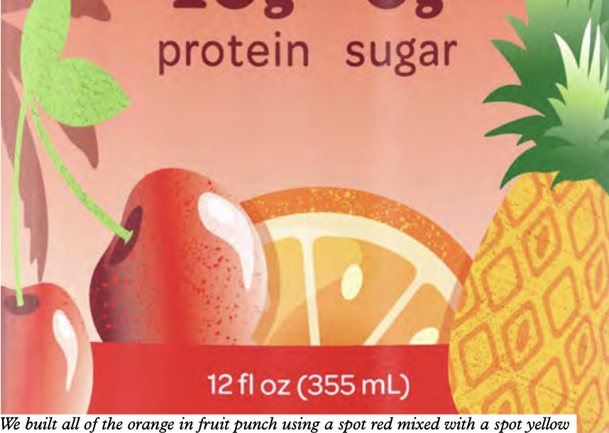
For example, the fruit punch design features a pineapple, an orange and a cherry. We didn’t have a spot color for orange. But with yellow and red specified, the separator used the proximity of dots to create the illusion of orange. And we had to do that for each can design. It was a masterclass in aligning creative vision with production capabilities.
It was a wild ride, and well worth it. SkyPop Protein Soda is set to be in thousands of stores nationwide by summer 2026. That breadth is pretty much unheard of for a new brand. And,
for a designer, it’s always a thrill to see your work ‘out in the wild’.
While this appears to be the story of a product’s before-and-after design, it’s really a business case for the ROI of strategic design. I’m not overstating it when I say that the packaging sold this product to the buyers.
Sure, they loved the taste, but the retailers would not have taken it on without the new design. They needed shelf impact
in the lifestyle soda aisle.
The leadership team understood a fundamental truth in business: Design is a means to an end. It is not just about
aesthetics; it’s also about economics. The design enabled distribution. Distribution enabled volume. Volume enabled scale. Scale enables a sustainable business.
This is design as a growth engine. And the theory proved itself with SkyPop.
Stay up to date
Subscribe to the free Label News newsletter and receive the latest content every week. We'll never share your email address.