Short-run printed packaging; a supermarket odyssey – part 12
The Olympics were in full swing when I snapped these few pictures of themed short-run printed packaging earlier this week.
More Olympic support from Procter & Gamble (P&G) was found, this time on Oral-B toothpaste cartons, which have been decorated with the now near-omnipresent medal logo P&G has placed on its products.
 P&G is a worldwide partner for the Olympic movement, so it’s no surprise that it has been at the forefront of my unscientific, pseudo “study” into short-run printed packaging as seen on store shelves over the course of this summer.
Its brands have been visible across almost all other media as well this summer, including TV and newspapers, and it is hard to go into any shop and down most aisles and not see the P&G medal logo visible on its products packaging and labels.
Snack food brand McVitie’s has been another big brand making the most of its British roots and the number of events we’ve had to celebrate in the UK this summer.
The Queen’s Diamond Jubilee celebrations, the upswell of support for Andy Murray as he reached the men’s singles final at the 2012 Wimbledon tennis championships and then his victory in the London 2012 Olympic tennis men’s singles final against Roger Federer as part of Great Britain’s record-breaking medal haul at its home games, seems to vindicate the decision of brands and food producers to focus so heavily on British-themed packaging this summer.
McVitie’s is one of those, boasting of its British heritage for over a century, and using the Union Flag to give many of its products a decorative overhaul, as have others like confectionery brand Cadbury and supermarket chain Tesco.
 McVitie’s has also been running various competitions and promotions across its packaging this summer, such as the “Bring Out the Cake” promotion and its giveaway of “Mega Mugs” suited to dunking its biscuit products in tea.
 Cereal brand Kellogg’s is another that has been visible working to use using new tools and value-added functions on its packaging this summer.
“Colour Me In” Rice Krispies cartons remain one of my favorite packaging formats I’ve seen on the shelf this summer, but Kellogg’s has been using its cereal boxes to increase interaction between its other brands and their target audience.
Packaging for its Krave cereal, which was launched in the UK in 2010, has been used as a tool for a flavor competition between two then-limited edition flavors, Totally Chocolatey and Chocolate Caramel, to decide which would become a permanent addition to the Krave brand, and directing consumers to vote for their choice via the cereal's Facebook page.
 Chocolate Caramel got the most votes and was put on general sale, though Totally Chocolatey was also later re-released for a limited time.
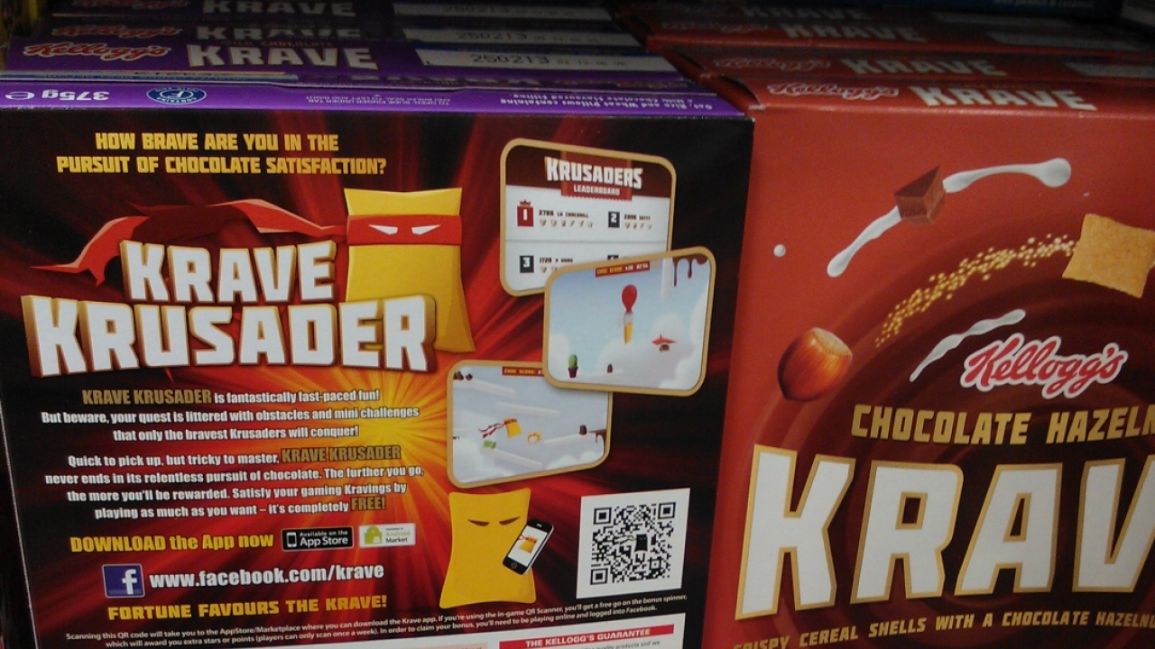
Kellogg’s is now using Krave cartons to promote its “Krave Krusader” mobile game, which is downloadable from various app stores.
 “Krave Krusader” can be seen to be a playful use of Batman’s nickname of “the caped crusader”, and to coincide with the release of the latest Batman film, The Dark Knight Rises.
Krave cereal boxes feature a QR code that when scanned takes consumers and gamers directly to the download page for the app, as well as a direct link to the Krave Facebook page.
Stay up to date
Subscribe to the free Label News newsletter and receive the latest content every week. We'll never share your email address.