Short-run printed packaging; a supermarket odyssey – part 13.5
With the main Olympic Games now finished, the big events around which brands and products can theme their packaging this summer are pretty much over. The Queen’s Diamond Jubilee, Wimbledon, Euro 2012 and the Olympics have all come and gone.
While I’m excited by what changes we’ll see due to the post-Olympic celebration of successful athletes, we’re also likely to now see this summer’s design themes phased out as the attention moves to annual dates in the diary, such as Christmas, Thanksgiving and other autumn and winter celebrations.
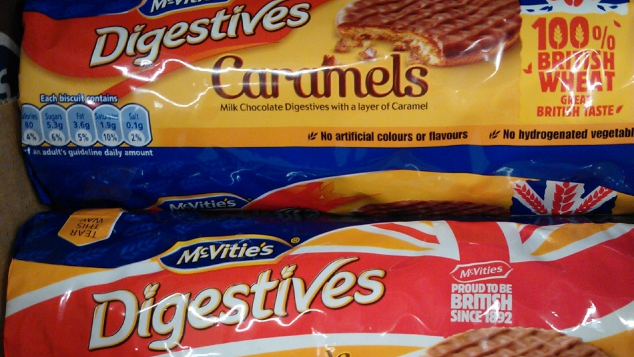
McVitie’s Digestives Caramels highlight the transient nature of short-run printed packaging nicely.
 This weekend I was able to photograph two packets side-by-side on a store shelf, one featuring a Union Flag decoration that has been commonplace on shelves this summer, and one featuring a more restrained use of the Union Flag to highlight the sourcing of ingredients.
Even the slogans are markedly different. “Proud to be British since 1892” boasts the pack in the Union Flag design, while the other pack states: “100% British wheat - Great British taste”.
Stay up to date
Subscribe to the free Label News newsletter and receive the latest content every week. We'll never share your email address.