Brand building

The role of the label is changing from a carrier of product information to a key element in brands’ broader communication strategies. Carol Houghton reports
It takes seven seconds for us to make a decision at the point of purchase; we don’t read labels but respond to the look and feel of a product and its packaging. The label provides a visual shorthand.
A company which understands this very well is Procter & Gamble, and Mike Ferrari was at the center of P&G’s marketing and innovation team during his 32 years at the company, completing his career as R&D associate director. Today he runs a consultancy, Ferrari Innovation Solutions, which seeks to understand and quantify rapidly changing consumer habits.
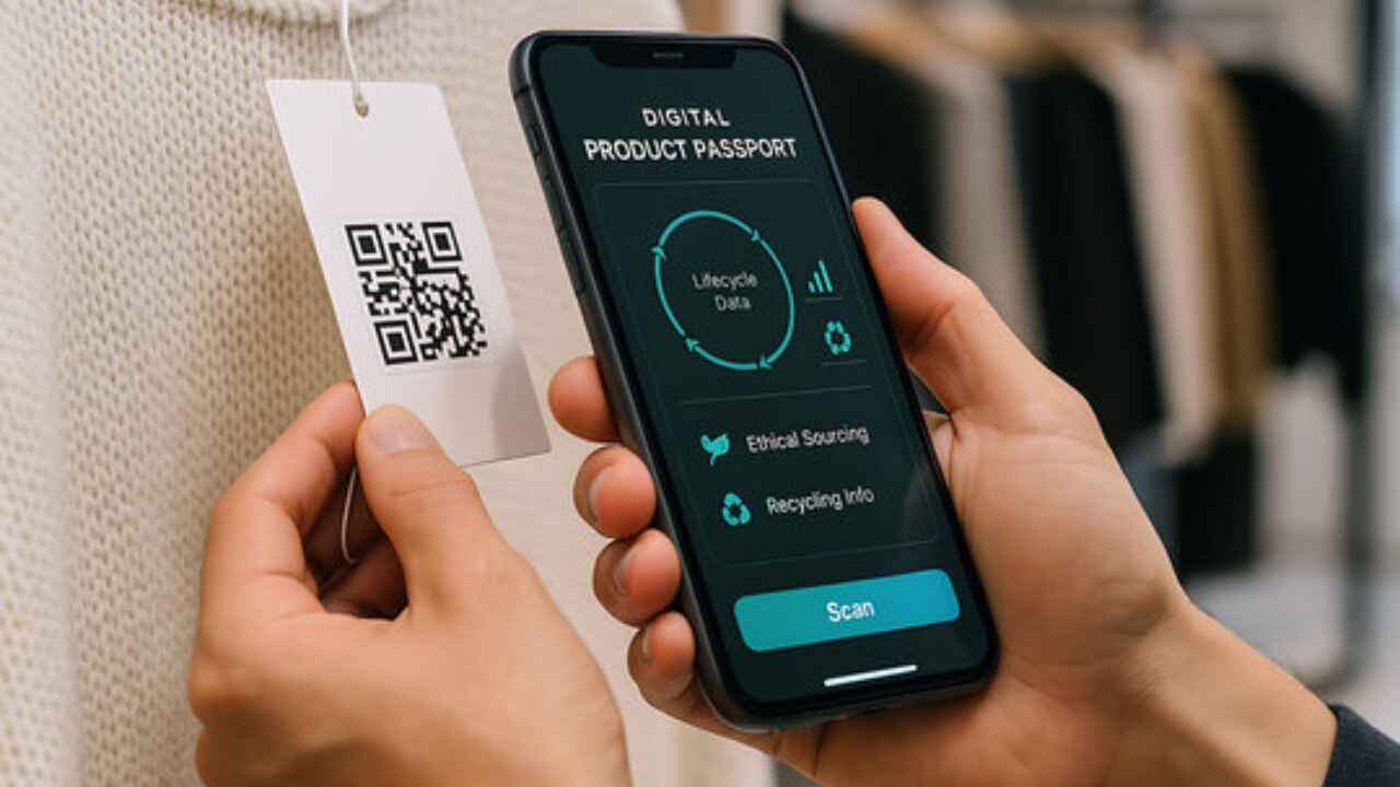
Ferrari points out that shoppers know more than ever before about the source and production process of the products they buy. They demand information that will impact their buying decisions and it is often left to the label to convey these facts. 2D or QR codes are increasingly appearing on labels. Currently used mostly for advertizing and promotional purposes, it is likely they will eventually provide the safety and nutritional information previously printed on the label, removing the need for two-ply or booklet labels.
Madelyn Postman, from branding design agency Grain Creative, says ‘less printing is happening’ – more information is being provided online instead. ‘The physical label is still needed in order to direct the consumer to that information, but this has become a marketing tool rather than the primary carrier of information, making it more important than ever for the label to stand out.’
These trends have led to a burst of creativity, typified by companies like Rolling Optics AB from Sweden, which has developed a micro-optic technology which creates stunning 3-D effects by printing different patterns on consecutive layers, creating a magnifying effect.
To assess the impact of his technology, company CEO Fredrik Blomquist commissioned a study using eye tracker technology to monitor a respondent’s gaze in store – where they looked and for how long. Results showed that the 3D labeled product received 70 percent more attention than that same product with the original label. After applying a Rolling Optics 3D optical illusion label, sales of Grazette of Sweden’s XL hair care product range increased almost 90 percent.
Another company which understands the importance of shelf impact is Sun Chemical, which recently launched its SunInspire range of ‘printable sensory graphic design effects’ combining color, touch, aroma and interactive effects. Comments the company: ‘Traditionally packaging was designed to stand out through its visual appeal, but today tactile coatings, aromatic technologies and interactive solutions are enabling brand owners and designers to design new concepts into their brands, thus further engaging with the consumer through printed effects.’
Going digital
The emergence of social networking means that the ‘first moment of truth’ is now in a virtual world rather than on the shelf. Brands are leveraging between two worlds, as well as changing their labels and packaging more frequently to remain relevant. Michael Ferrari says this trend will drive the mass adoption of digital printing technology.
Digital printing allows brand owners quickly and easily to change graphics and data to keep up with consumer trends and current events, as well as short runs for seasonal promotions. Ralph Bates, HP Indigo UK labels and packaging says ‘digital is driving change in the market but change is coming from the brand.’
Digital offers faster response times, shorter supply chains, faster time to market and reduces inventories and waste as well as cost for short runs. According to Bates, packaging and label buyers are waking up to these benefits. Coca-Cola Israel recently ran a campaign using digital technology to increase brand awareness and extend the customer’s experience. For four weeks consumers visiting the ‘My Coca-Cola’ website could upload pictures and use online tools to design backgrounds and effects to be printed on their own, personalized shrink sleeve can design. Thousands of consumers were involved in the production of 50,000 separate designs. Using an HP Indigo WS6000, the company says digitally printing shrink sleeve labels rather than directly onto the can meant designs from the website were printed on a seamless workflow.
This level of personalization is an expensive undertaking for both the consumer and the brand, however, and Kodak’s David Croft suggests that versioning of labels is a more cost effective solution. Brands can vary the data depending on the country or region rather than the individuals to stay relevant and create a bond with consumers.
Alon Bar-Shany, vice president and general manager, Indigo Division, HP, points out another benefit of digital printing: ‘Many brand managers have also discovered the benefits of using digital printing for prototyping and market trials, where cost-effective test products may be produced on final substrates.’ Driven by brand owner demands for variability and immediacy, HP is now expanding its technology from labels into flexible packaging and folding cartons.
Neil Goodman, creative director at Direct Design, however, sees limitations for digital in packaging applications: ‘Litho is still the cheapest option for large runs and best for color matching and spot color, which cannot be achieved with digital.’
Brand color management
Color profoundly affects the consumer’s view of a product. Research has shown that secondary colors are more calming than primary – yellow evokes cheerfulness whilst red makes food more appealing as well as encouraging a quick purchase. Forest green and burgundy appeal to the wealthy and raise the perceived perception of price.
Barbara Pellow, group director at Info Trends, says color is symbolic of value and should be chosen carefully to remind consumers of the brand’s value proposition. As an example, Walls recently rebranded its products, using blues to give the package a traditional feel and extend its appeal to the target family market.
Studies into consumer behavior have shown that if a color is consistent across all of a brand’s products the consumer will immediately recognize it amongst competitors. ‘Packaging and labels are the main carriers of the brand identity and are often referred to as the ultimate interface between the consumer and the product. Consistent brand color is therefore vital in making packaging stand out on the shelf,’ says Patrice Aurenty, business leader color management at Sun Chemical. The challenge is to keep the color consistent across all elements – multiple substrates, ink suppliers and printing methods.
‘Matching color across processes and substrates is an ongoing aspect to print packaging and design. It’s something that is very important to any brand owner and an easy way to understand the printer’s capability and approach to quality,’ says Stuart Lendrum, Sainsbury’s head of packaging.
Manufacturers need a ‘reference library’ of colors to achieve the same results across various printing processes and substrates. Brand color variation can be caused by the restrictions of different label substrates as well as standards varying from country to country for a global product.
It can also be attributed to the method of defining the color to begin with. Pantone is the definitive reference for specifying brand color, recognized across marketing, design, pre-press, converting and ink color manufacturing sites. However, variations in pantone-based guidebooks show the tool isn’t as accurate as it needs to be and over time variation in printed labels can result in an unrecognizable brand color.
Often in direct contact with brands, Sun Chemical has been working to improve the color communications workflow for label converters. The SmartColour system allows brand owners to see the results on the final printing press at an earlier stage of the product development process. Existing products can also be reassessed to improve color consistency across multiple pack types. Globally, brands can review their existing palette of colors and remove the duplicated colors that cause unnecessary problems and costs. The database makes it possible for converters to reorganize their ink room to develop a specific palette of colors that they know will run correctly on press. Digital proofs are then used as color standards for each press to work to.
Color issues are not only related to solid colors. Designs are becoming more elaborate to create a higher impact, using vignettes and spot color overprints which vary depending on the print process, substrate and ink formulations. Sun Chemical can now evaluate color to ensure optimal consistency across a brand’s range and flag up any potential issues at an earlier – and therefore less expensive – stage.
The demand for higher quality and more complex graphics is driving the need for higher pigment inks and more colors per job, but brands are still concerned with reducing costs. New flexographic plate technology, such as Flexcel NX plates from Kodak, can achieve greater print density with no additional ink. Users typically report savings in excess of 25 percent in set up costs, according to David Croft, packaging segment manager for Kodak.
‘Package artwork is a key consumer communication at the point of purchase decision,’ says Croft. ‘CMYK is often not enough to meet these demands, but when greater ink density is combined with improved process stability and the ability to hold finer resolution dots, Flexcel NX plates increase the available color gamut, making more colors available out of the four process color set.’
The addition of extra spot colors or standard orange, green and blue inks (CMYKOGB) further widens the color gamut. Working in a fixed pallete color space reduces the amount of down time between jobs and wastage of ink and materials involved in washing up of individual print stations between jobs. By increasing the number of colors that can be printed by CMYK, Kodak says its plates can remove the need for spot color ink.
Private labels
Richard Barkaway, creative director at the One Eleven design team at Berlin Packaging, confirms that private labels are big news in the UK and beginning to emerge in the US market. Mass grocery chains are realizing that good packaging design sells. The market is becoming more competitive as products themselves improve. A good design will convey the quality of the product and also has a huge impact on sales. He also identifies a huge trend in filmic PS labels for ‘no label look’ applications in a sector traditionally seen as based around ‘value’ packaging.
The use of color and finish is one way of creating a premium look for these brands. Neil Goodman, creative director of Direct Design says ‘Tesco finest packaging features silver and deep black on thick card with an uncoated rustic feel to create a premium element. The brand’s packaging also features a cut out window so consumers can see the product itself.’
British supermarket Sainsbury’s recently relaunched its private label brand ‘by Sainsbury’s’, introducing new products and improving existing products and their packaging. Stuart Lendrum, Sainsbury’s head of packaging, says for brands ‘It’s the product offer that counts and packaging and design are but two parts of this.’ The label design reflects Sainsbury’s working closely with suppliers and customers to ensure it follows ethical values when sourcing ingredients.
Consumers want sustainable, environmentally friendly and responsible products and this extends to the processes and materials involved in creating the label and package.
Sustainability
The cost of raw materials has risen steeply in recent months and brands are concerned with reducing packaging in order to reduce cost. This is being supported by initiatives such as the Worldwide Responsible Accredited Production (WRAP) program. There is also a trend towards ‘right sizing’; ensuring the optimum materials and dimensions are used in consideration of the packaging’s purpose.
Numerous studies have shown that consumers are becoming more concerned about how and where products – and their packaging – have been produced. They may even be likely to switch to a new/rival brand based on its green credentials. David Croft, packaging segment manager for Kodak, says it may not actually be about the most sustainable product but more a case of which product looks more sustainable. For example a sandwich box may be made from recycled cardboard but the plastic window is overlooked. He adds another example; whilst the plastic wrapping on cucumbers is perceived as environmentally irresponsible, it has actually been proven to increase shelf life, thus reducing food waste. Indeed, loose vegetables result in 27 percent more waste.
Another example is corn starched-based laminates replacing plastic as a more sustainable option, despite many experts arguing that this takes land directly from food production at a time of rapidly rising food costs and land shortage.
Neil Goodman, creative director of Direct Design says his big brand clients are opting for printers that use greener production methods, looking at areas like plate making, waste reduction and use of sustainably sourced papers. The Forest Stewardship Council (FSC) is an independent organization established to promote the responsible management of the world’s forests. FSC certification provides a credible link between responsible production and consumption of forest products, enabling consumers to make purchasing decisions that benefit the environment. Using FSC papers allows a printer to be certified even if they are not recycled.
Madelyn Postman of Grain Creative says brands are asking for sustainable materials and inks to be incorporated into designs. She adds; ‘Consumers want to be a part of an environmentally friendly company.’ Grain Creative donates one percent of its turnover to charities working for a more sustainable future.
Material world
In the competitive frenzy to gain and hold the consumer’s attention, products can switch rapidly between label materials, and nothing can be taken for granted. Shrink sleeves, for example, have been the biggest growth area in the label sector recently, but Christoph Geppert, founder of branding design agency Grain Creative, points to a major disadvantage: ‘although shrink sleeves create a high impact at the point of purchase, they are left unsightly or even a hindrance once the product has been opened. The consumer is left with this 'mess' during the ongoing use of the product and this results in a negative brand experience.’
Avery Dennison Corporation recently introduced a technology which allows brand owners to achieve some of the impact of shrink sleeves in labeling complex, curved surfaces, while retaining the print quality of top quality PS labels.
The Fasson Curvy film label combines a wraparound look with the shelf appeal of PS graphics and is said to create up to 30 percent more space for primary labeling than flat surfaces. Larger back panels can carry more information and this also reduces the need for two-ply labels.
‘Avery Dennison Curve Appeal allows marketers and package designers to profoundly affect consumers’ decision-making,’ says Renae Kulis, Avery Dennison’s global marketing director, health and beauty, home care. The Curve Appeal system combines Fasson Curvy film labels with dedicated label applicator systems.
Pictured: Rolling Optics 3D optical illusion label for Grazette of Sweden’s XL hair care product range
This article was published in L&L issue 4, 2011
Stay up to date
Subscribe to the free Label News newsletter and receive the latest content every week. We'll never share your email address.