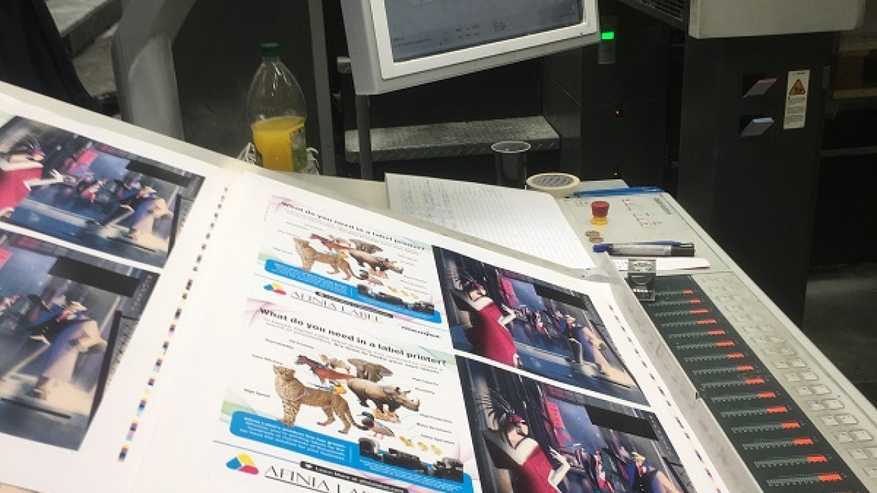
Issue 4 cover celebrates finishing

The front and inside cover of L&L issue 4 – a 1920s Chicago speakeasy theme with resplendent foil and embossing effects – was the result of months of planning and collaboration between various industry parties.
Kurz, who sponsored the project, has supplied foils for previous L&L issue 4 covers – it’s the biggest edition of the magazine every year, with extra copies printed and distributed at Labelexpo Europe or Labelexpo Americas. But this was the first time that the inside front cover was included as well, allowing illustrations on both sides which could relate to each other.
L&L’s publishing director Tim Gordon, after discussions with the magazine’s production team, headed by James Wenman, approached Kurz with the idea of creating a foiled and embossed outdoor illustration on the front cover which could be turned over and relate to a night-time illustration on the inside.
Crucial to making this work was a design that would allow hot stamping on both sides of the same page. Freelance illustrator Marianna Tomiselli accepted the challenge and, with input from L&L designer Ben Walton, created the stunning design. ‘The speakeasy project is one of the most exciting I’ve done this year,’ she says. ‘It was my first time working with foiling and embossing. It was a great challenge to find a way to combine the two illustrations with the same objects reflected in both.
‘I researched the era and used elements such as the neon sign, vintage car and clothes to bring the viewer into the scene. Light is very important to create atmosphere. In this case I wanted to create suspense: something is happening in the yellow light, but you don’t know what it is until you turn the page. Then, the yellow light on the cover is now the main tone of the second illustration. The mood changes completely: you see the same characters with elegant evening wear having fun in the club. I used gold as the main element of the interior to bring out the foiling.’
Along with the L&L team, Kurz – providing the foils and sponsoring the project – played a key role in organizing the different elements. ‘Kurz’s involvement in the cover design was to coordinate the conversations between printer, designer, die maker and publisher and make sure that the appropriate foil formulation and specifications were received by the printer and the die maker,’ says April Lytle, marketing coordinator at Kurz USA. ‘It’s testament to the partnership and passion of all involved that we could take an already stunning artwork and bring it to life with embossing and decoration.’
Foils
Matt Hodgson, area sales manager at Kurz UK, selected the foils: MTS 220 and 428, and Laser Seamless AL-XL. ‘MTS is the Kurz flagship grade and perfect for a job of this manner,’ he explains. ‘The artwork stipulated the need for a versatile foil grade as there was a mixture of fine and larger type allied with some solids that were reversed out. This particular grade has a quick release functional layer which ensures perfect edge definition on even the finest of foiled fonts, no matter the foil application.
‘220 is a soft Yellow Glossy Gold and is extremely popular. 428 is also a soft Yellow tinted Matt Gold Foil and proves an excellent contrast to the glossier 220 shade.
‘Laser Seamless AL/XL is an extremely versatile grade of foil used in all of our holographic foils. Our XL grade will give both excellent edge definition as well as extremely good coverage properties on even the most porous of materials.
‘The rainbow pattern will attract a distinct eye-catching effect from many different angles.’
Dies were created by Germany-based die manufacturer hinderer + mühlich, a member of Kurz Group. ‘To realize the project as designed we produced four dies – one for each of the three foils and one for the registered embossing. The die for registered embossing included a raised flat relief with rounded corners,’ says Heike Martetschläger, marketing and design manager at Hinderer + Mühlich. ‘The challenge in a project for a front cover of a magazine is to get the right balance between the depth of the relief and the fact that the print or foil should not be damaged during transport.
‘Another challenge in this project was the fact that the cover was not only hot stamped from one side. We had to make sure that there was no overlap of the hot stamping on the front and back sides.’
Sascha Dremel, account manager at hinderer + mühlich, continues: ‘We are always happy to be part of a project team where everybody brings expertise in a special area – design, printing, stamping tools, hot stamping, foiling. Working together right from the beginning ensured the optimum result of the finished product.
‘When a cooperation like the one for this cover, across different countries and even continents, works out perfectly as it did, it is very rewarding for us.’
Regular L&L printer Bishops printed the magazine cover, while UK-based Duraseal, a print finishing specialist, took care of the foiling. Duraseal director Matt Bayliss says: ‘The front and inside covers were wet matt laminated in one pass, then we had three passes for foiling, one for each color, and one pass for embossing.’
L&L publishing director Tim Gordon concludes: ‘This was a unique project and we are delighted with the results. It’s the most ambitious and striking L&L issue 4 front cover that we have produced, and we are very grateful to all involved.’
See the front cover here and inside front cover here
Labelexpo Americas 2018 takes place September 25-27 at the Donald E. Stephens Exhibition Center in Rosemont, Illinois
Stay up to date
Subscribe to the free Label News newsletter and receive the latest content every week. We'll never share your email address.


