Beer and spirits: crafting a winning strategy
Entering the highly competitive craft beer and spirit market can be difficult for a new brand looking to make its mark. How can these brands craft a winning strategy to stand shoulder-to-shoulder with the big-league players? Akanksha Meena reports
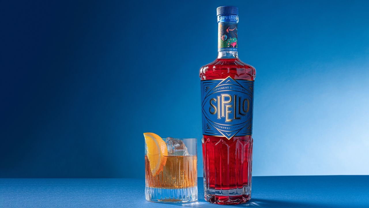
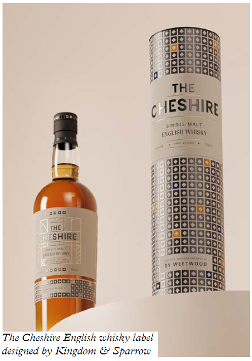
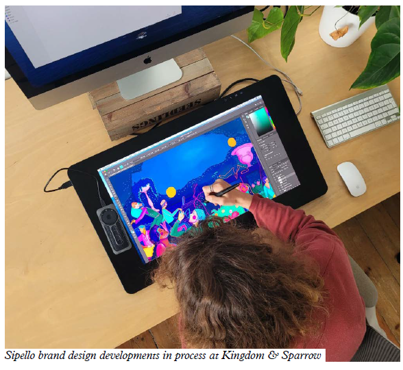
Sipello label designed by Kingdom & Sparrow
In the world of beer and spirits, competition is fierce as startups emerge to challenge the longstanding legacy brands. These new players enter the market intending to disrupt the status quo. But how can they stand shoulder-to-shoulder against the big-league players?
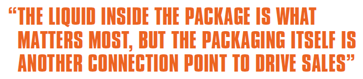
‘The craft beer industry has become so large that it is getting harder and harder to stand out against your competitors. The liquid inside the package is what matters most, but the packaging itself is another connection point to drive sales. If you can create a premium, intriguing design that connects with your audience, you may have a long-term customer base,’ says Vanita Marzette, senior product manager, wine and spirits, at Avery Dennison.
Understanding the brand and having clarity on how it should come to life is crucial. Deciding whether they want a smooth label or a tactile feel can get the ball rolling. Then comes decisions on colors and print methods, all of which will come into play when selecting material.
CHOOSING THE RIGHT BASE
Using the correct material is key, as longevity, adhesive, shelf life, moisture protection and water resistance are all factors that can adversely impact the product.
Frank Alexander, senior vice president of global sales at All4Labels, says: ‘In such a competitive market as the traditional world of beer labeling, a fundamental driver to stand out on the shelf and differentiate from competitors is to have a disruptive look and feel. Traditional wet glue labels are being replaced by pressure-sensitive labels or sleeves due to the various capabilities of embellishment options and the superior appearance.’
The traditional world of beer labeling often prefers wet glue labels, which are highly cost-effective, particularly on high-volume, long-run jobs. On the other hand, a label with more decoration is more likely to stand out on crowded shelves.
‘A concrete and effective alternative [to wet glue labels] can be pressure-sensitive labels, which offer better adhesive properties and more decoration options on reverse-printed mirror solutions, with metallic effects available in graduations. The opportunities of customization and embellishment are uncountable and can also include tactile effects for an outstanding look and feel,’ Alexandar says.
Using a UV coating can improve the finish on the label and provide long-lasting protection to the print. For example, a product labeled then stored in a cold room or freezer environment, versus a product stored in an ambient temperature will require a different material and finish. Additionally, adding a laminate or coating to the label not only adds an attractive matte or gloss finish but also offers protection for the label against moisture, condensation or scuffing.
SIMPLIFYING DESIGN
The experts at UK beer label specialist AA Labels suggest clearly conveying the key strengths of the product on the label if looking to go toe-to-toe with the best in the business.
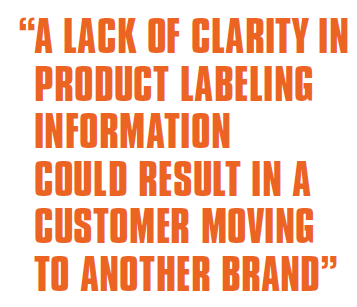
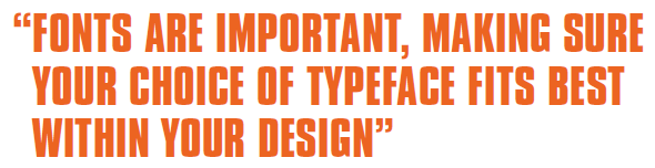
‘A lack of clarity in product labeling information could result in a customer moving to another brand. Fonts are important, making sure your choice of typeface fits best within your design,’ says Shoaib Akram, operations manager at AA Labels.
Colors, imagery and typography play a crucial role in label design and can create a unique brand identity. Colors elicit specific emotions and can drive decision-making. Therefore, using the same colors across logos, websites, storefronts, in-store design, staff uniforms, packaging and advertisements can strengthen brand recognition and awareness. Font choices often set the tone for the whole design and can influence viewers’ feelings toward and interactions with the design. Images are highly effective communication tools and can help create a connection with the text and clarify the information presented.
Embellishments such as foiling or embossing can help highlight particular parts of the label.
Kieron Weedon, managing director at UK agency Kingdom & Sparrow adds that consumer behavior is an important factor to consider in design. When consumers buy something new, it’s mostly an instinctive decision. They’re drawn to the label or packaging, and it elicits an emotional response. The functional story comes later for them. Putting too much information on a label isn’t necessarily the right thing to do as a brand.
Alexander also recommends sticking to two keywords – simplify and optimize, he says – to create a knockout design. A clean and simple design can be just as effective as a complex one while being more cost-effective to produce. Another tip could be to optimize label size to maximize the printing run and reduce material waste.
Cost-effective short runs can be produced using digital printing, which allows brands to print labels on demand and in smaller quantities. Digital also enables printing special editions, or one-off campaigns.
Storytelling is an integral part of design. Johnny Paton, creative director and founder of Kingdom and Sparrow, says the story to be told through a brand’s packaging depends on the brand itself. Some brands require more complex storytelling, particularly within the craft beer category. For instance, a brewery may have an overarching story that extends across its entire brand, with individual characters featured on each beer’s packaging. Conversely, other breweries produce a lot of products and require each beer to have its unique name and story. In these cases, the story may come from the brewery team’s experiences or anecdotes, which we then translate into visually compelling designs that align with their vision.
Weedon adds that craft beer and spirits have traditionally focused on the manufacturing process - the ingredients, hops, aging and casks used. However, with so many craft beers now available, these stories can become muddled and difficult to differentiate.
‘To stand out, we strive to move beyond process stories and instead create an experiential connection with consumers,’ he says. ‘This could involve developing a memorable character or mascot or sharing surprising stories about the founder or of the product itself. By focusing on emotional ties rather than process, we aim to create something distinct and different in a crowded market.’
More brands are also focusing on interactive labels. Elements such as QR codes can add an extra layer of information and engagement to the label. Weedon says that it’s crucial to have discussions with beer and spirit manufacturers about the value of QR codes. Often, there’s a misunderstanding of the effort required to ensure that the QR code leads to an engaging and compelling experience. Some may view the QR code as a mere checkbox for interactivity without realizing that it’s only the beginning of the customer’s journey. Generating content or experiences that enhance the consumer’s interest often requires additional resources. Therefore, it’s vital to ensure that the QR code adds value to the consumer, rather than being a gimmick for brands looking to incorporate interactivity.
Paton emphasizes the value of staying up to date with the latest technology to be aware of what is possible and achievable.
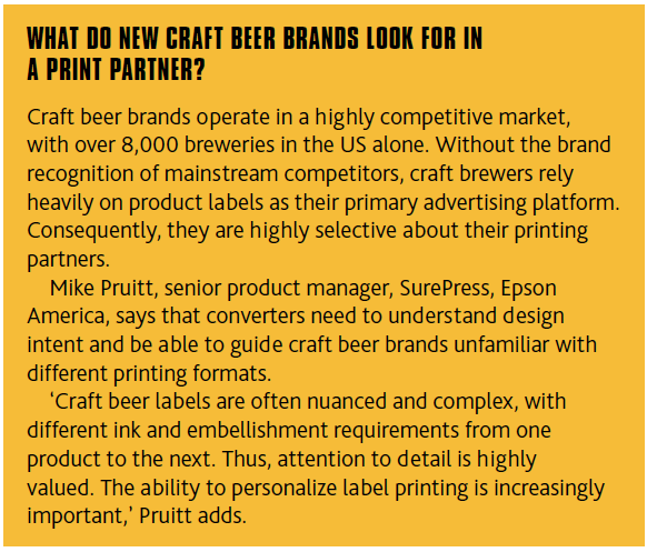
New-age alcohol brands, especially craft beer manufacturers are coming out with very eye-catching designs, but they are at the risk of missing out on legal requirements, says Ashu Bhargav, an associate at legal advising firm Chandhiok & Mahajan.
‘Enforcement of labeling laws is quite aggressive in India and, therefore, focusing on the design of labels at the cost of space for mandatory declarations on the bottles (or cans) can become a problem for new entrants. While all products retailed in India must comply with the provisions of legal metrology laws, alcoholic beverages must adhere to additional requirements concerning warnings and alcohol content in a specific manner.’
Established players in the sector are now well-versed with the requirements but novel brands suffer penalties and seizure of inventory for the most trivial of non-compliances. Lack of legal awareness is a major factor there.
‘With the high level of creativity in the labels I have been seeing in the market lately, I must say that it is now becoming increasingly crucial for both legal and design teams to work alongside to achieve their goals,’ Bhargav adds.
AVOID ROOKIE MISTAKES
There are some basic dos and don’t when it comes to beer and spirits label design. Firstly, do not pack too much information. ‘Including too much detail on a small sticker will make it hard to read and detract from the overall design, diluting your brand,’ Akram says.
Try not to stray too far from the brand personality or color scheme. ‘Using custom illustration is a great way to share fun and engaging aspects of your brand’s personality, but make sure your label design and colors coordinate with your brand and enhance your message,’ he says.
Another mistake to avoid is not considering the labeling needs for its useful life. Consider the wet strength, for instance.
Alexander explains that beer bottles are often exposed to different temperatures – especially cold – and therefore, the labels not only have to withstand these temperature fluctuations and the resulting condensation, but they must also not peel off and crease when exposed to these conditions. Likewise, as the labeled bottles come into contact with one another on the conveyor belt and also on transport in a box or a pack, labels should have good abrasion resistance.
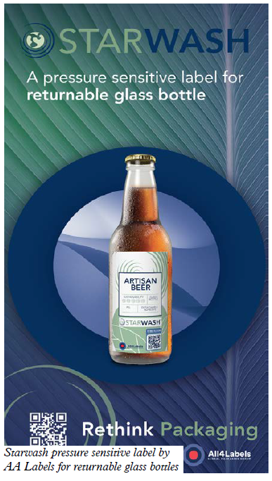
Wet glue and PS labels destined for returnable container deposit schemes or recycling need a wash-off glue solution. Pressure-sensitive labels require a special accelerating processing material, to avoid any negative effects on the process. However, in general, it is good to use nonbleeding inks not contaminating the recycling stream.
Additionally, if a durable label is required, the labels must have good alkali resistance, Alexander recommends.
‘At All4Labels, we stand alongside our customers along the whole design development process. All4Graphics, our packaging design unit, integrates innovation, creativity, design and prepress processes with the most modern workflows, from the pilot validation phase through to product realization.’
PLAY THE LONG GAME WITH SUSTAINABLE LABELS
New craft beer and spirit brands can effectively communicate
their commitment to sustainability through labeling. This can include information on reducing emissions, providing eco-friendly packaging, using renewable energy, recycling, production efficiencies, enabling the availability of clean water, or any number of other sustainable practices that will impact the planet positively.
Sustainability can be reflected in the use of recycled materials in packaging decoration. In the beer market, wash-off labeling technology is crucial to enhance the circularity of glass bottles, Alexander says.
All4Labels promotes its own Star range of sustainable materials.
Marzette adds that consumers are now demanding sustainability: ‘We have seen more of our recycled films, hemp and barley papers used to enhance a brand’s identity.’
STAYING ABREAST OF DESIGN TRENDS
Akram highlights key design trends for new brands, such as playing with typography. While choosing a new font can be fun, don’t forget about function, he says.
‘If you sell your products online, most of your potential customers will be viewing your products through small mobile screens where real estate is cramped and fine details get lost. Large, clean fonts and concise messaging speak more loudly online,’ Akram says.
New-age brands are giving their customers a break from sensory overload by choosing soothing, muted color palettes. Pillowy pastels, rustic earth tones, and wispy watercolors abound in 2023 label designs.
Metallic accents can be added to the label design such as metal foils, metallic ink, and even actual metal pieces (such as metal plates or wires). One of AA Labels’ designers says, ‘If you use gold, especially metallic gold, against black, that creates a nice elegance with a lot of shelf appeal.’
One way to differentiate your brand is with an unconventional label shape, which can be achieved with custom die cutting.
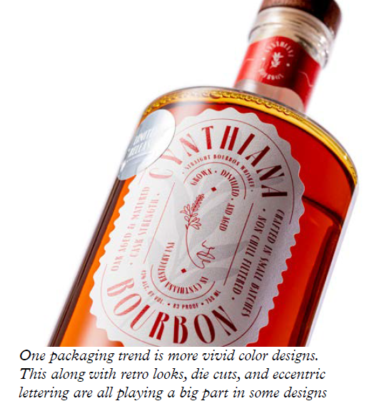
Marzette adds: ‘Some premium beverage trends that have made their way to craft beer and elevate the industry, are the use of tactile varnishes. This attention to detail brings another level of premiumization. Also, the use of a die-cut label allows the brewery to catch the consumer’s attention.
‘We are seeing more vivid color designs, retro looks, die cuts, eccentric lettering and irreverent characters playing a big part in some of the designs,’ he continues. ‘These trending designs are helping craft beers and beverages stand out and attract the younger consumer market.’
Avery Dennison has a business development resources and prototyping team to help brands learn more about materials and see their branding on different stocks.
Alexander agrees that in general, the main aim is to include special and premium effects to get a disruptive appeal and win the shelf challenge. Examples include: creating graduated metallic mirror effects on reverse-printed labels, which simulates reflected natural light; photochromic inks which change color when exposed to sunlight; thermochromic inks change colors in different temperatures; or labels that light-up or glow-in-the-dark inks for a fun user experience.
More craft beer brands are making use of social media and gaming platforms as promotional tools, as well as incorporating more interactive consumer journeys, breaking the barrier between the physical and digital experience.
‘Alongside that, we have been seeing a rising request for customization and more individualization,’ Alexander says.
TESTING THE WATERS
Akram suggests testing the waters before a full-scale launch of a new product. ‘It will help you reduce the risk behind full-scale production and supply of the products. The basic steps which should be taken before launch include checking competitors’ labels, avoid seasonal labeling (initially), and create your own creative color pallets and branding.’
Weedon adds that in the case of craft beers and spirits, feedback from bars and retailers is often more valuable than from consumers because of their deep understanding of the space. For example, for a spirits brand, ensuring that the bottle is easy to use and the label is easily recognizable from a distance is crucial for bartenders when making cocktails. Understanding how the product will be merchandised in the retail space can also be highly valuable.
Established legacy brands are increasingly being challenged by new players looking to make their mark. By investing in thoughtful, eye-catching label design, new brands can score big with consumers and establish themselves as serious contenders in the game.
Stay up to date
Subscribe to the free Label News newsletter and receive the latest content every week. We'll never share your email address.