Emotional power of labels
A tequila packaging neuromarketing study by UPM, Kurz and Eurostampa examines how labels emotionally influence consumers and shape perceptions of product value.
UPM Adhesive Materials, Kurz and global label manufacturer Eurostampa together conducted a neuromarketing study exploring how tequila label design influences consumer perception and purchase behavior. The study reframes the label as
a strategic brand asset, moving beyond its technical role to become a key driver of consumer engagement and brand value.
Conducted by SenseCatch in collaboration with UPM, Kurz and Eurostampa, the study examines how label materials, finishes and embellishments shape consumer behavior from shelf impact to perceived product quality.
‘Labels are an essential part of our packaging. They are the silent sellers of our products,’ says Florencia Daroni, packaging solutions manager for wines and spirits Latin America at UPM Adhesive Materials. ‘Design is an art form, a way for designers to express ideas and concepts through creativity. At first glance, we can subjectively decide whether a label’s design appeals to us or reflects the product’s concept.
‘But the real question is: Is the label truly effective in capturing the consumer’s attention and convincing them to buy? This study aims to answer that question and identify which elements can make a label more persuasive.’
Is the label truly effective in capturing the consumer’s attention and convincing them to buy? This study aims to answer that question and identify which elements can make a label more persuasive
In the past, UPM has conducted neuromarketing studies on labels and packaging for white wine, red wine and gin. This time, the focus was on one of the spirits with the strongest character and identity, tequila. Despite its tradition, tequila stands out for its innovative designs, offering a wide range of creative possibilities to experiment with design resources. To achieve this, UPM partnered with leading companies to combine expertise and resources to evaluate every aspect of label design. Kurz contributed its range of finishes and decoration embellishments. Eurostampa used its label printing and converting technology to create stunning labels. UPM provided a wide variety of label materials. Saverglass provided bottles, and closures were from Amorim Top Series.
This study delivers actionable insights for producers, designers and stakeholders across the value chain.
The study
The study was conducted in Texas, one of the largest regions for tequila consumption globally, to ensure authentic consumer reactions and behavioral data. Using a fictional tequila brand and 27 unique packaging designs, the research simulates real-world buying conditions and tracks visual attention, emotional engagement and implicit perceptions.
Neuromarketing specialists SenseCatch conducted the research. The team used advanced tools, including the eye tracker, brain tracker and bio tracker, to gain deeper insights into consumer decision-making. Through these methods, they were able to objectively identify which different aspects of the label lead consumers to choose one product over another.
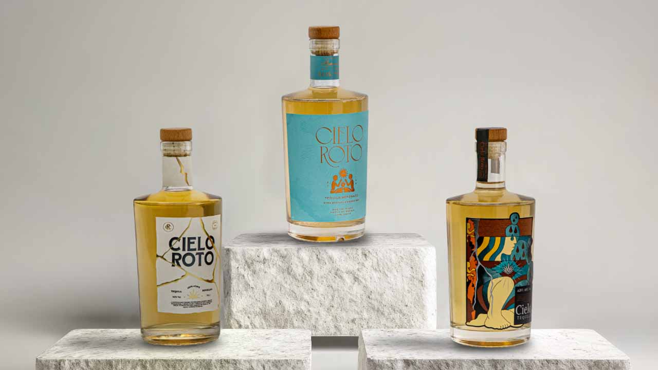
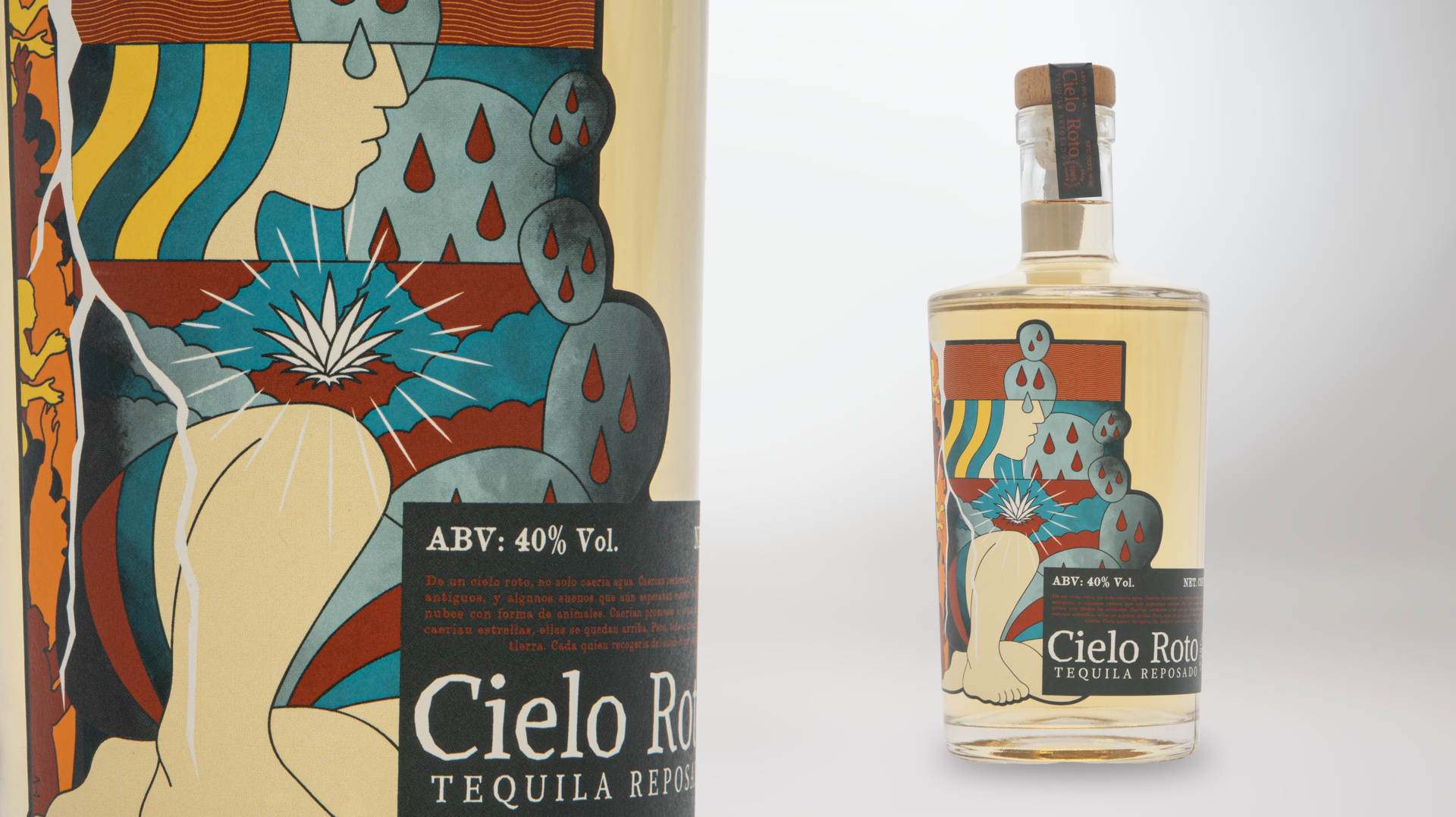
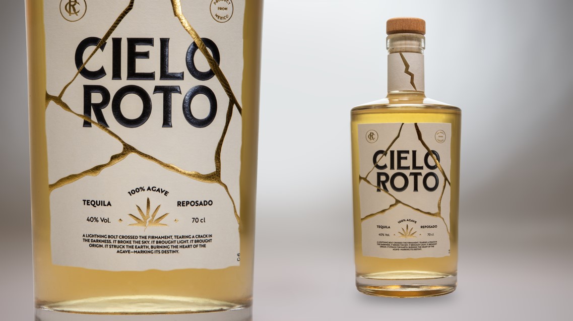
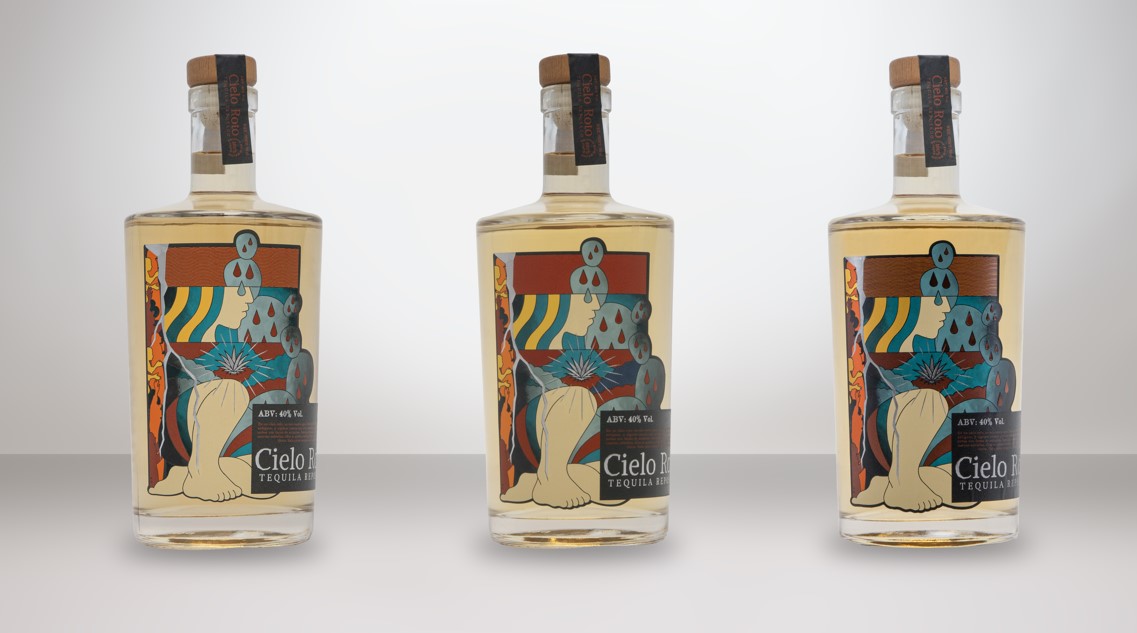
Three design studios, Hi! Studio and Estudio Albino from Mexico, and Denomination from Australia, developed a label with creative freedom, based on a brief UPM created for a fictional brand Cielo Roto.
‘We asked each studio to design three different styles: one highly detailed, one moderately detailed and one minimalist. Then, with guidance from experts at Kurz, Eurostampa and UPM, we combined embellishments, printing techniques and label materials to produce nine finished labels for each design. And when I say different, we truly witnessed how the same design could come to life in completely unique ways with each combination,’ Daroni says.
Based on a tequila market study, the team selected the location and the type of consumers to participate. The study was conducted in Dallas with a representative sample of 30 non-expert tequila consumers, balanced 50 percent between men and women, and 50 percent Hispanic. To conduct the evaluation, the team recreated a store shelf with these samples in a controlled environment to minimize the influence of other variables on the measurements.
Moment of truth
This study marks a significant step forward in understanding the emotional and sensory power of packaging and how the label, once a technical detail, is now a central driver of consumer connection and brand success.
‘At the first moment of truth, when the consumer chooses the product from the shelf, the most eye-catching labels share three key characteristics. Metallic paperless materials with spot gloss or foils. Layered richness and overlapping embellishments. Tactile appeal such as embossing, engraving and textured varnish,’ Daroni explains.
This study confirms that the material on which a label is printed is much more than a technical choice; it is a sensory and strategic decision.
Consumers tasted the same tequila packaged with different labels, yet the tequila associated with the most preferred labels was perceived as smoother, more balanced and with a better aroma
The study also uncovered a surprising result: premium papers and finishes performed exceptionally well, even when bottles were placed away from the central shelf position. Shiny and tactile enhancements quickly drew the consumers’ attention, proving that design quality can outweigh where the product is placed on the shelf. This means that investing in high-impact materials allows brands, especially challengers, to stand out without relying on prime shelf space. Haptic finishes play a significant role in shaping consumer perception and behavior. Touch adds emotional impact to the experience.
‘At the second moment of truth, when the consumer physically
interacts with the bottle, there is a natural gesture of touching the label,’ Daroni explains. ‘This tactile interaction creates sensory reinforcement, which strengthens emotional engagement and builds a sense of quality and authenticity. As a result, consumers are more likely to develop a positive impression of the product, increasing purchase intent and brand loyalty.’
Consumers were influenced primarily at a subconscious level. Neuromarketing tools allowed UPM to identify which label elements attract subconscious attention. Interestingly, the impact extended to the tasting experience as well. Consumers tasted the same tequila packaged with different labels, yet the tequila associated with the most preferred labels was perceived as smoother, more balanced and with a better aroma.
From texture to finish, the label’s appearance plays a vital role in how consumers perceive tequila and assign value to the brand.
‘This study offers spirits producers and packaging professionals valuable insights to guide label material selection, helping them create stronger shelf presence, emotional resonance and lasting brand loyalty,’ says Daroni.
‘Material, texture and embellishment aren’t merely design choices; they’re powerful triggers of perception, emotion and value that directly influence the consumer’s final purchase decision. In the world of spirits, like tequila, the label can turn a product into a story and a shelf into a stage. Packaging becomes storytelling.
Backed by neuromarketing data, this research confirms what we stand for: labels become emotions,’ says Priscilla Montilla, marketing manager at Eurostampa.
Allan Quimby, head of marketing at Kurz, adds that the weight and texture of the substrate, the shimmer of metallics, the depth of print effects, and the tactile pull of haptic finishes together shape how consumers perceive quality and authenticity. These elements engage sight and touch to make a brand feel more premium, memorable and desirable, transforming packaging into a powerful sensory brand experience.
Takeaway for brands and designers
The study focused on a premium tequila, Tequila Reposado, and revealed that consumers directly associate investment in label materials and embellishments with the perception of ‘premiumness’.
High-quality paper label materials, textures, foils and print effects signal value and authenticity, which strongly influence purchase decisions in the premium segment.
‘However, it is important to note that for spirits in other segments, brands do not necessarily need to replicate the same level of investment,’ Daroni notes.
‘When designing the perfect tequila label, start by creating a strong shelf impact with label materials that deliver brilliance, like metallic or natural papers with iridescent finishes. Combine visual shine with tactile elements, embossing, debossing, textured
varnishes and textured papers, to engage multiple senses and reinforce authenticity.’
She adds that every choice should reflect the brand story. Metallics evoke luxury and celebration, while natural textures convey authenticity and sustainability. Layering techniques such as foil and varnish add depth and craftsmanship, and placing tactile
details where consumers naturally touch enhances interaction.
Finally, consistency across materials and finishes is essential, turning the label into a sensory identity that ensures a coherent narrative aligned with the product.
Experts at Kurz, Eurostampa and UPM can provide guidance for creative combinations of materials and effects that can capture attention and drive engagement without exceeding budget constraints. The study emphasizes that the priority should be to balance visual impact and tactile appeal with the brand’s positioning and target consumers’ expectations.
Kurz partners with Jägermeister
Leonhard Kurz and Mast-Jägermeister SE, together with label manufacturer Götz + Müller from Berlin, Germany, have developed a recyclable embellishment project for a limited‑edition Jägermeister label that combines iconic design with sustainability.
For the limited-edition label, Kurz supplied its recyclable embellishment technology, which meets modern sustainability standards while maintaining brand impact. The project used Kurz’s shiny gold KPS slim 2.0, which reduces the transfer‑carrier thickness from 12 to 6 microns, conserving resources at the material input stage.
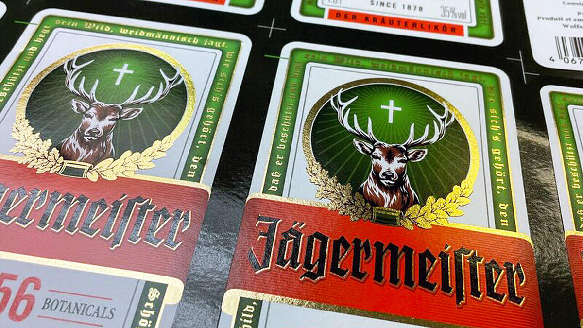
The application was carried out using a resource-saving cold transfer process. The PET carrier residues collected and removed after the finishing process are sustainably recycled using the Recosys recycling system. The resulting Recosys rPET material can then be used in various applications, including textile yarns.
Kurz and Jägermeister developed the project around the principle of ‘design for recycling’, ensuring no compromise in shine, feel, appearance, iconic design, quality, or brand impact, while maintaining a focus on sustainability. The high-quality
finish not only features an ultra-thin transfer carrier but can also be fully integrated into the recycling process.
The collaboration between Kurz, Mast-Jägermeister and Götz + Müller demonstrates what sustainable embellishment can achieve in combining creative design with full recyclability.
The project shows that responsibility and premium quality can coexist in modern packaging design.
Stay up to date
Subscribe to the free Label News newsletter and receive the latest content every week. We'll never share your email address.