Gallivanter Gin’s astute attention to detail
The label’s red, bold typography, complemented by subtle turquoise accents, conveys a sense of excitement and pays homage to the brand's Australian roots
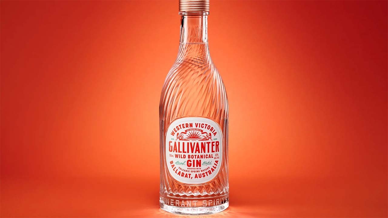
Chad Michael Studio's packaging design for the Gallivanter gin brand exudes a sense of adventure and sophistication.

The bespoke bottle immediately captures the eye with its intricate embossed glass, promising a distinctive experience within. The label’s red, bold typography, complemented by subtle turquoise accents, conveys a sense of excitement and pays homage to the brand's Australian roots. The embossed typography on the bottle's top adds a refined touch, showcasing the attention to detail and craftsmanship that makes Gallivanter's packaging a step above the rest.

Bespoke bottle, closure, brand and package for Itinerant Spirits of Ballarat, Australia. Tailored for the intrepid traveler at heart, this Australian Gin celebrates the adventurous spirit in us all, blending wild botanicals with volcanic spring waters which crafts an unforgettable journey for both the palate and the soul. ‘The Horizon Awaits’.
This article was sourced from the Dieline and is published with permission.
Stay up to date
Subscribe to the free Label News newsletter and receive the latest content every week. We'll never share your email address.
