Parle Agro revamps Appy Fizz label design
Iconic red, white and black brand colors have been juxtaposed in eye-catching, clean, contemporary lettering
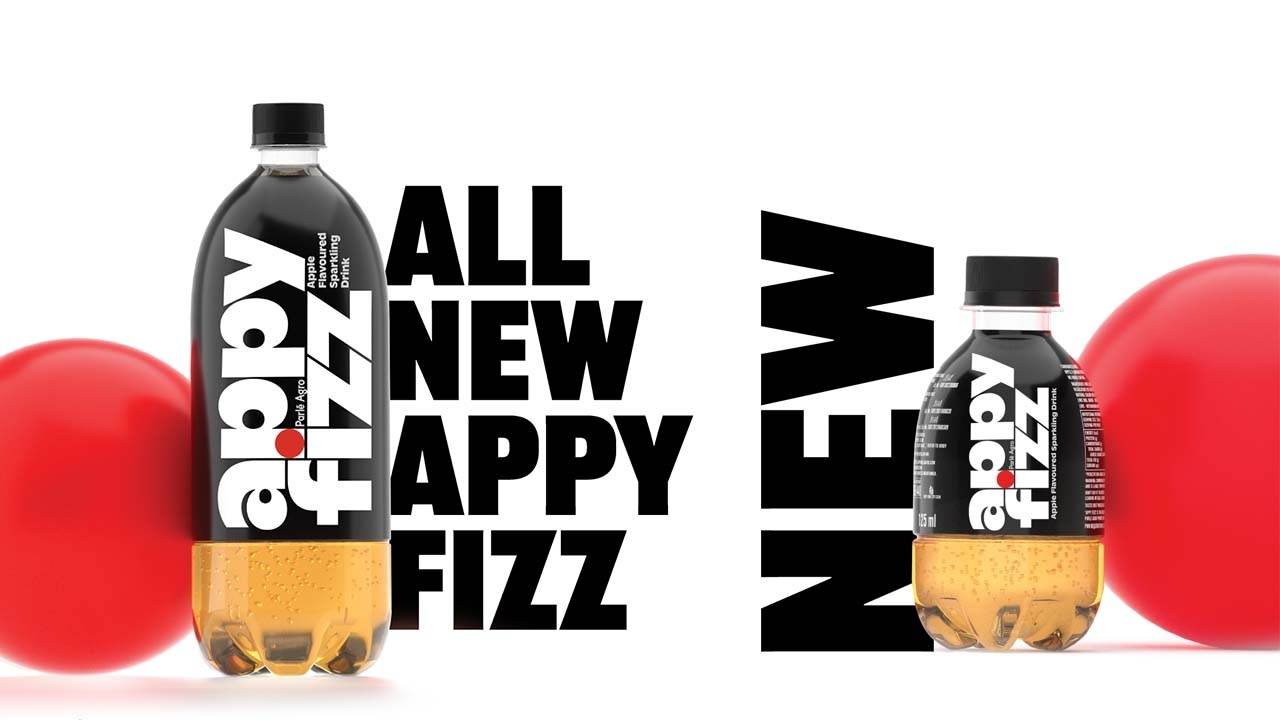
Appy Fizz, sparkling fruit-flavored drink from Parle Agro has revamped its label design for fresh, re-imagined, bolder avatar.
The iconic red, white and black brand colors have been juxtaposed in eye-catching, clean, contemporary lettering for the brand’s logo.
The sparkling fruit-flavored drink has emerged in a new category in the beverage industry. It dominates the category with a 99 percent market share. Touted as a healthier alternative to colas, Appy Fizz continues with its edgy and exuberant campaigns.
Through the brand redesign, Parle Agro aims to celebrate Appy Fizz's quality and bring a disruptive new look to the sparkling fruit-flavored drink category. The brand is looking to further elevate the Appy Fizz experience and maintain its position in the market.
The new packaging has been designed and conceptualized by Pentagram.
Harry Pearce, partner, Pentagram Design, said: ‘The essential idea for the Appy Fizz design was to modernize and to create a more visually arresting identity and bottle shape moving the brand away from the huge number of copycats. We re-addressed the emphasis giving the word “Appy” equal prominence to “Fizz” and employed a distinctive font with custom elements. The design retains the brand equity invested in black, white and red with a nod to the apple in the red dot.’
Stay up to date
Subscribe to the free Label News newsletter and receive the latest content every week. We'll never share your email address.