Sister Mary embraces maximalism in holographic candle label design
The New York based designer blends the artistic tradition of votive candles with Sister Mary's bold perspective, featuring a vibrant holographic label.
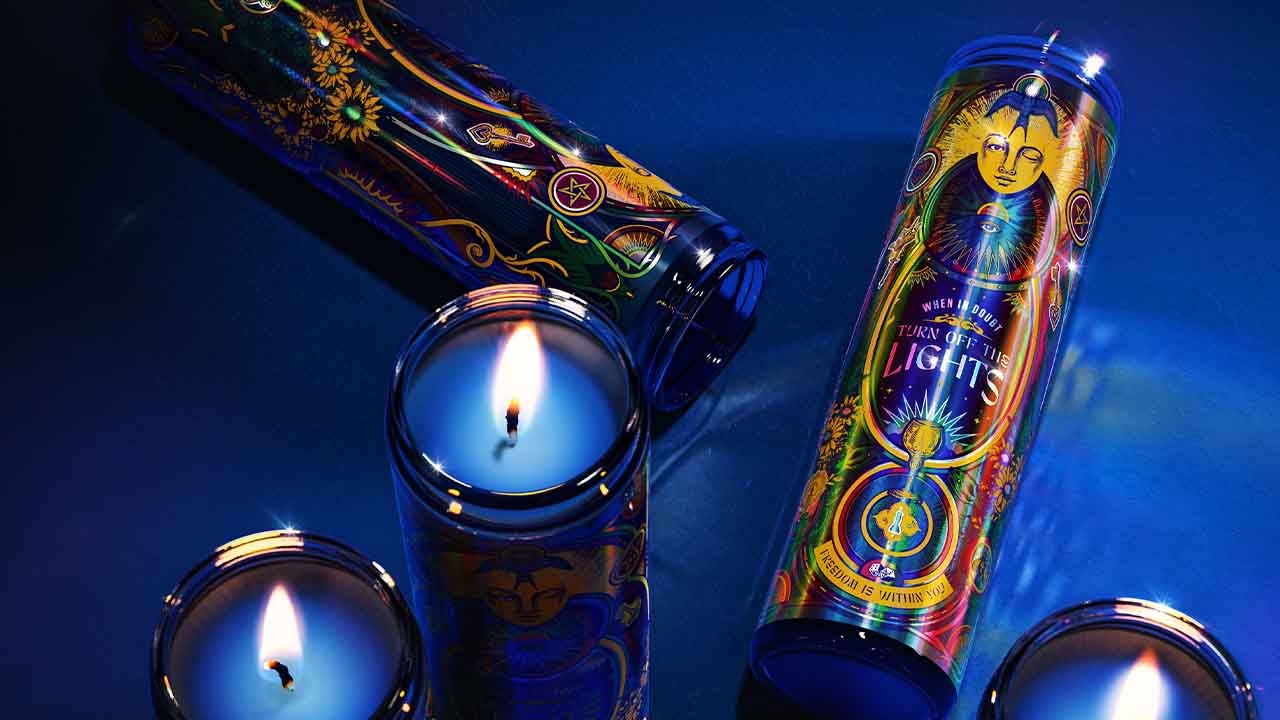
Sister Mary, a new New York based strategic design agency founded by Leigh Chandler, has unveiled the holographic label design for a limited-edition run of intricately designed votive candles to represent her creativity and agency.
Chandler, whose 20 year career has seen her design for major brands including Baileys and Guinness, said: ‘If you’re going to start your own agency, you might as well start off by giving yourself your dream brief. Designing these limited edition Sister Mary candles was the perfect opportunity to engage myself creatively, from day one as an agency owner, and to simultaneously show off what Sister Mary does best: express the beauty of ideas and the power of art.’
The detailed candles, linked to the agency’s namesake Sister Mary Corita Kent, represent Chandler's expertise in transforming brands away from uninspiring packaging. She underlines the importance of conveying powerful ideas through beautiful design.
Chandler got inspired at her local New York bodega filled with diverse prayer candles. She saw creative potential in ordinary objects such as candles, aligning with her brand's cheeky religious motifs. The resulting design blends the artistic tradition of votive candles with Sister Mary's bold perspective, featuring a vibrant holographic label.
Chandler has spent her career helping brands turn their packaging into beautiful objects that convey meaning to their customers. This was her opportunity to create a beautiful object that would honor and elevate her business to peers and ideal clients.
Having chosen candle design, Chandler applied her strategic process and identified a guiding concept for the project: beacon of change. This concept evokes the image of a candle, aligning with the agency's namesake, Sister Mary Corita Kent, an artist and activist, and resonates with Chandler's personal values.
Chandler, who has been outspoken about the inequity women leaders face in the creative industries, explained: ‘Sister Mary is standing for equality in creative ownership of agencies. Our ethos and way of operating is different to other agencies. Our way of working and creative output is disruptive and unique. We wanted this candle to signify that.’
Chandler also wanted the candles to be rich and multi-layered in terms of storytelling. An avid opponent of ‘blanding’, Chandler saw the candle design as an opportunity to show off her maximalist, expressive design style through rich symbolism that told her story while also harkening back to artistic traditions that have always inspired her.
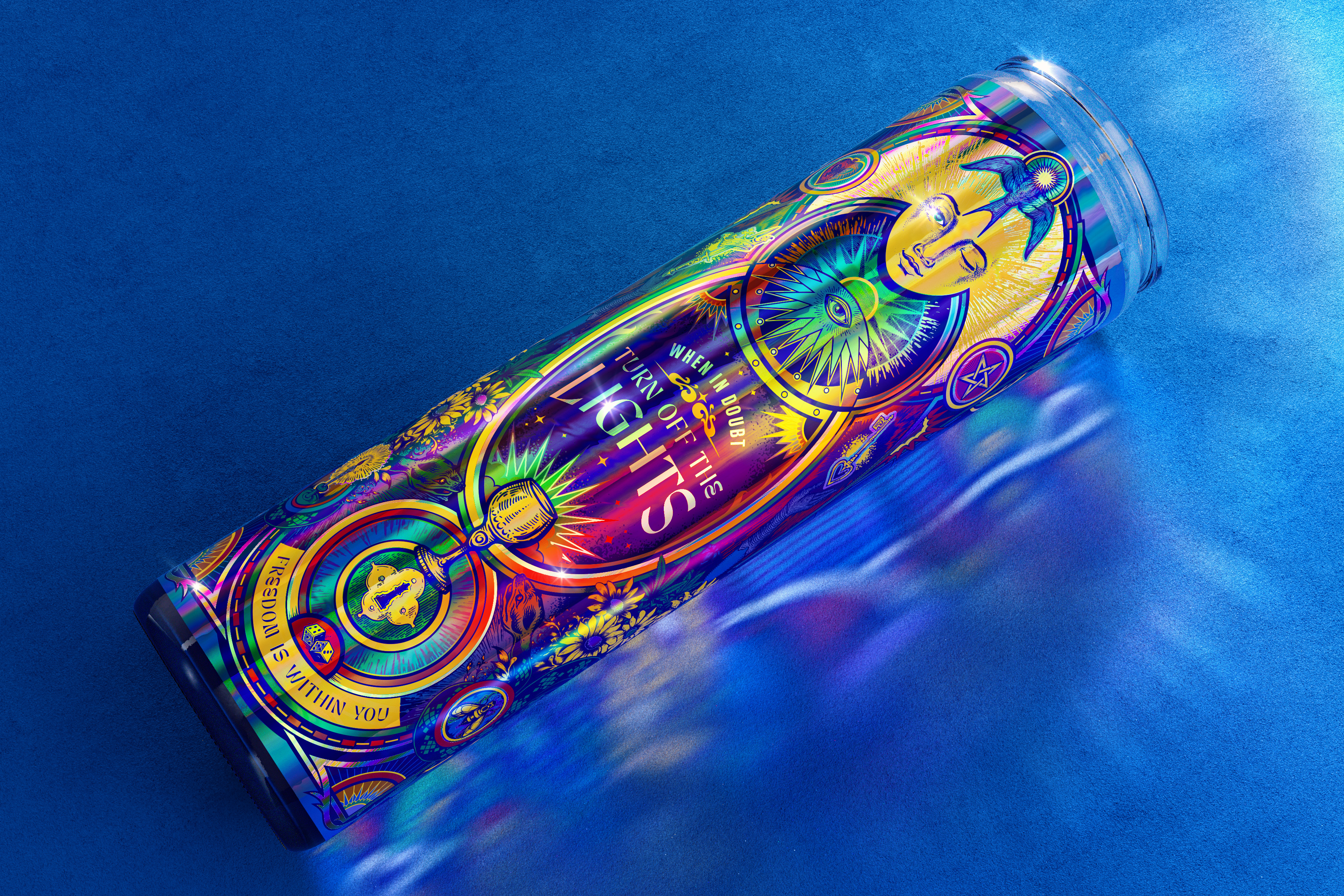
The artwork incorporates Biblical imagery, Tarot symbolism, and some from the broader world of the mystic, as well as the winking nun – one of several homages to Sister Mary Corita Kent.
Another nod to Kent is the text ‘When in doubt turn off the lights’, which comes from language on a wartime poster Kent included in a collage piece. Chandler found her own meaning in the line: ‘I see it as a call to take time to reflect and look inward for inspiration if you ever feel overwhelmed or uninspired.’
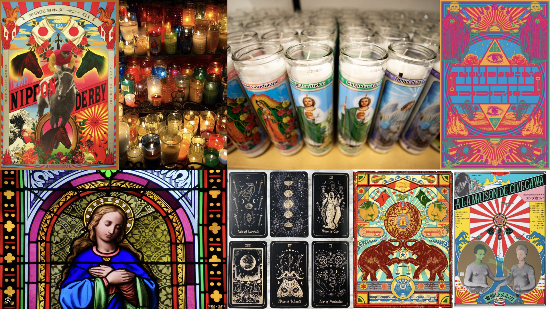
To help bring the rich symbolism to life, Chandler brought illustrator Graham Erwin on board. ‘It was important that we pulled upon recognizable symbols but made sure they all had a playful twist upon closer inspection,’ Erwin said. ‘We were very inspired by collaged imagery from tarot and the occult, but also screen printed poster art and street art to give us the modern energy we needed.’
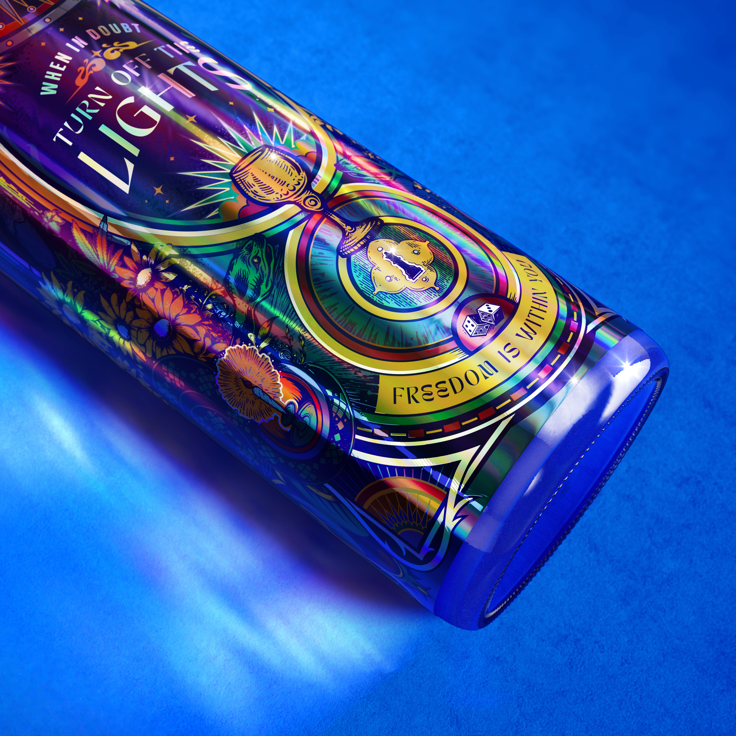
But Chandler and Erwin were keen to create something truly unique that didn’t fall into current trends. As a result, Easter-eggs that are unique and personal to Chandler and Sister Mary abound in the final design: a lit joint disguised as a candle and subtle marijuana leaves climbing up the side of the label are nods to Leigh’s experience designing for cannabis brands and recent stint as a judge for the Cannabis Clio Awards; an occultic Pentacle design represents a tarot reading that Chandler received whilst deciding whether or not to found her agency; and sunflowers, symbols of longevity, represent the kind of lasting relationship Leigh hopes to have with dream clients.
‘I have always tried to instill in people working with me that the world is our oyster,’ says Chandler. ‘We can make anything we can dream up. Let’s go wild, let’s let loose and allow ourselves to stretch. These candles are my way of following my own advice.’
Stay up to date
Subscribe to the free Label News newsletter and receive the latest content every week. We'll never share your email address.
