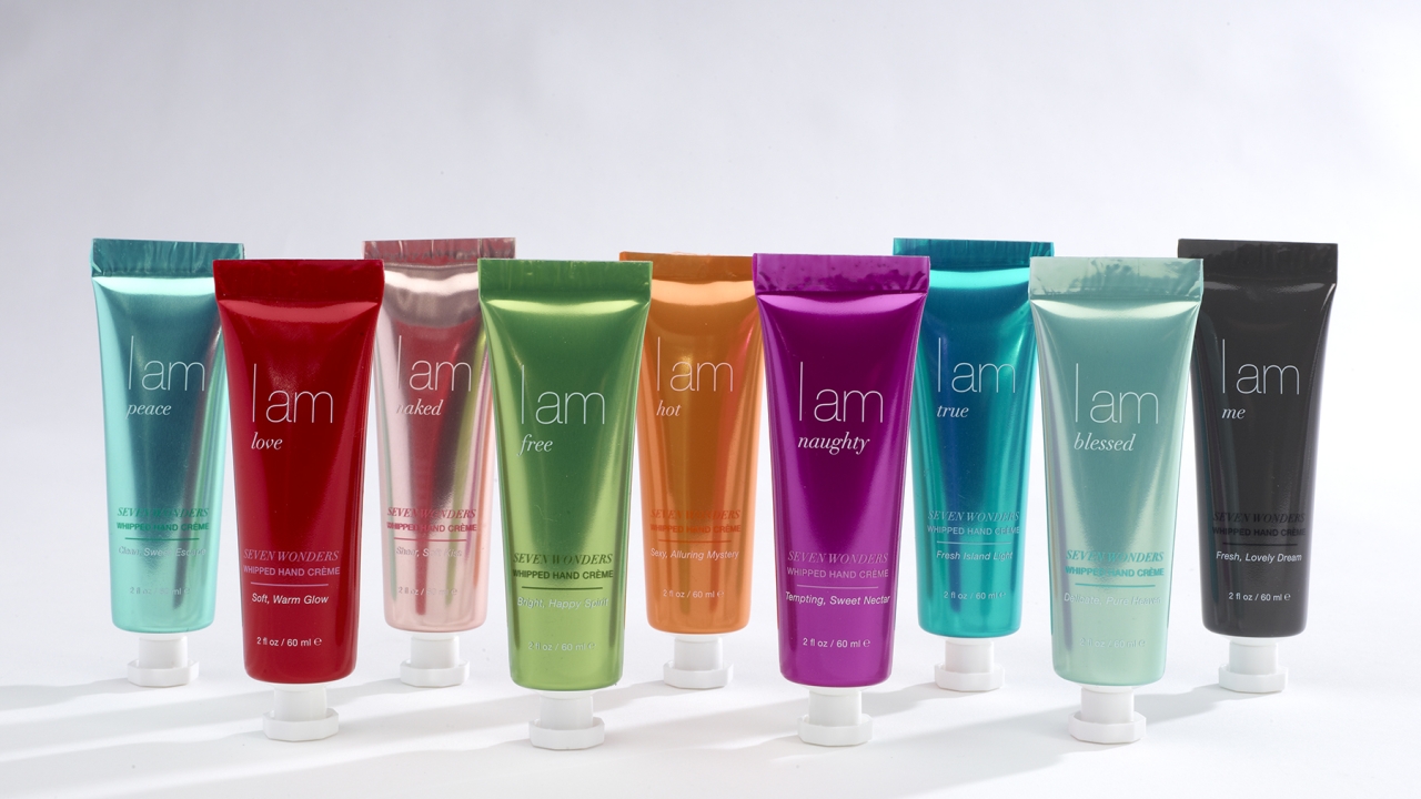
Color key in new cosmetic packaging
World Wide Packaging (WWP) has developed and manufactured unique packaging for a new line of hand creams from cosmetic brand I AM, a manufacturer and supplier of fragranced luxury beauty products.

The I AM whipped hand crème line consists of nine fragrances, with the unique-to-client packaging consisting of a 30mm foil polymer tube with an octagonal cap. Each tube contains 2oz of product.
Color selection for the line’s packaging was conducted by WWP in collaboration with Product 360, I AM’s design partner, to ensure that the colors complemented each whipped hand crème’s name and scent with an appropriate tube hue and tone.
The color schemes for the nine I AM skin crèmes are: vibrant red for I am love, turquoise for I am peace, charcoal grey for I am me, teal for I am true, mint green for I am blessed, hot pink for I am naughty, pale pink for I am naked, neon green for I am free and vibrant orange for I am hot.
WWP provided expertise and support to guarantee the colors were vibrant, with a foil layer in the polymer structure providing a key visual characteristic of the tubes and screen printing used for the text.
‘Determining and perfecting the color matches of each metallic glowing tube was particularly challenging, because each of the nine fragrances is unique yet contained in a set brand,’ said Jim Farley, vice-president of global business development at WWP.
‘For that reason, the colors needed to be dramatically different from one another while still making sense within the uniformity of a branded line. For example, I am true and I am naughty are not only two separate scents but different mindsets entirely – and the packaging for each had to reflect that distinction while still staying true to brand.’
Stay up to date
Subscribe to the free Label News newsletter and receive the latest content every week. We'll never share your email address.

