Packaging – then and now

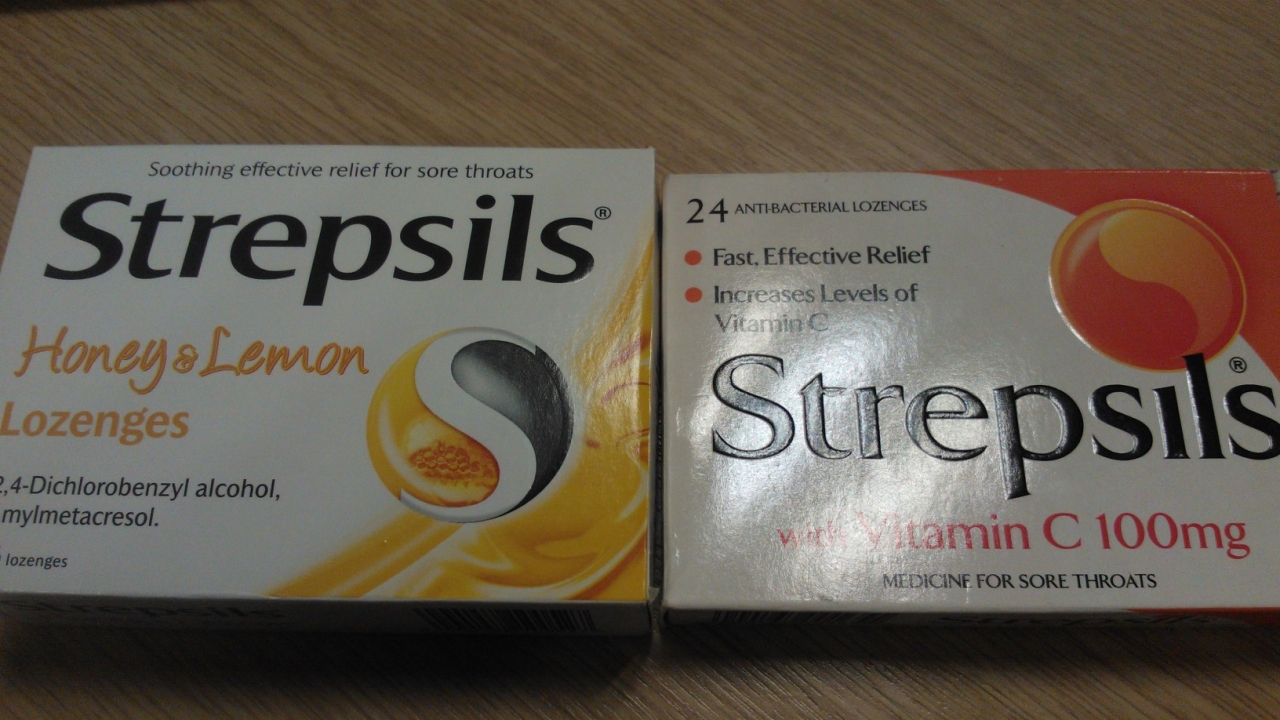
A colleague was rummaging through his desk drawers the other day when he stumbled across an old packet of Strepsils throat lozenges. So old are they that the use by date passed in August 2005 – over seven years ago – so the stricken workmate who needed some cough relief had to go elsewhere, but the packaging found its way onto my desk as an example of a folding carton from the early 21st Century.

The Strepsils packet donated to my desk collection (pictured above, left) actually pre-dates the iPad, or any modern tablet computer for that matter, as well as the very first iPhone and the Android operating system. In fact, the top-selling mobile phone of 2005 was the Nokia 1110, a 2G device that shifted 150 million units worldwide. Nokia dominated the list of the top selling mobile phones in 2005, with a few interjections from Motorola and Sony Ericsson.
It’s fair to say that none of these companies would feature in the top selling devices sold today, with Apple, Samsung and a raft of other manufacturers sweeping in to take advantage of the demand for mobile connectivity.
Changes in the printed packaging market might not be so widely reported, nor so evidential, but I was intrigued to know what the differences are between the packaging then and that which you can buy today.
So buy some 2012 Strepsils I did, and I’m pleased to see that there have been some key developments in the packaging.

The main physical difference to the packaging is the addition of Braille lettering on the back panel. This is a valuable addition to any modern packaging and in accordance with EU Directives and amendments brought in since the older packet was produced.
The use by date is also presented in a clearer way, with the older carton having the date simply impressed into the carton material, while the modern version has it printed in a larger point size in white text on a red background.

 Other changes include a new-look “S” logo on the front (pictured right, on the right), supported by decoration with a more “fluid” appearance, and rewording of the instructions for use, warnings, storage instructions and contact details.
Both cartons have the brand, “Strepsils”, embossed, with the lettering of the older carton feeling taller than on the modern carton, while the older carton appears to have a glossier finish compared to the matte-looking version from the second decade of the 21st Century.
The basic shape of the carton has not changed however, as you’d expect in this case, nor has the opening mechanism.
In fact, it’s pleasing to be able to say that the older carton has stood the test of time well and that the structure, material and print quality remain perfectly serviceable.
Although it has spent much of its life sat in a drawer, it’s good to see that the cartons we all see on a daily basis, and regularly buy, have the capacity to perform as intended long after the product inside has exceeded its useful life.
If you find any old examples of packaging dating back to previous decades, I’d be keen to see those and find out how they compare to today’s versions.
Drop an email to editor@packprintworld.com if you do have any to share.
Stay up to date
Subscribe to the free Label News newsletter and receive the latest content every week. We'll never share your email address.


