Drupa 2028 unveils new brand identity
Print trade fair adopts an octopus as its symbol of networked printing.
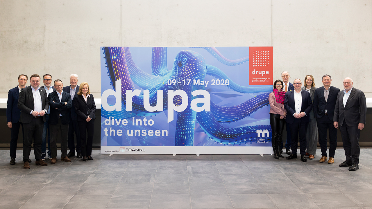
Drupa 2028 has launched a new brand identity two years ahead of the trade fair, centering on the octopus as a key visual to represent networking, intelligence, agility and the mastery of complex, integrated print processes.
The rebrand is accompanied by a new slogan, 'drupa. dive into the unseen', reflecting the fair's aim to present technological innovations within the broader context of markets, applications and value chains rather than as isolated products.
For the first time, Drupa 2028 will introduce an experience architecture that bundles content, applications and formats for exchange along clearly defined thematic clusters, providing a shared framework for exhibitors, visitors and media.
'Drupa 2028 will be a Drupa like never before,' said Dr Andreas Pleßke, chairman of the Drupa Committee. 'We are setting new standards in how technological developments, applications and markets are classified and brought together.'
'The slogan sums up what Drupa stands for: vision, knowledge transfer and orientation in an increasingly complex technological landscape,' added Sabine Geldermann, director Drupa, Portfolio Print Technologies at Messe Düsseldorf. 'It underscores Drupa's claim of not presenting future topics and technological progress in isolation, but classifying them in the context of the market, application and value creation.'
Drupa 2028 is scheduled to take place in Düsseldorf, Germany.
Stay up to date
Subscribe to the free Label News newsletter and receive the latest content every week. We'll never share your email address.
