Seeing through touch

‘Only a handful of beauty brands have invested in packaging that’s accessible for the visually impaired,’ according to Vogue Business. One brand that invested early on is L’Occitane. As Vogue Business detailed, the founder of L’Occitane noticed a blind customer in a store feeling the bottles in an attempt to get familiar with the product in the 1990s. As a result, the company started incorporating braille into its packaging in 1997. While the majority of the brand’s products now feature braille, its progress has not come without struggles: around 30 percent of the brand’s products still do not feature braille due to technical constraints. According to Vogue Business, ‘The brand has found it particularly challenging to include such lettering on smaller products like soaps and tubes.’ L’Occitane is justified in this struggle: designing for touch, rather than sight, is a new and challenging avenue of inclusivity. Packaging for the visually impaired must overcome two challenges: design and application.
Design considerations
Designing packaging that is meant to be touched as well as seen presents unique challenges. Brand strategist and L&L columnist Vicki Strull explains some of the elements that must be considered. ‘The intent of sensory marketing on packaging is to engage and connect with customers at the retail shelf. What we’re really talking about is haptics and texture, but it’s a poignant technique to engage and assist the audience we’re talking about, the visually impaired. I work with a variety of food brands, including a premium dried-fruits brand. If we were designing for the visually impaired, we might include packaging and pouches that have a different texture for each product – cherries, apricots, plums, figs, raisins, cranberries and so on. The design would be engaging for any shopper, but would specifically alert someone who is visually impaired as to the product differences.
“Packaging for the visually impaired must overcome two challenges: design and application”
‘I think it’s important to note that when you take into consideration a specific audience – in this case, the visually impaired – your design shouldn’t detract from the experience of your broader audience. Rather, the design is an addition to ensure you’re meeting the needs of a specific audience, i.e. it’s inclusive. We're actually adding a layer of communication that can also dual purpose as engagement for our sighted community, and we’re using haptics to do that.’
Designing for inclusivity can have a payoff for brand engagement, according to Strull: ‘From what I see with brands that are focusing on inclusion and specific audiences, when you do include design that supports their needs, that audience, that community, is appreciative. They hear about it, they share it with their fellow communities, so brands actually get a very niche targeted audience talking about their product because they’ve identified needs and supported those needs in their packaging design.’
In terms of considerations printers and packaging designers need to account for with packaging for the visually impaired, Strull says: ‘You need high contrast, you need large fonts, you need a lot of haptics. We’re designing for the sense of touch, and that starts with the substrate.’
‘Then you go into different textures,’ she continues. ‘You might include some tactile finishing, some spot gloss, maybe some matte or soft touch. It could be overall or spot, depending on the intention of the label and what it is communicating about the brand and to the shopper. Because we’re talking about different finishing techniques, converters have lots of options conventionally and now they are easily executed digitally, using Scodix or MGI. Once digital finishing is involved, then the possibilities are endless, down to personalizing, making each one different, and other versions.
“Packaging with tactile elements, whether braille or tactile symbols, can cater to a new audience and expand marketability”
‘As a brand, you’re always listening to your audience (or you should be). When you understand how a package can assist them, engage them, and provide information, then you can create a package that is not just inclusive, it creates a memory, a perception, a sale and even a 5-star review.’ 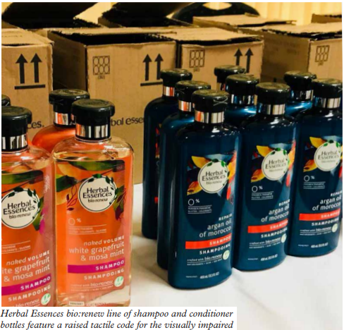
Application considerations
As in any language, ensuring correct spelling is essential, especially for medical packaging. Adding an extra space or an extra dot could change the meaning of the word, or the dosage information on medicine. To take precautions against this, printers may need to invest in new quality control equipment.
Manage Artworks details several considerations converters need to take into account including that dots are not universal across all braille languages, the diameters of the dots and offsets need to be clear when touched, and printers should expect longer set-up times for projects with braille. All of those factors can increase costs for a project by anywhere from 5-25 percent for converters, according to Manage Artworks.
Additionally, where and how the packaging will be used matters with braille packaging. One blind shopper told Food Navigator that braille should be embossed into packaging so it is more durable. She explained: ‘If you put sticky labels on things, then put them in the freezer, they can disintegrate eventually.’ Converters will want to ensure that the braille on packaging is just as legible and durable as any other product information.
Braille Ale
While adding braille is an additional step in the design and production process, some companies have found it to be more than worth the effort. Last year Kentucky-based converter Steinhauser partnered with West Side Brewery and the Cincinnati Association for the Blind and Visually Impaired (CABVI) to print a specialty beer label named the Braille Ale. This Braille Ale label recently won best of category in the Graphic Media Alliance 2021 Print Excellent Awards for the flexographic printing category.
‘The printing on our flexographic press wasn't going to be an issue, as it is all line work. The real concern was the braille itself,’ says Erin Dickman, senior account executive. ‘We confirmed with our local screen manufacturer that we would need a special tactile screen to get the braille to register as readable.’
“Your design shouldn’t detract from the experience of your broader audience”
She explains that they needed more height on the dots, and it was a challenge to find a supplier of the correct screen. ‘We kept searching through our suppliers and finally found the screen we needed, but it had to come from Europe, which was a big issue due to the pandemic.’ As this project started at the beginning of the pandemic, Steinhauser had to wait months for the screen.
After the shipment delays, the screen was installed and the Steinhauser team was able to print the first label, only to run into another problem. ‘We realized we needed someone to check it who could read braille,’ says Dickman. She drove to CABVI and was able to have someone who was visually impaired and fluent in braille inspect the label. After getting the go-ahead, the project was successfully completed.
According to Dickman, the project was a real collaborative effort. ‘We reached out to many of our suppliers and told them about this project and, for the initial run, many aspects were donated including the materials and time on-press.’ The initial run was 16,000 12oz can labels, and subsequent runs have since been produced.
The entire project was printed on Steinhauser’s MPS EF530 press. The key differences in the project versus a standard label were the screen and the special tactile used. ‘With the right tactile varnish and the right screen, it wasn't a challenge for the press to achieve the result,’ says Dickman. ‘There is no reason why we wouldn't consider any addition of braille to any project in the future.’
During challenging times, the project was uplifting for Steinhauser. ‘This was the first time as a company that we printed braille,’ says Dickman. ‘We celebrated it internally as a fun project, as something positive during the pandemic, that was a bright spot to pull off so successfully last year. Everyone loved the challenge of something new and different.’
Procter & Gamble tactile bottles
West Side Brewery is not alone in catering to the visually impaired with tactile packaging. Domino recently partnered with Procter & Gamble (P&G) to print tactile symbols on Herbal Essences bio:renew line of shampoo and conditioner bottles. 
Scott Scheib, national account manager at Domino Printing, explains that P&G approached Domino because it realized there was an opportunity to improve its social brand responsibility to consumers. To better serve visually impaired customers, the Herbal Essences’ shampoo bottles now feature a raised stripe while the conditioner bottles have raised circles. P&G decided to use symbols, rather than braille, for a variety of reasons, Scheib explains.
‘We initially did braille and were successful, but we ultimately did not proceed with braille because of three major reasons. One is because of the speed envelope and the amount of time we had to put the laser energy on the actual bottle; there might not have been enough time to get all of the braille information on there that would give the proper information about conditioner versus shampoo and whatever brand it was. The second reason is that a lot of people can't read braille. The third reason is that there are different characters of braille and different ways to produce braille and with those considered, we couldn't get it strong enough without infringing on the brand information on the label. At that point we transitioned to tactile symbols.’
The placement of the tactile was dependent both on design and the technology of where the brand was already placing coding.
Scheib elaborates: ‘On the existing label, there is a code that we produce all the time, a traditional alpha numeric code. We had to figure out a way where we could use laser coating technology [for the tactile symbols] which we already used here to try to recreate it, otherwise we would be introducing additional technologies that could become cumbersome and complex to the packaging application.’
The decision was made to put the tactile in the same area so that the code and tactile symbol could be added simultaneously as the bottles go by. ‘You have to have laser coated capability to separate those two codes, do them simultaneously, and with all going on, you have a limited footprint to do that in,’ says Scheib.
To accomplish this, Domino used its D series CO2 laser coders. ‘Through our testing, CO2 lasers, our D series, was selected because of the overall performance of producing that coated speed.’ These symbols are now standardized globally with the Herbal Essences bio:renew line. According to Scheib, ‘There is no reason why everything in a rigid plastic isn't a target for tactile, visually impaired functionality.’
This project also needed a special audience to test the effectiveness of the tactile elements. To ensure the new stripes and circles approach would work for consumers, P&G presented the newly coded bottles to the Royal National Institute of Blind People (RNIB) in the UK for consumer testing. The group, comprised of individuals living with partial or complete sight loss, gave many positive reviews and the project was approved.
Scheid explains: ‘We live in a world of labeling and coating cost savings, efficiencies and lack of errors. I've been in the industry for 25 years and this is the first time ever that this tactile project was a form of social responsibility, and I don't think you can measure that. P&G wasn't looking for more shelf space; what they were hoping was that all their competition would end up embracing the same level of social responsibility to consumers.’
He echoes Vicki Strull’s thoughts: ‘Anything that you can put on your packaging that will help the visually impaired will just expand your market space.’
Stay up to date
Subscribe to the free Label News newsletter and receive the latest content every week. We'll never share your email address.
