Design to annoy

Design to annoy
Erik Askin, an industrial designer at NewDealDesign in San Francisco, has taken a theoretical look at designing inefficient packaging as a way to explore how issues can be tackled in unconventional ways. He spoke to David Pittman about his thoughts on packaging to discourage smoking.
 
This summer, designer Erik Askin’s concept for inefficient cigarette packaging was a hot topic on Twitter.
 
His concept was that cigarette cartons designed to be less convenient and simple to access could be a way of discouraging smoking, a problem that has puzzled governments around the world for many years.
 
Legislation

Legislation has taken on many forms in markets from the UK to Australia. The UK has brought about changes to the legal age that you can purchase cigarettes, introduced a ban on smoking in public places, increased the requirements for health warnings printed on packaging and enforced the removal of cigarette packets from display in shops in a move to discourage young people from starting to smoke in the first place.

 
The Gulf Cooperation Council (GCC), whose member countries include Bahrain, Kuwait, Oman, Qatar, Saudi Arabia and United Arab Emirates, has also made moves to increase the use of graphic images on cigarette packaging to discourage young people from becoming lifelong smokers.
 
In addition, tobacco firms are trying to battle with Australian legislators over a new law that makes plain packaging mandatory, and removes brand colors and logos from packs.
 
Many other developed nations are considering adopting plain cigarette packaging, with emerging markets, like India, also said to be supportive of this change.
 
A different view
Askin has gained experience working with several leading design firms on projects in both the consumer and medical fields, and states that he strives to work to find simple solutions to complex problems.
 
Askin’s “Design to Annoy” concept does not look to eliminate branding and colors from cigarette packaging, nor scare smokers off using dire warnings and graphic imagery to illustrate the consequences of smoking.
 
Instead, he has given thought to the idea that the convenience, portability and way branding is used on cigarette cartons could be a contributing factor to people smoking.
 
So, what if cigarette cartons were less convenient, and designed to annoy?
 

To realize this, he came up with several sketched ideas, including an all-black packet described as the “Death Box”, blister packs to display cigarette cartons at the point-of-sale, an elongated packet that would not fit easily into a pocket, cylindrical cartons and packs for half-size cigarettes.

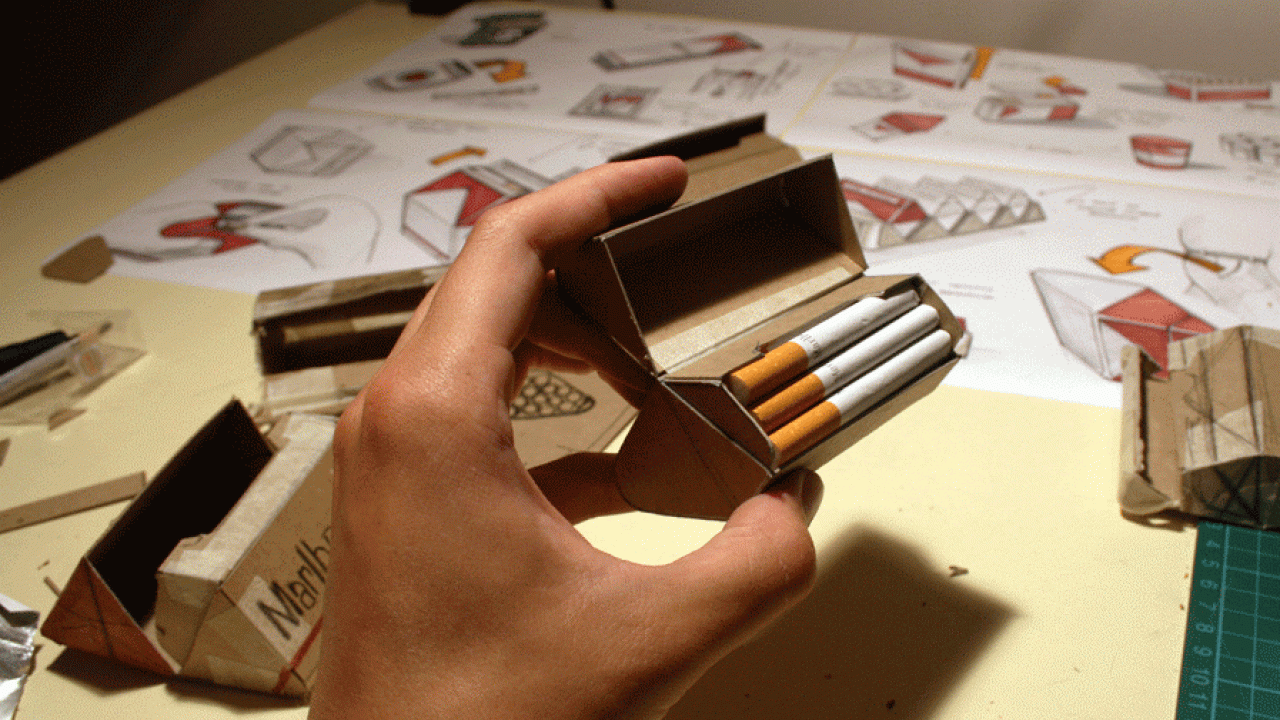
Askin finally settled on a diamond shaped carton (pictured, above) as the least efficient and ergonomic design, and created chipboard mock-ups to validate the concept.

‘One of my main goals with the diamond pack was to inhibit accessibility as much as possible,’ he says. ‘By re-orienting the cigarettes so only one could be accessed at a time, the act of grabbing a smoke or sharing one with others inherently becomes more difficult.
 
‘Along with making the act of accessing a cigarette difficult, the diamond pack also explores several other theoretical annoyances. For instance, the shape fits poorly in one's pocket and with its multiple facets sits awkwardly on most surfaces.’
 
Askin says his concept also looks at the way inefficient design could affect tobacco brands themselves, and the printers and converters manufacturing cigarette cartons.
 
‘The cap location and overall geometry also inhibit branding by limiting usable logo space and conceivably create an annoyance when it comes to point-of-sale displays.
 
‘I did explore how, by taking these annoyances to the manufactures themselves, the diamond design could "annoy" in all aspects of its product cycle.
 
‘Imagine if the government could regulate the design of a cigarette carton so they were harder and more expensive for tobacco companies to make? Far-fetched maybe, but interesting none the less. By increasing the cost to make cigarette cartons, it would in turn raise the price of cigarettes, which would in turn make purchasing cigarettes harder.’
 
He adds: ‘The real debate, however, lies in how much say the government has in what you can and can't have. Tobacco and junk food companies have no interest in making their product harder to use, so such a design would have to be forced upon them.’

Askin is keen to note that his “Design to Annoy” project is only conceptual and that the main message is not against smoking, rather how design can be used to solve problems in unconventional ways.
 
‘I chose cigarettes as a subject to explore this premise because I think we can all agree that they are bad for you. That being said, I think it really does start to explore how through package design consumers can be educated about the products they are actually buying.’
 
And Askin says that, while an overall concept such as "Design to Annoy" would be quite far-fetched for actual market implementation, aspects of it could be adopted.
 
‘When approaching this project I was very much influenced by everyday designs that serve to annoy for the better good.
 
‘Devices such as safety caps on medication bottles and the beeping noise your car makes when you don't buckle up are all great examples of instances when annoyance is useful. The main objective of this project was too challenge the way we commonly approach design problems by making things easier, better and simpler.
 
‘Rather, "Design to Annoy" looks at how we can solve a problem by making something harder, difficult and confusing.’
 
A piece of the puzzle
Packaging, he says, is just one part of the puzzle when it comes to tackling issues that involve consumer purchasing behaviour.
 
‘There will always be battles between law makers and tobacco companies on how cigarettes will be sold. While package design is an important aspect of the "smoking experience", I believe tobacco branding and marketing materials have a greater impact on influencing new generations of smokers.
 
‘Packaging is only one piece of the picture, but one that can have great impact on how we, as consumers, make decisions.
 
‘A product's package is its own personal salesman and plays a huge factor in influencing whether we buy the product or not.
 
‘As a designer, I believe product packaging must be honest to its contents. If products are harmful or unhealthy, it must be clearly acknowledged on the package and brought to the attention of the buyer. Companies must be held to high standards on the messages they display and must not be allowed to fall back on the fine print.
 
‘Everything from portion control and nutritional information to convenience could all be implemented to discourage the use of unhealthy products.’
 
Read more features from Package Print Worldwide here
Read more on tobacco packaging here
Read more from North America here