Highland Mountain whisky textured labels depict Scottish Highlands
US based design agency Brand Hatch Creative makes rich use of foiling, metallic inks and textured printing to achieve striking effects on the whisky label.
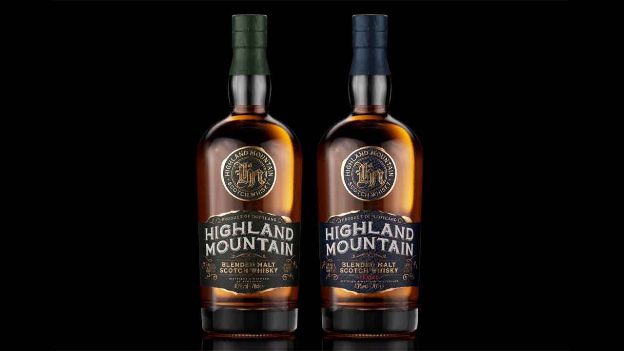
Florida-based agency Brand Hatch Creative has designed packaging for Scottish brand Highland Mountain Blended Malt Scotch Whisky. The tactile label design of the spirit bottle depicts the landscape of the highland mountains that inspired the brand and its packaging.
Highland Mountain Blended Malt Scotch Whisky originates from the heart of Scotland in the Highlands. This brand is dedicated to showcasing the natural beauty and environment of the Highland mountains alongside the bustling urban life of the big city. It delves into the region’s rich distilling heritage and quality with the introduction of both a blended malt and a peated blended malt scotch whisky.
The brand aims to capture the essence of the modern rugged drinker who enjoys exploring the highlands but is equally at home in an urban setting.
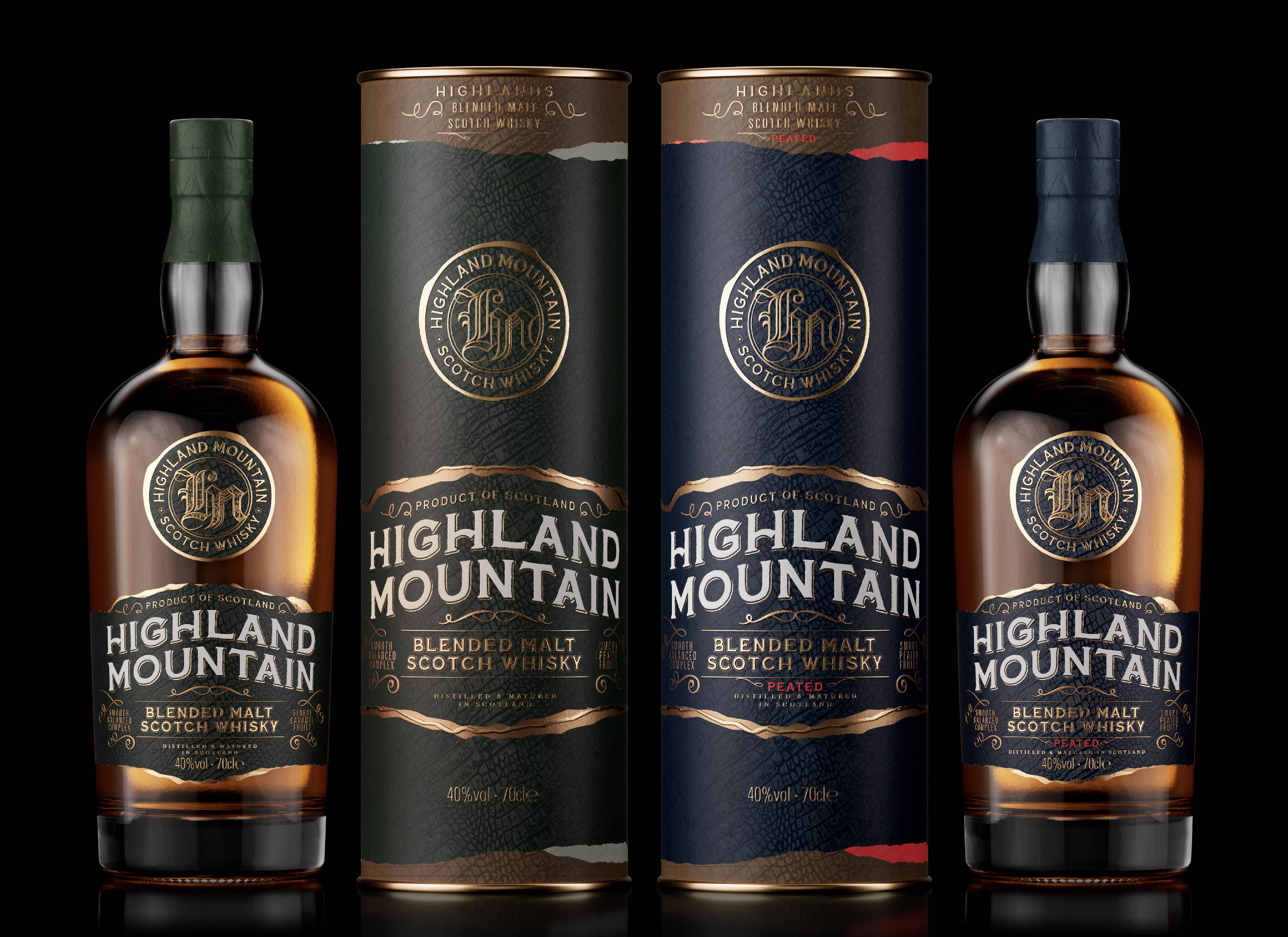
Brand Hatch Creative was tasked with developing the brand, creating a design, message, and direction for the product. The bottle itself traverses various terrains, incorporating foil, an upper label, and textured lower label with high-quality finishing. The label shape mirrors the ruggedness of the Highland Mountains but with a modern twist for the urban drinker. The upper layers and landscape of the Highlands are depicted, and the background pattern resembles the charred wood inside the barrel, symbolizing the influence of the barrel on both the flavor of the whisky and the brand itself.
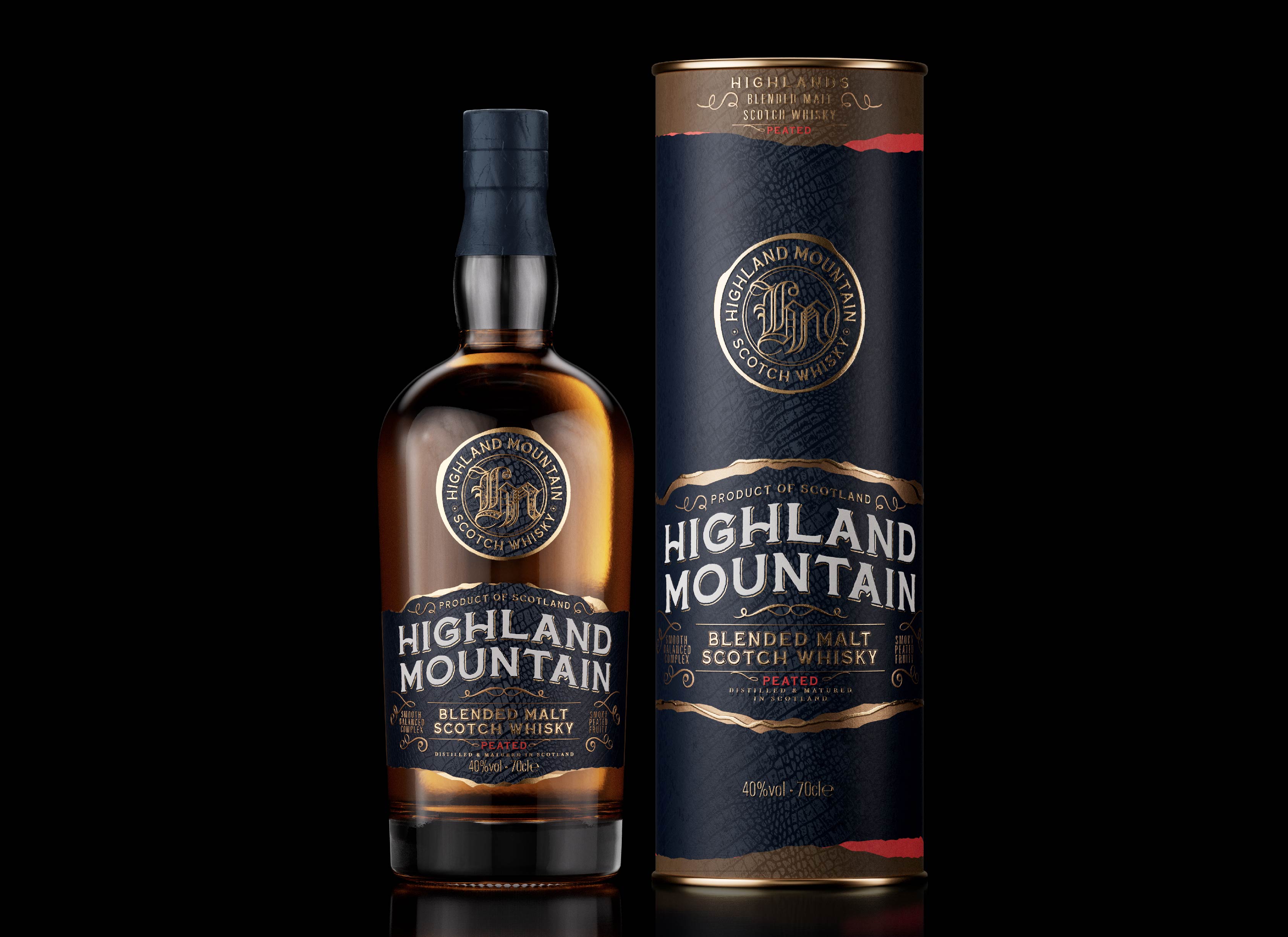
The bottle label utilises two different materials. The upper badge label is a premium metallic foil material, incorporating printed, embossed core branding with a debossed texture. The foil is overprinted to match the specified Kurz foil used on other branded elements. Complementing this, the base label is produced on a premium thick paper stock, featuring a combination of foil and metallic ink. It mirrors the print finishing techniques, including embossing and debossed texture on the wood barrel in the background. The overall result is a visually striking bottle with a tactile quality that enhances the product's appeal.
The secondary packaging — tube uses a similar premium paper stock, ensuring consistency in aesthetic presentation. The difference is the omission of debossing on the tube of intricate background detail as this would be lost in the production process.
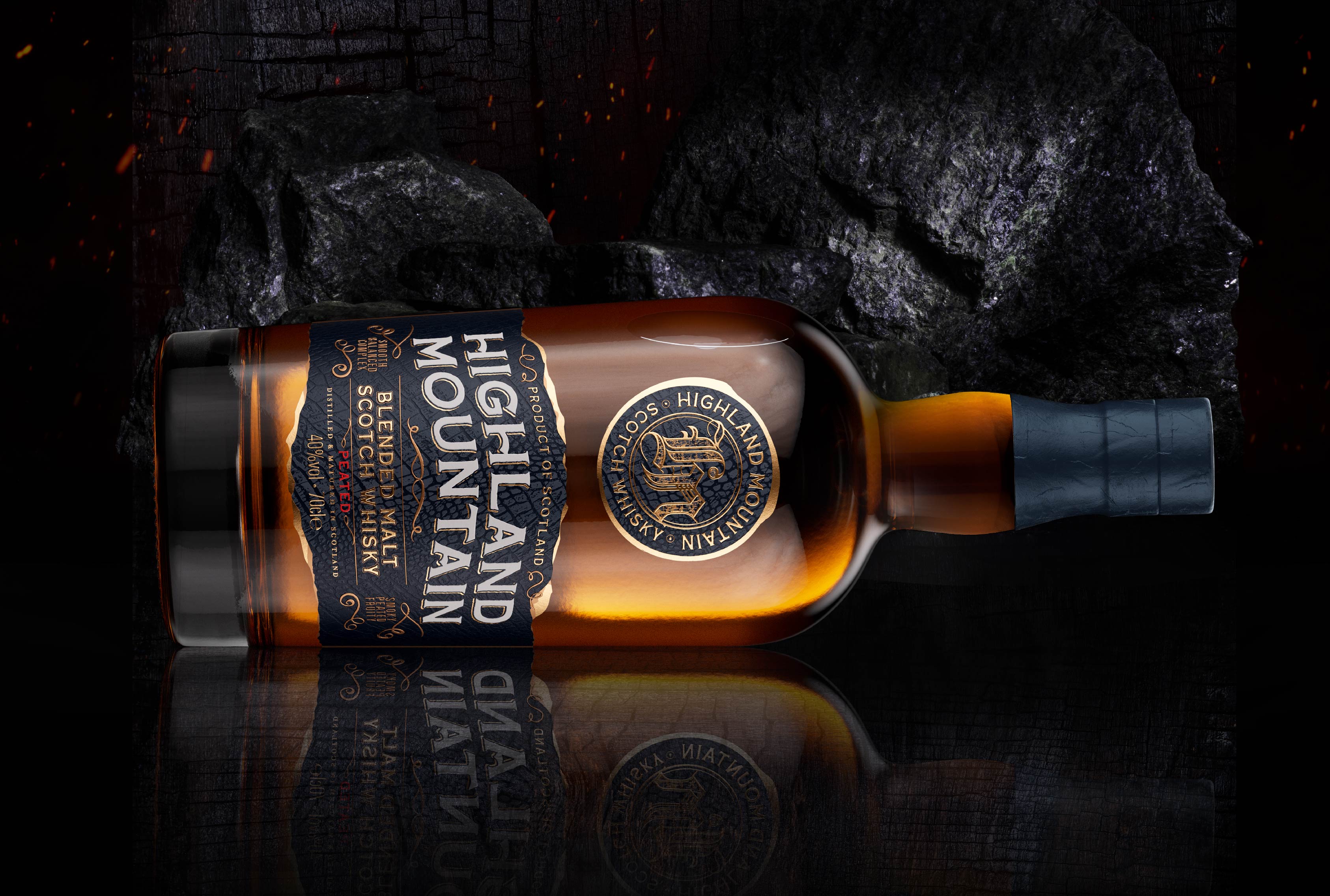
The design agency crafted a unique brand system that seamlessly merges traditional typographic elements with an urban texture, blending the old with the new. The whisky is thoughtfully developed for the modern drinker. Both expressions receive similar treatment, distinguished by a variance in color palette. For the Peated release, a red accent has been introduced to symbolize the smoking of the peat in the whisky.
Stay up to date
Subscribe to the free Label News newsletter and receive the latest content every week. We'll never share your email address.
