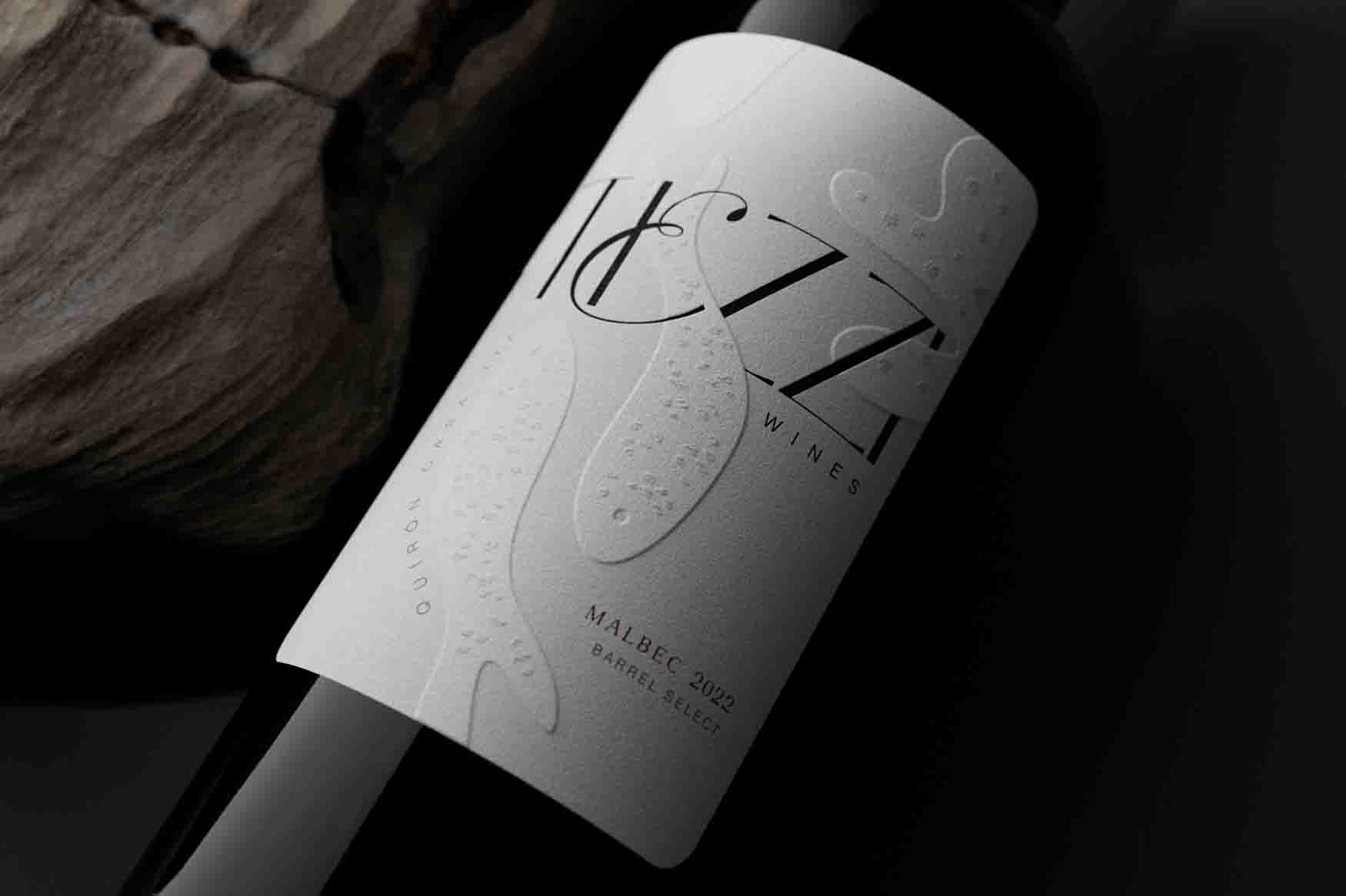
Tiezzi Wine label is a tactile masterpiece
Argentina's Mamba Estudio design agency designs Tiezzi Wines' abstract tactile black and white label that invites consumers to touch.
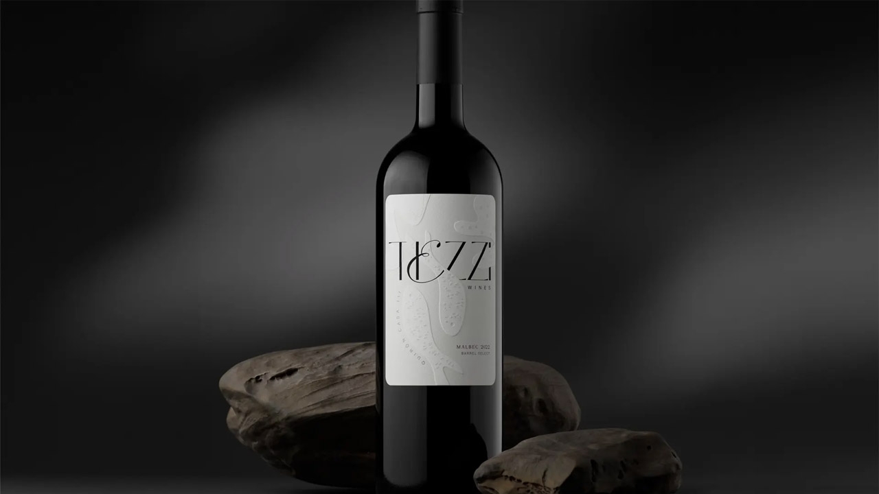
Argentina's Mamba Estudio design agency has designed Tiezzi Wines' abstract black and white label that tempts consumers to touch and feel its embossed tactile effects.
Every good art exhibition needs wine, so why not pick a bottle that looks like art itself? Argentina's Mamba Estudio makes a real contender with their gorgeous work for Tiezzi Wines.
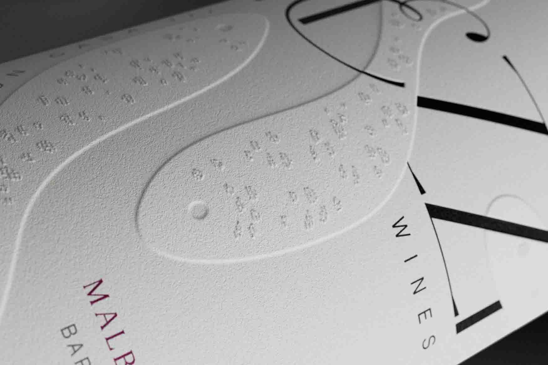
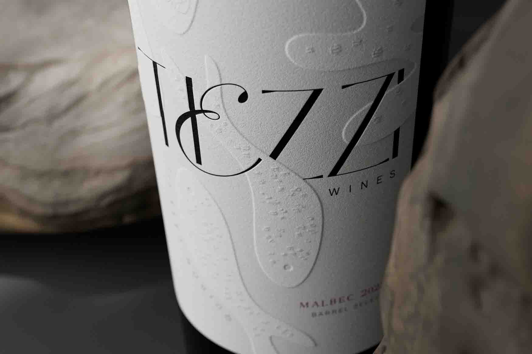
While the palette is a simple, no-nonsense black and white, next-level embossing and typography make the label stand out. Abstract fish swim through the swirly logomark, and they even have tiny little scales that look like a pleasure to touch— a wine for the real sensualists, so to speak.
Tiezzi is a label that claims to be explored.
It's a trip to discover the inner oenologist, the essence of it's creator through insinuating shapes and abstract illustrations based on it's author's life facts and values.
Monochromatic, subtle details explained by multi-level embossed techniques and elegant typographies, make this label as unique and visually clean as it can be.
Tiezzi label allows the consumer to get a bit of fresh air in a visually stunned atmosphere as the wine is being slowly tasted, cup by cup.
To be understood only by the curious, to be remembered by everyone.
This article was sourced from the Dieline and published with pesmission.
Stay up to date
Subscribe to the free Label News newsletter and receive the latest content every week. We'll never share your email address.
