UPM Raflatac reveals the power of labels in neuromarketing study
Focused on white wine labels, the research shows how label material and finishes drive purchasing and influence tasting experience

UPM Raflatac has partnered with Argea, SenseCatch, Kurz and Krämer Druck to examine the interplay of the human senses to form an overall picture of the wine buyers' purchasing journey.
The study was designed to analyze consumers’ visual impressions and emotional perceptions while observing the white wine labels, exploring the role of fine embellishments and the touch of the label material on consumers’ experience, expectations, and finally on tasting.
The study included the assessment of 32 labels of the same shape and size, that were produced by combining six types of paper supplied by UPM Raflatac with five Kurz finishings. The graphics and textual content of each label were the same but differed in terms of paper characteristics (tint, degree of opacity, thickness, degree of roughness, and tactile effect) and enhancements (color, thickness, relief – embossing/debossing – and gloss).
The labels were industrially printed by Krämer Druck, as occurs in the real production process, to generate a label identical to that which could be found on the shelf which were then affixed to bottles of the same shape and color. The entire customer journey was then reconstructed - from looking at the shelf and selecting the wine, to tasting the product. The sampling was undertaken by 30 German consumers (50 percent women), who were white wine drinkers and aged 25 to 56.
The results of the study demonstrate that the appearance of the label and its tactile sensation influence its attention-grabbing ability on the shelf and the product-tasting experience, both in terms of perceived quality and taste.
When it comes to purchasing behavior, the effectiveness of the wine label was shown to be strongly driven by its color, tactility, contrast, and paper-finishing combination, with the findings showing the following:
- Color – consumers are more inclined to purchase bottles with labels that have gilded and glittering finishes and have light and opaque paper.
- Tactile dimension – purchasers prefer embossed paper with a good degree of relief, and smooth embossed finishes with tactile effects are appealing.
- Contrast – consumers are drawn to contrast and prefer features such as textured paper with a matte surface and glossy embossed finish.
- The paper-finishing combination – the effectiveness of individual details is dependent on the combination of elements.
Stefano Pistoni, senior business development manager at UPM Raflatac commented: ‘This comprehensive neuromarketing study clearly illustrates that the label is part of a multi-sensory storytelling, both narrating and anticipating a person’s experience with the wine. It doesn’t just play a key part in guiding a consumer to purchase the wine, but it also has an important post-purchase role, influencing consumption anticipation and the experience of tasting. These findings are important, as they will help reshape the decision-making process across the wine value chain for design agencies and brands.’
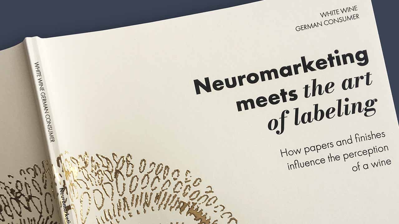
The research has been summarized in a book, which also features a foreword by Uwe Melichari, a sustainable packaging expert, designer, and Pentawards jury member.
Stay up to date
Subscribe to the free Label News newsletter and receive the latest content every week. We'll never share your email address.

