Avery Dennison, Mind Insights study explores wine buying behavior
Like it or not, your subconscious is hard at work every time you step into the store. There are countless thoughts, emotions and associations that drive decisions on the products we choose to buy.

There is perhaps no other industry where the label is as important than in the wine aisle, where consumers are exposed to a huge number of products on the shelf. In the US alone, 3,500 new wines hit the shelf each year, according to a 2017 Nielsen report.
Knowing that wine consumers are spoiled for choice, many wine brands pay close attention to the material type, font styles and size and other design elements of their labels and many depend on on package differentiation to earn and retain consumer attention.
A recent webinar hosted by Avery Dennison and Labels & Labeling explored the science and psychology of consumer behavior. It featured insights from Gordy Pleyers, a neuromarketing professor at the University of Louvain and founder of Mind Insights, and Ralph Olthoff, global marketing director for the wine, spirits and craft beer segment for Avery Dennison's labels and packaging materials division.
The webinar was split in two sections, first with Pleyers discussing the science of neuromarketing, and Olthoff offering a neuromarketing case study with a Chilean wine label.
The science
Pleyers’ research focuses on how consumers' perceptions can be automatically activated by various factors, such as design elements that may relate to product packaging. He employs an experimental approach and lab testing to study the psychology of consumer behavior.
Pleyers said in wine packaging, there are explicit factors at play, such as the brand, the region of the winery, the grape variety are all taken in consideration when a consumer picks up a bottle. But there also are implicit factors that may influence a purchase decision, such as shape of the bottle or label, colors, engraving, weight, images and printing techniques all can have an impact.
‘It’s fascinating how even tiny manipulations of certain visual factors can have significant impact on consumers,’ Pleyers said.
Some of these implicit factors are quite irrational. Certain typefaces and material choices can have an affect on consumers’ perceptions of quality and taste – even when it’s the same product inside the bottle.
Color is also extremely important, Pleyers said. His studies found that products with lower color saturation had a higher rating of value.
Wine label redesign
Mind Insights partnered with Avery Dennison to study a label redesign proposed at Santa Rita Estates, a well-known winery in Santiago, Chile.
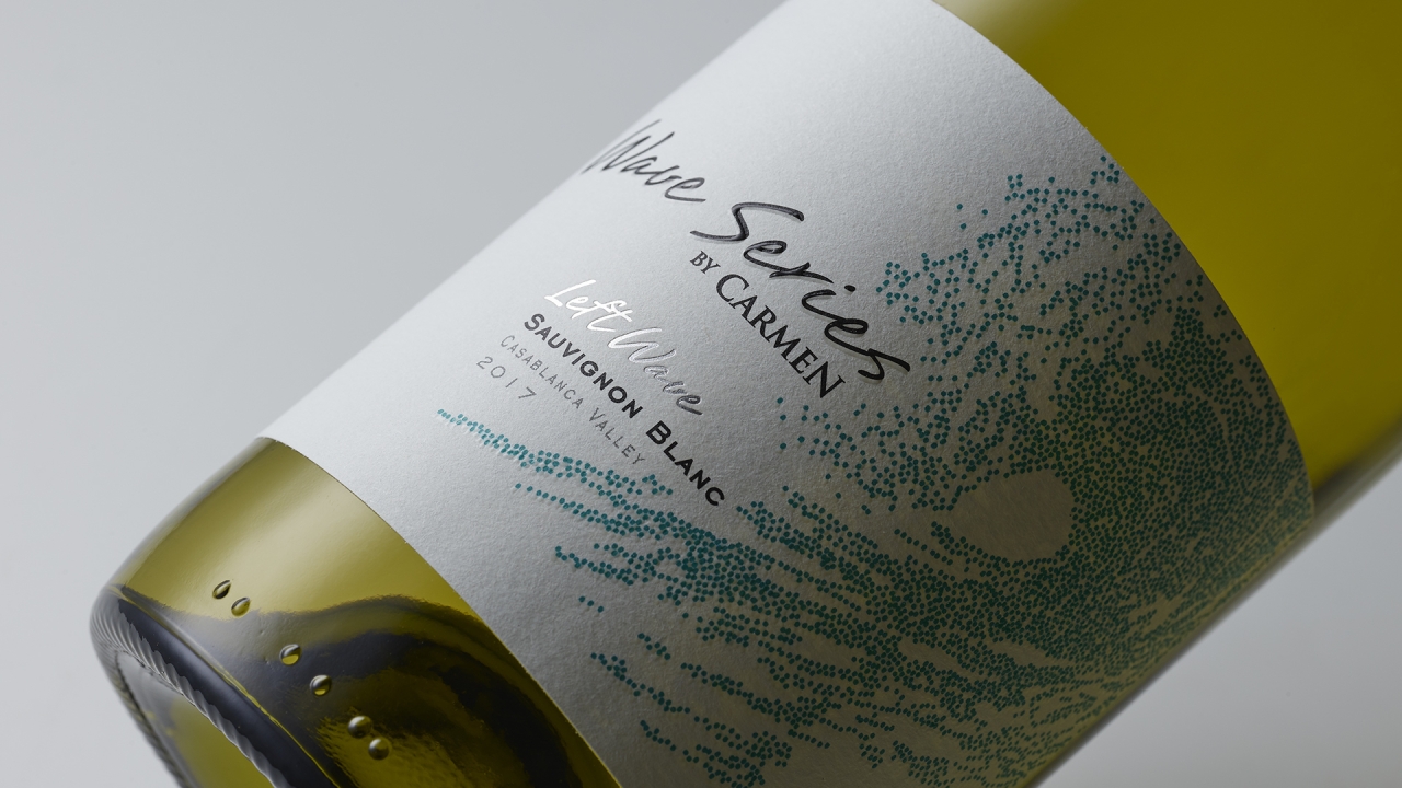
In an effort to boost sales of their Wave Series, the winery sought to redesign the label. While the design team felt strongly the new design’s easy-to-read typeface, bold color palette, and glossy facestock material would win over consumers, they wanted to be sure the brand refresh was worth the investment, Olthoff said.
For this project, Mind Insights surveyed 240 people from US, Europe and China. Participants were evenly split between men and women, and age ranged from 30 to 70 years old. Designers for the Wave Series proposed overhauling its label look from a handwritten type, to block letters and changed the brand colors from green to blue.
The scientists soon learned that the handwritten typefaces elicited a more powerful feeling from consumers, however they noted that handwriting could present challenges in legibility.
Further, the study revealed that premium label materials offered a major advantage on consumers’ feelings of authenticity, price value and product quality, compared to standard label materials. Uncoated, tactile materials more strongly activated a sense of authenticity, price value and being ‘premium’ than coated, flat materials.
In the three countries studied, green was interpreted as being positive thus making it a good choice for consumer goods. Unlike blue, green has the connotation
of being environmentally friendly.
While the Carmen redesign was visually pleasing, the data reveals higher impacts associated with the original design. The study found that the original design was more effective for automatically creating a positive emotion, activating ‘premium 'related cognitions, a sense of authenticity and capturing consumers’ attention.
So instead of a major brand overhaul, Santa Rita decided against it in favor of a more minor refresh. The team did decide to change material and decided to switch their label material to the white cotton facestock from Avery Dennison.
The entire project took nine months to complete.
The webinar with Mind Insights and Avery Dennison was the first in a series of events. The next webinar will be Dec 9 and will focus on sustainability.
Stay up to date
Subscribe to the free Label News newsletter and receive the latest content every week. We'll never share your email address.


