New look for Bulgarian wine by ‘The Labelmaker’

Graphic designer
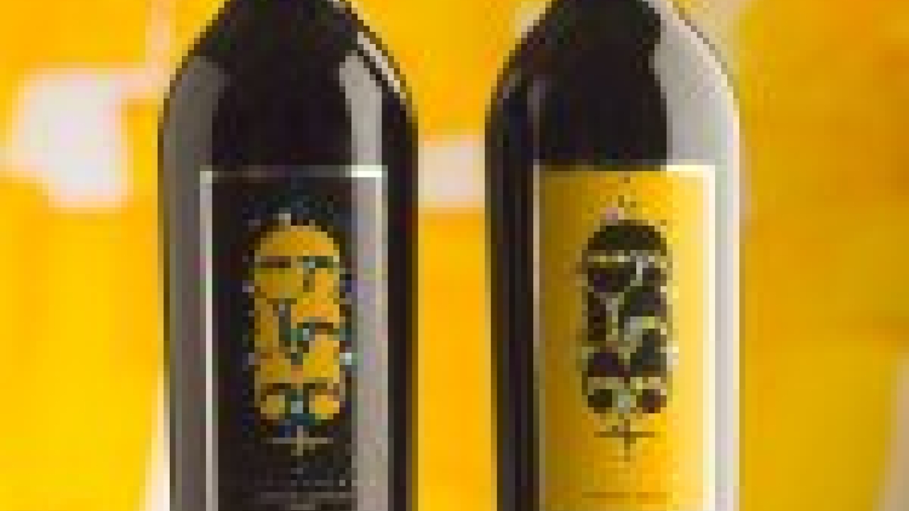
‘I wanted everyone not only to see this label as an image, but to feel it and sense it with their fingers – that’s why I used puff-up transparent varnish to make the biggest possible relief structure on the logo,’ Jelev said.
A selective transparent UV matt varnish is applied on the pattern of circles around the logo against glossy background and a transparent puff-up varnish on the +359 logo to create the appearance of wave lines. The label is bordered with a glossy hot foil stamp, and there are some tiny hot foil dots around the logo as well.
The label was screen-printed by Rotoprint in
Stay up to date
Subscribe to the free Label News newsletter and receive the latest content every week. We'll never share your email address.

