A box is never just a box
A recent packaging design project for SkyPop and Costco reinforced lessons about balancing creativity, collaboration and commercial success
As a packaging designer and design strategist for more than 30 years, I’ve created a wide range of designs from labels, cartons, shipping boxes and shopping bags to logos, brochures, t-shirts and posters. And like a parent, I don’t have a favorite design, but occasionally, a project challenges me with something completely new. One recent project did exactly that.
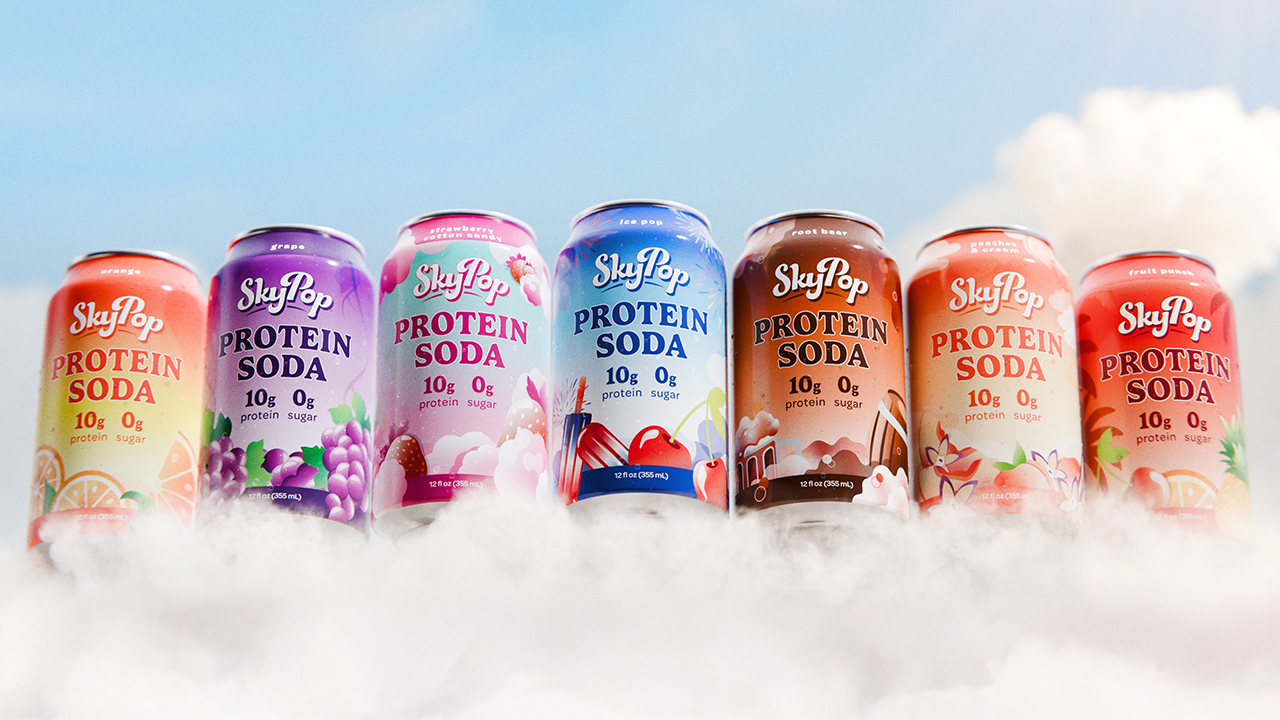
This year, I designed the logo and packaging for SkyPop, the world’s first protein soda. It was fun and exciting, and very quickly, SkyPop got picked up by Kroger, Target, Walmart and several other retailers. In those retail environments, SkyPop is sold in individual cans. You can see on the cans (See Image 1) that the packaging strategy and design are intended to make it pop on the shelf. When designing for retail, I focus on engaging shoppers, providing instant information and standing out from the competition.
“We, designers, don’t necessarily love a barcode on every panel, but I understand logically why it’s required”
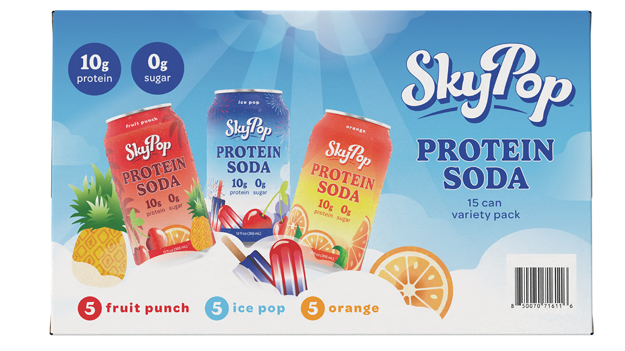
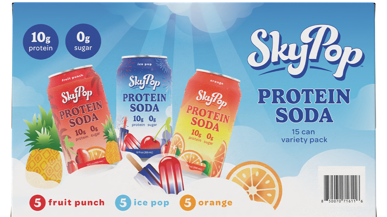
A few months after SkyPop’s launch, my client gets the news that Costco wants to carry SkyPop, but Costco doesn’t sell individual cans. Products must be packaged and sold in multipacks. So, my client asked me to design a 15-can multipack carton.
To begin, I need the dieline of the carton and a blank paper mock-up. Once I have the paperboard prototype, folded and in hand, I start concepting. Typically, when I design a carton, I start with what I consider the most important panel, the primary display panel. For the SkyPop multipack, I assumed the front panel (the largest panel) would be the primary display panel and that the handle side would be the top.
The physical reality
After I concept and design the large panel, suddenly it strikes me that I didn’t consider exactly how the cans will fit into the carton. Do the cans lie sideways or stand upright? This makes me rethink which side will be the primary display panel and which side will be on top. So, I set up a meeting with my client to discuss it.

Turns out, the cans go in vertically, standing up. Here’s why: the tops of aluminum cans are reinforced, so they can be stacked on top of each other, either singly or in cartons, on shelves. The sides of the cans are non-reinforced aluminum; you know this if you’ve ever crushed a can.
This was especially important input to consider, given that Costco doesn’t have shelves. Costco merchandises through the pallet, displaying product cartons on large pallets in the aisles. So, shoppers will see the multipacks stacked, cases upon cases. That’s when I had my ‘a-ha’ discovery: the SkyPop cartons can’t stack with the largest panel facing out, because that would mean the cans would be on their side inside the cartons. And when those cartons are stacked one on top of the other, all that weight on the sides of the cans adds up, and the cans could crush. Instead, the SkyPop multipacks would need to stack with the largest panel on top, and a different panel facing outward.
So now I need to know the pallet dimensions and configuration. Seriously, when else does a designer ask for a pallet configuration? But I need to know this if I’m going to design not just a carton, not just a multipack, but a cohesive, intentional, engaging merchandising display, with the correct panel facing outward.
You know how I’m always talking about design strategy? THIS is design strategy. As a designer, not only do I need to know which way the cans fit in the carton and which panel is the primary display panel, but I also need to know exactly how my cartons will be palletized.
Seeing the pallet configuration confirms my insight that the largest panel (the one I’ve already designed) will not be the one facing out to shoppers.
The ‘money side’ revelation
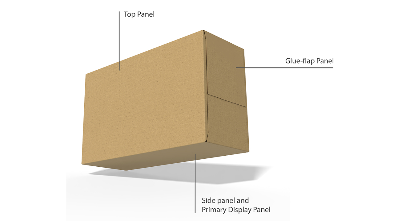
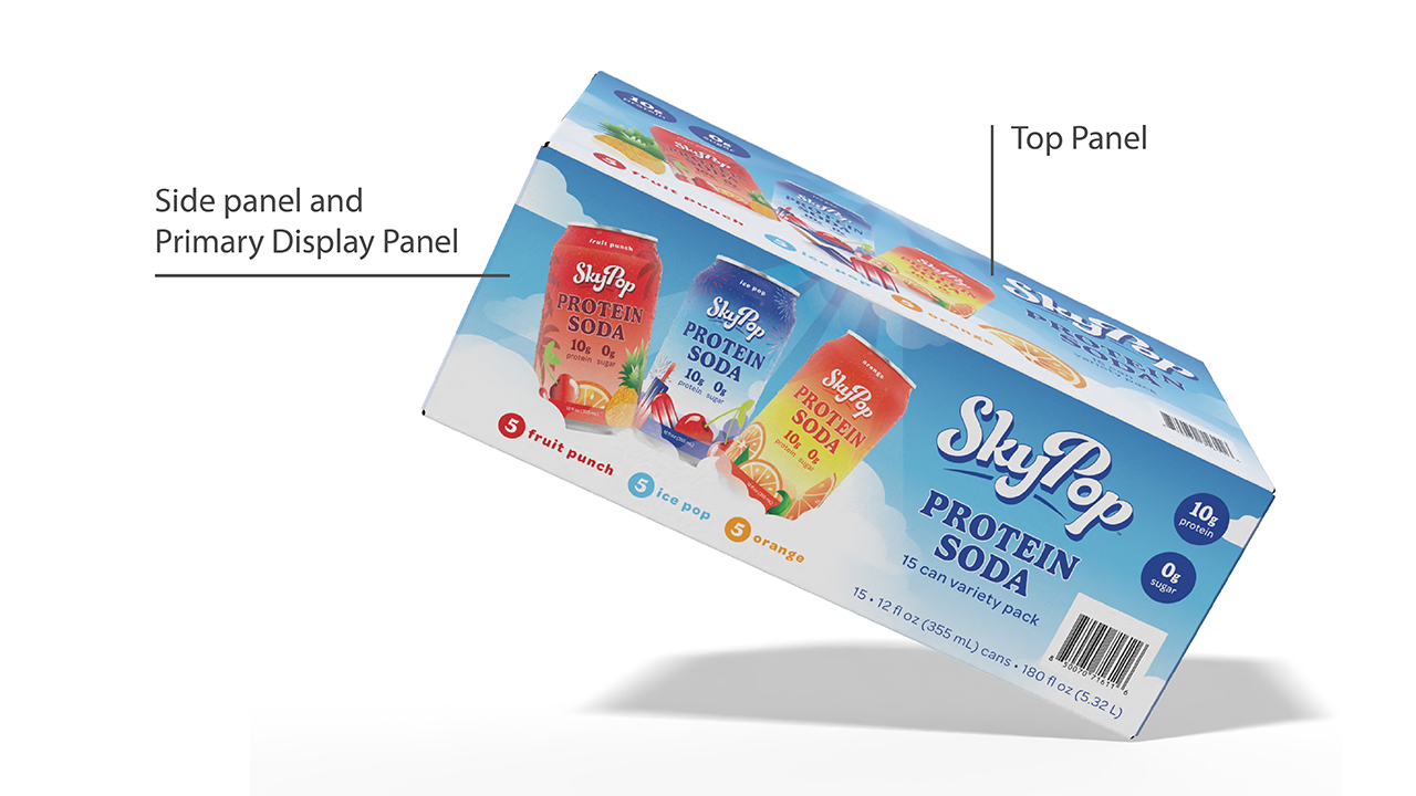
So here I am, having designed the largest panel first, thinking that will be the one that faces customers, but no. The carton will sit on the shelf with the side panel facing customers. That’s right! The cans sit right-side-up in the cartons to hold the weight of the other cartons on top. (See Image 3A.) My first designed panel is now actually the top view, like a bird’s-eye view. Even though it’s the largest real estate of the carton, in this instance, it’s not what I call ‘the money side’, the side customers see first. Instead, I now need to design one of the smaller side panels to be front-facing, since it will be the primary display panel for this carton.
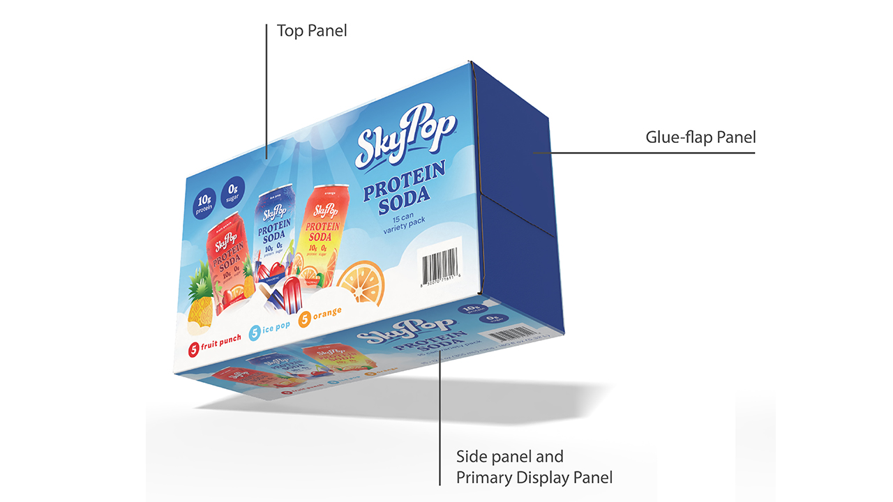
The more questions I ask, the more important information I learn for the design. Not only are one of the smaller panels the customer-facing one, I learn that the handles are facing in. I learn that Costco’s pallet configuration is 48in long by 40in wide. I learn that there are nine rows of multipack cartons on a pallet. And, when cartons are lined up in a row on a pallet, three of the side panels show outward, plus one glue-flap panel.
I’m neck-deep into this now. Many designers would simply be designing the best multipack carton they could, based on brand guidelines, layout and so on. But I couldn’t just go and design a great-looking box that would fit in any store. I couldn’t design in a silo. My client will sell this 15-can multipack only in warehouse retail environments, such as Costco. It must be specifically designed to be palletized.
Yes, I used the word palletized.
Billboarding
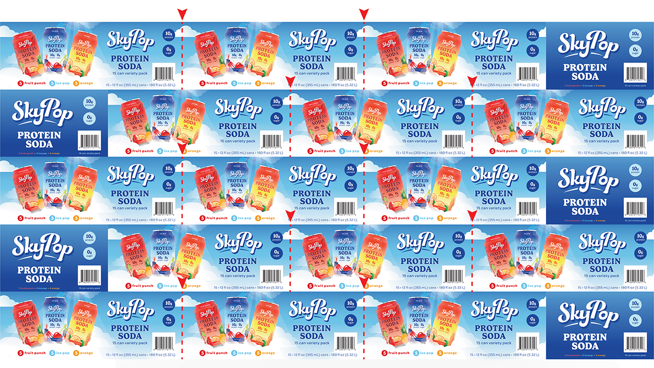
Now let’s talk about the artwork’s view from the pallet. Look at Image 4; this is how the cartons sit on the pallet. I’ve highlighted where they change from one carton to the next. You’ll see that I have the artwork intentionally extending beyond the cartons. This is called billboarding. As the cartons sit side-by-side on the nearly four-foot pallet, the customer doesn’t see a harsh break from carton to carton. I created certain pieces of the artwork to overlap, so it’s like a huge billboard for SkyPop. See where I’ve marked the end of one carton? I have some clouds crossing over, the gradation crossing over. The goal is for your eye not to register a start-stop pattern. Instead, it’s like one big sky.
You see three cartons with the money-side facing out, and then one with the glue-flap side facing out to fit the pallet configuration. This is how the billboarding is displayed to the customer.
Don’t ignore the seams
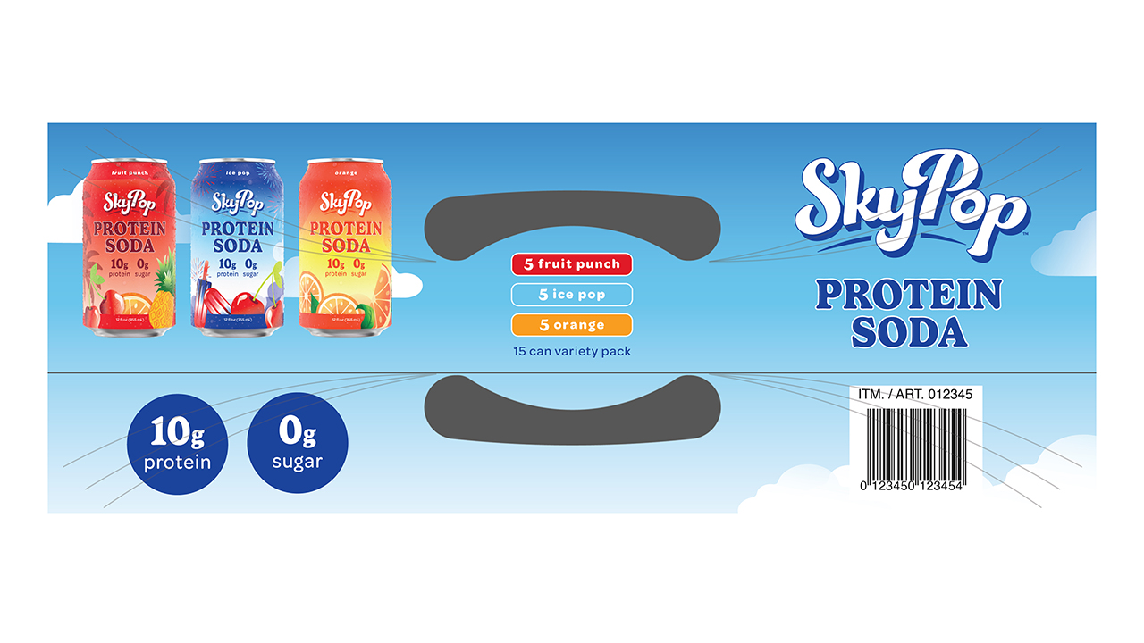
Another thing I made sure is that the carton’s seams don’t obstruct the design. When I was working with the prototype, I considered the seam in the glue panels. Since folding and gluing the carton are automated, not every seam will fit together precisely every time. There’s often a little shift. Naturally, I didn’t want any artwork crossing those seams. So, I deliberately designed the glue panels so that artwork is just above and just below the seam, and no seam interrupts the artwork. And I did that on every panel that has a seam, including the top panel with the handle. If I have a crossover, I need it to be precise, intentional and built into the design.
Look at Image 5 for instance. I’ve highlighted the seam. See how there is no artwork here? Just the color gradation. And if that doesn’t line up precisely, that’s not concerning. However, if the word ‘protein’ doesn’t line up precisely, that is concerning. If the can artwork is misaligned, that’s concerning. So that’s why I put artwork above and below the seam and made sure the artwork is unobstructed on the individual cartons.
Designing for the system
You might be wondering about the barcode (probably not, but I’m going to tell you about it anyway). Costco requires a UPC barcode on every panel of the carton, because they don’t always know exactly how a customer will have the product sitting in their cart. With the barcode on every panel, a Costco employee can walk up to the cart with their scanning gun and scan the product quickly. Efficiency is essential at Costco.
“As designers, we always need to be thinking about how the package sits, not just where”
We designers don’t necessarily love a barcode on every panel, but I understand logically why it’s required. And the goal is to sell the product. So, from a design perspective, no, UPC codes aren’t attractive. But from a practical standpoint, I get it. This is also part of being a design strategist versus a designer who does not consider a user’s or retailer’s experience; my goal is to help my client sell products. We’re not designing for design’s sake. We’re selling products. If the barcode isn’t readily visible, and it takes cashiers longer to scan that product, then eventually Costco might get annoyed with that product or brand and not want to sell it anymore. So, in this case, the design isn’t just for my client; it isn’t just for the customer buying SkyPop; it’s also for the buyer at the retailer and the cashier who has to scan it.
The how’s and why’s
As you can see, I learned a lot designing the SkyPop Costco carton. And most of it happened mid-design. Understanding the physical reality of the packaging was just one part of the learning; recognizing the reality of the retail environment was a huge additional part. As designers, we always need to be thinking about how the package sits, not just where.
That’s thinking beyond the box, and that’s why, when it comes to packaging, a box is never just a box.
Stay up to date
Subscribe to the free Label News newsletter and receive the latest content every week. We'll never share your email address.