Short-run printed packaging; a supermarket odyssey – part 11
I was back where I have most of my best ideas (in the shower), idly staring at a new Procter & Gamble (P&G) brand shampoo bottle, when I realized that the packed cupboards in the Pittman house would likely provide examples of pre-Olympic packaging to compare to those printed more recently, and featuring the imagery and themed decoration I’m searching out for my blog looking at short-run printed packaging as seen on store shelves this summer.
With special events, such as the London 2012 Olympics, Euro 2012 football tournament and Queen’s Diamond Jubilee, providing brands with additional opportunities to annual dates in the diary, like the Wimbledon tennis championships, the amount of uniquely themed packaging being printed and sold in UK stores this summer has been astounding.
This is no surprise given the sum brands pay to become an official sponsor of something like an Olympic Games, so when I went through the bathroom cabinet I was happy to see that there were a couple of pre-Olympic P&G products to compare.
P&G is a worldwide partner to the Olympics, so has more reason than most to use its products as a vehicle to promote its support for London 2012.
 Head & Shoulders shampoo was the first product I found, with newer bottles featuring the special P&G medal logo that it has been using in the run-up to and during the Olympics.
Although we’ve not go any bottles featuring images such as the weightlifter, which you can see here, the introduction of the medal logo has been made to reinforce P&G’s position as a worldwide partner of the Olympics.
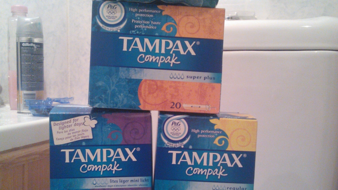
 P&G’s feminine care brands, Tampax and Always, have likewise been carrying the medal logo on their packaging as the Olympics drew closer.
A silvery blue in color to suit the busier carton packaging, compared to the gold medal printed on the near-plain shampoo bottle, you can seen how P&G has introduced themed elements to its packaging.
The stack of Tampax pictured also highlights product diversification through packaging, with different color schemes of the same design used on cartons for varying products and in a range of pack sizes.
In addition, Tampax boxes are printed with the text “Worldwide Partner = Partenaire Mondial”, with French one of the official languages of the Olympic movement, and heavily used at the opening and closing ceremonies.
Tomorrow, the kitchen cupboards get raided for pre-Olympic packaging!
You can help me compile this unscientific “study” of short-run printed packaging as seen by consumers on store shelves this summer. Just snap a picture on your phone's camera and share it using your own Twitter account, mentioning @D_Pittman_PPW and using #packageprinting.
If you're not on Twitter, please email pictures to [email protected] so I can see what you see on the shelf this summer when it comes to themed short-run printed packaging.
You can even share your photos with us via the official Package Print Worldwide Facebook page.
Stay up to date
Subscribe to the free Label News newsletter and receive the latest content every week. We'll never share your email address.