Minimalism meets mixology at Jimmy’s Cocktails
Jimmy’s Cocktails responds to the growing popularity of cocktails in India with colorful label designs
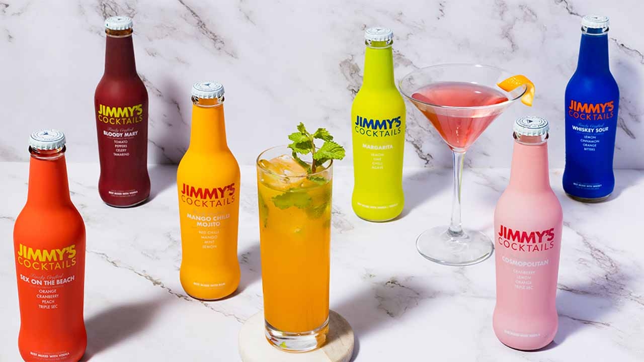
Jimmy’s Cocktails original minimalist design, feature bright-colored shrink sleeves with text in contrasting colors
Minimalism meets mixology in the packaging design for
Jimmy’s Cocktails, a line of premium cocktail mixers. The
brand’s glass bottles are adorned with bold, bright colors,
adding a playful touch to the brand’s modern and sophisticated aesthetic. The minimalist approach to design allows the vibrant colors to truly shine, making these bottles stand out on the shelf.
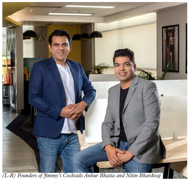
Jimmy’s Cocktail is a brand of low-calorie, non-alcoholic spirits mixers founded in 2019 by Ankur Bhatia and Nitin Bhardwaj of Radiohead Brands. The brand was created in response to a shift in consumer preferences towards less sugary drinks and the growing popularity of cocktails in India.
‘I was in Bombay with my friends, and I noticed that everyone who frequented bars gravitated towards cocktails,’ says Bhatia. ‘A larger market that drinks at home was not able to make cocktails. The solution needed to be clutter-breaking since it was a new category. To stand out, you had to look and behave differently. That’s what gave rise to Jimmy’s.’
The brand has a head office in Gurgaon and another in Delhi with production facilities in Nashik and Indore. The company has more than 150 employees in 20 cities.
Bhatia has worn several hats during his career which started in 2003. He worked at Motorola, joined a publication Maxim, and founded his online magazine MenXP which was acquired by Times Internet. He then worked with the automobile company Mahindra & Mahindra. In between, Bhatia also worked in the alcohol industry for six to eight years where he worked extensively in packaging.
With a background in packaging and design, he recognized the importance of the product’s packaging in standing out in a crowded market. He understood the importance of labels and packaging in the spirits industry in India and wanted to create a design that was unique and memorable.
With limited marketing resources during the early stages of the start-up, Bhatia understood that the product label had to play the role of a salesman.
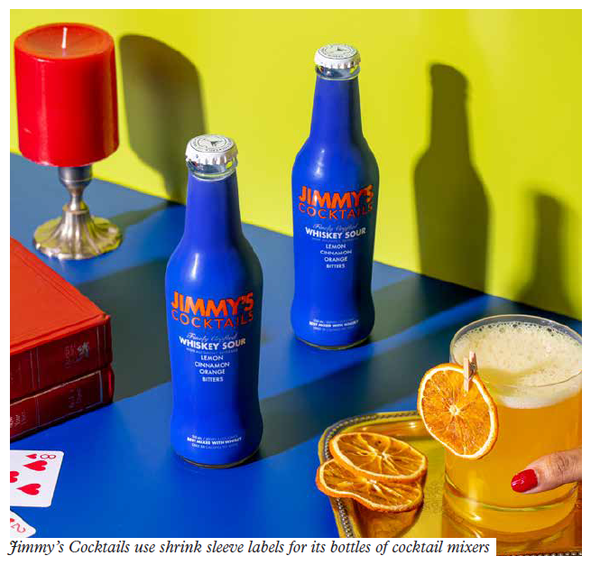
He chose to use glass bottles with shrink-sleeve labels, which was unusual in the alcohol industry but allowed for more space to communicate information to consumers.
Jimmy’s in-house design and packaging team created several designs, but in the end, the brand stuck to its original minimalist design, featuring bright-colored shrink sleeves with text in contrasting colors. The label has a QR code at its back with information on cocktail recipes.
‘When you think of a cocktail such as a margarita, it reminds
one of a beach bar with salt-rimmed slim glasses and lemon on the side. But if I remove the label and look at the liquid of the cocktail mixer, you will just see a green liquid which is not as inspiring as the cocktail in my head. It was one of the reasons I chose to put a shrink sleeve on the bottle. Your memory of the cocktail is a stronger marketing weapon than the actual color of the liquid. The liquid will eventually look like a cocktail,’ he explains.
The brand’s packaging was recognized for its impact and won an award from Kyoorius.
Bhatia uses the ‘MECE’ principle for his designs. MECE stands for mutually exclusive and collectively exhaustive. Mutually exclusive means no overlap between each piece, while collectively exhaustive means all the pieces combined form the original item without any gap.
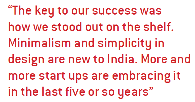
‘The key to our success was how we stood out on the shelf.
Minimalism and simplicity in design are new to India. More and more startups are embracing it in the last five or so years.’
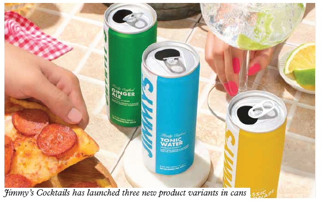
Jimmy’s recently launched three new variants in cans - tonic
water, ginger ale and lemon ale - which posed a unique design and packaging challenge. Designing cans required a different approach than bottles. What worked with bottles did not translate well on a can and still had to adhere to brand guidelines.
After months of R&D, the cans featured Jimmy’s logo vertically with a white strip as background. The cans, following the same design philosophy as bottles, come in bright colors with a minimalistic design.
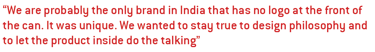
‘We are probably the only brand in India that has no logo at
the front of the can. It was unique. We wanted to stay true to the design philosophy and let the product inside do the talking. The design needs to pop enough for you to be attracted. The cans look better when kept together,’ he adds.
The minimalist design of the bottles and cans allows for future collaborations.
‘As a founder, I think ahead of time and have a vision. I
constantly think of new ideas and already have a few ideas about the next product. My art team has a vision for collaborations and if your packaging is too design heavy, where will you place the collaboration in your brand? We have a lot of space in our design,’ Bhatia says.
Bhatia believes that the success of the brand is due to its product, not just its packaging and that consumers are savvy enough to know what the brand is without needing to oversell it.
‘Someone once told me that the minimalism on your packaging design tells me that you are so confident about your product that you don’t need to say anything and that’s what Jimmy’s stands for.’
The company hires experts from the beverage industry and its recipes are created by the leading bartender in India.
Jimmy’s labels are supplied by some of the leading converters in India. It has in-house label applicators at its plant in Nashik. The long-run labels are printed on rotogravure printing technology and short-runs are produced on flexo.
For Jimmy’s can variants, the aluminum sheets are printed
directly and converted in long runs. The company sources its cans from two leading suppliers in the space.
The company’s packaging design department is also actively involved in R&D with its label supplier and can launch new flavors frequently, including limited editions.
MOQs were an issue at the beginning with conventional
technology. However, the brand scaled rapidly in the last 1.5 years and its consumption of labels grew.
Opportunity in adversity
The company scaled rapidly during Covid despite its challenges.
Jimmy’s Cocktails had just launched and was ready for lift-off in March 2020 when a country-wide lockdown was announced in India.
The brand faced several issues in those days such as supply chain limitations, rising costs and unavailability of raw materials. Shipping the product and sourcing packaging was also a hurdle.
In addition, having started in a retail format, which was shut
during Covid, the company had to pivot to D2C model. At the time, the company was run by just three including Bhatia.
‘Since everything was shut, so were the bars. In those days,
there was only one way to have a cocktail and that was Jimmy’s.
So we started marketing Jimmys’ online with a tagline – “bring the bar home.”
‘Since warehouses were shut, we stored the bottles at my
residence and arranged shipping of the bottles that we packed ourselves,’ he says.
As soon as the pandemic subsided, the company scaled rapidly. In FY22, the brand witnessed a growth of over 200 percent in its revenues and is now available at over 12,000 FMCG retail outlets, wine shops in over 50 cities, and at leading e-commerce/quick delivery platforms such as Swiggy Instamart, Zeptos and Blinkit.
The brand delivers from its website to over 400 cities in India. Recently the brand has also started exporting to Australia, South Africa and ISC countries.
‘The moment I realized that drinking cocktail at home becomes easier, people will do it. We just needed to ensure that the product was right. Packaging and branding can make you pick up the product once but if you don’t like it, no matter how good the packaging is, you will not buy it anymore. The role of packaging is to attract the consumer once on the shelf. The reason for our success is the product inside. We have a lot of repeat customers.’
The company is planning to expand its presence in the
international market. Radiohead will also launch new brands with new product lines.
Stay up to date
Subscribe to the free Label News newsletter and receive the latest content every week. We'll never share your email address.