Story of the moon
Rohan Rehani, co-founder of Indian mead start-up Moonshine Meadery, tells the story behind its eye-catching labels.
 Nitin Vishwas and Rohan Rehani, co-founders of Moonshine Meadery")
A hobby turned into a business, Moonshine has made waves in the Indian alcobev market with its out-of-the-box flavored meads and label design concept. The brand gained further popularity when it appeared on the business reality television show Shark Tank India.
Mechanical engineer Rohan Rehani and ex-McKinsey employee Nitin Vishwas transformed their hobby into a business, launching Moonshine Meadery in 2018.
The story of Moonshine’s label design began with a minimalist Scandinavian logo of uppercase and lowercase ‘M’ which Rehani says received positive customer feedback. Depending on the SKU, the color of the label and text would change but the overall design remained the same. The start-up introduced wordplay around its logo to create customer engagement on social media with ‘Mm’ standing out in slogans such as ‘IMmune to bullshit’. Rehani recalls he saw people wearing t-shirts bearing the slogans. This convinced the founders that there was a scope for clever marketing behind the original logo.
However, as the business brewed, the duo realized that there were several constraints surrounding the logo. ‘One was that we had misjudged the target audience,’ says Rehani. ‘When Vishwas and I first started, we priced the meads at 220 INR [2.92 USD] so that consumers above 30 years of age would be able to buy them and would like minimalist designs. We were, of course, wrong. Young India has the power to spend on products that appeal to them. ‘The second thing was that while all our communications were about Moonshine, we hadn’t realized that “Mm” was the biggest thing on the visible on the bottle.’
The brand faced a peculiar problem. Customers would walk into liquor shops asking for Moonshine only to be told that it is not available. When a customer notified the co-founders of the unavailability, Vishwas called in to a shop in Chembur that was selling Moonshine meads, but was told that the product was unavailable.
‘Vishwas called me and said either the stock is selling out too fast (within eight hours of shipment) or the shopkeeper doesn’t know what Moonshine is.’
He went to the store and asked for Moonshine and received the expected response. But Vishwas pointed out the Moonshine meads stacked neatly behind the shopkeeper, to which the latter replied: ‘Oh, you mean “M-M”!’
The brand launched in February 2018 and by June the problem was apparent. Rehani and Vishwas started looking for a design agency and found The Jungle Gym and its founder Nikhil More. ‘We told them we wanted a visual-forward brand language. Prior to that we had text-heavy brand language which was nice and fun but we felt several constraints. When we realized the target group was much younger, the bottle needed to be a lot more visually striking,’ Rehani explains.
He was determined to do away with the animal or insect mascots that are popular among craft brewers. ‘To have a bee as a mascot for a honey-derived drink made the most logical sense. But honestly, that’s why we didn’t want it – because it made logical sense. We were very unconventional in such a way that we didn’t want to belong to this industry for any logical reason.
‘We decided to do this out of a passion which became a hobby. Everyone said, why not make beer – something people already understand. That’s the point: if everyone is zigging, we wanted to zag.’ Another thing Moonshine was sure of was collaborating with artists.
To have a bee as a mascot for a honey-derived drink made the most logical sense. But honestly, that’s why we didn’t want it
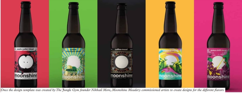
When More came up with the moon logo, Rehani thought it was radical as an idea. A white circle in the middle morphed with label design was unique and integral to the brand identity.
‘Both Vishwas and I were like – whoa! More came back with 8-9 different artworks and rough sketches to show us how the entire architecture pops out when you line the bottles together.’
The circle in the center of the label with the brand name Moonshine beneath, along with the name of the mead, remains consistent in the design. The company contacted several artists across India and asked them to design something using the template.
‘The product inside of the bottle is so handcrafted that we wanted the label – our identity – to be integral with the artwork. Instead of treating our logo as sacrosanct and saying you cannot touch it, we wanted the artist to overlap the logo by 20-25 percent. The circle is such a universal symbol that you can do so much with it, and it worked!’
Collaborating with artists
The co-founders chanced upon their first artist, illustrator and graphic novel artist Anand Radhakrishnan, at a Starbucks coffee shop where they noticed him sketching them. Radhakrishnan was commissioned to design Moonshine’s Apple Cyder mead. ‘In the rough sketches he came up with, the cross-section of the apple also looks a lot like an owl’s face. He morphed the circle into an owl’s
face. He used the 25 percent rule very well,’ Rehani says.
The second artist was Aniruddh Mehta, a designer, visual artist, art director and a DJ known for his work in Sacred Games, a Netflix series. Mehta designed his own favorite variant – the Coffee mead.
His art style includes repetitive patterns and elements of coffee and hexagons of honeycomb to show what the product is made of.
What we love about the circle is that it is ‘freshly consistent’. The label architecture allows variety and consistency, which is super-exciting for us
‘My personal favorite is what More did,’ says Rehani. ‘He came up with the design for Traditional mead. It is closest to what our ancestors drank. Mead is the oldest beverage known to mankind – it predates beer and wine by thousands of millennia. It’s also a part of our culture and is mentioned in the Vedas.’
The Traditional mead label shows India’s first satellite, Aryabhata – named after the famous Indian astronomer and mathematician – in space, partly silhouetting the moon.
The company has launched 12 variants of its meads so far and each label is designed by a different designer, depicting the diversity of the brand.
For Grilled Pineapple mead, the company launched it as a competition on social media to crowdsource the design during the first lockdown in India.
‘What we love about the circle is that it is “freshly consistent”. The label architecture allows variety and consistency which is super-exciting for us. This year, four new meads are coming out and we are reaching out to artists and finalizing artwork for them,’ Rehani says.
The company outsources printing services and started out applying the labels manually. Now it has an in-house Skanem automatic label applicator for front and back labeling and a bottling machine developed by Rehani and Vishwas.
The labels also include QR codes with a link to the artist and the inspiration behind the artwork. ‘We see this as an opportunity to shine a light on artists. That’s important for us, which is why we will always outsource the design.’
What you see is what you get
Rehani says that all Moonshine labels show what you are going to get inside the bottle.
‘If it’s grilled pineapple there will be grilled pineapple in it and if there’s apple there will be apple in it. We are strong believers in naming our product to depict what you see is what you get,’ Rehani adds.
Apart from the three flagship meads, the seasonal variants will be produced in limited stocks which may not be available again for a year or so. The reason is the unavailability of seasonal fruits as the brand insists on using fresh ingredients instead of rehydrated fruits and pulp.
‘We didn’t start Moonshine to start a business. We began as home brewers and it became a passion. We ask everyone who comes to work with us to create their own mead. When one of our employees, Devashish, joined us as an intern, he came up with Guava Chilli mead which is now one of our best-selling meads. This is why it is exciting. There is a new label on the horizon and that freshness is consistent,’ Rehani highlights.
Moonshine has also launched its own brand of the high-quality varietal honey used in its meads. It claims to be the only alcobev producer in the world which sells its raw material as well, ‘because we are proud of its quality’.
The brand uses silver PP and a matte lamination layer on its labels. ‘This shift to silver PP and matte lamination happened 3-4 months ago. You might still find regular PP labels in the market, but over time the transition will happen to silver PP.’
Moonshine won the Kyoorius design award for its rebranding strategy.
‘I sometimes see the brand out in the wild, which is not really the brand. And a couple of times on Instagram we have had people taking pictures of white circles and sending it to us and tagging us when it is not even our artwork. The circle for us makes a lot of sense,’ Rehani says.
Moonshine is making its mark on the Indian alcobev industry with a fresh outlook in product and package design. Often product differentiation is a challenge for new start-ups on the overly cluttered FMCG shelf. Rehani recommends that start-ups have a clear brief and reference of what they want.
He says that working with an agency that guides a brand through the complete thought process is ‘invaluable’.
‘We had a one-hour long session with More, who helped us through the process of understanding the exact design that we would like. By the end of it, we were clear about what direction we wanted to go in.’
He encourages originality and suggests moving away from conventional thinking. ‘Again, don’t be afraid to zig when everyone is zagging. Don’t go with what people believe how things should be done or should be like. You can start afresh and do something really unique. As clients, More was happy to work with us because we didn’t give him too many constraints about what he cannot do. We are huge fans of trying something new – our whole business model is dependent on trying new things.’
Stay up to date
Subscribe to the free Label News newsletter and receive the latest content every week. We'll never share your email address.