Ballenal Mezcal label design blends visual and tactile sensitivity
Mexico based design agency Hi! Estudio uses mix of materials for the mezcal label
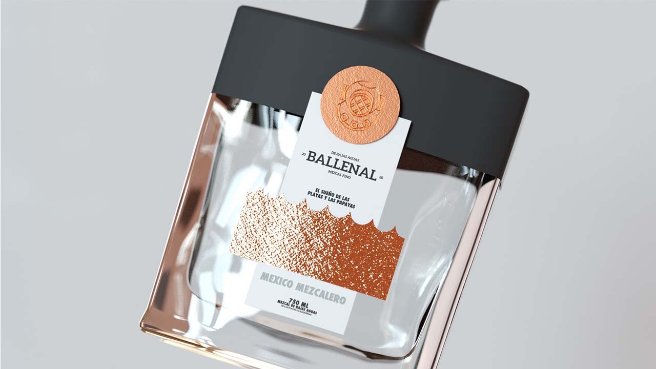
Ballenal Mezcal De Bajas Aguas label design plays with visual and tactile elements brought through use of a mix of materials. The label was designed by Mexico based design agency Hi! Estudio.
The inspiration for Ballenal comes from Oaxaca beaches.

As a satire, allusion is made to a diver who went to Puerto Escondido to look for papayas and the only thing he found was mezcal in the deepest part of the ocean.
The design aims to strike a balance between the crude and playful and the elegant, which was achieved through geometric compositions and the mixture of materials.

The label makes a play of volumes and textures that remind of the hammered copper used in some crafts and the copper stills where the produces artisan mezcal.
The material that Hi! Estudio selected for Ballenal was silver foil emboss as it allowed the designers and offered them the flexibility to land a concept, a paper that helped them to enhance the texture of the label, giving the project a visual and tactile sensitivity.

A symbiosis between materials, concept, graphics and bottle that invites customers to search into the deep of the ocean and dream about the beaches.
Stay up to date
Subscribe to the free Label News newsletter and receive the latest content every week. We'll never share your email address.
