Mirinda unveils vibrant new visual identity
New visual identity developed by PepsiCo Design and Innovation to ignite creativity
Mirinda has revealed its new global brand platform, 'There's no flavour like your flavour', alongside a playful new visual identity system, which honors creativity and uniqueness in all generations.
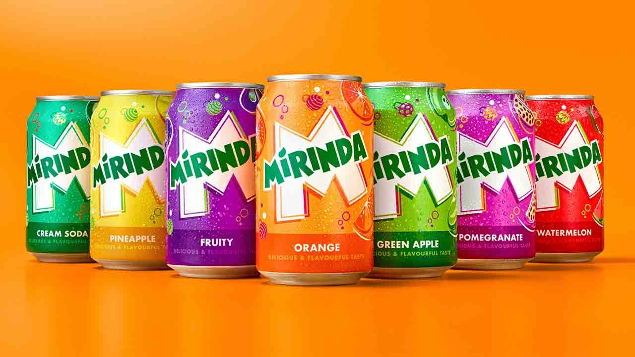
Coinciding with the #NoFlavourLikeYourFlavour launch, Mirinda has been given a striking new visual identity called ‘Making an M-pact', developed by PepsiCo Design and Innovation to ignite creativity. The Mirinda logo has been refreshed with a brighter green, along with sharper corners and cleaner lines to amplify its distinction. The Mirinda 'M' serves as a canvas of creativity from which the brand is brought to life. The new visual identity features playful color palettes which provide a burst of refreshment, while twirling spheres, fizzing bubbles and zesty fruit illustrations convey a sense of playfulness and energy throughout.
Each of the brand's more than 50 fruit flavors, including Green Apple, Orange, Pineapple, Strawberry, and Watermelon, will be given a corresponding color palette, each with their own vivid, contrasting colorways. Mirinda's flavor offerings are tailored to the unique palate of communities around the world, including Green Cream Soda and Orange Tamarind in Vietnam, and Acai Berry in Poland. The new visual identity will be visible on all Mirinda cans, merchandise, advertisements, retail displays, digital media and Mirinda across its 200 markets.
Eric Melis, vice president global brand marketing at PepsiCo, commented: ‘We are pleased to unveil Mirinda's new global brand platform that inspires vibrant creativity, encouraging Gen Z to harness their uniqueness as a superpower. Through #NoFlavourLikeYourFlavour we have developed a refreshing new visual identity and platform, which Mirinda fans can identify with - one that empowers this generation to resist conformity and instead, embrace self-expression. This marks the first step for the brand as we continue to evolve and grow in line with the youth of today. We look forward to rolling out the exciting plans we have in the pipeline.’
Mauro Porcini, SVP and chief design officer of PepsiCo, said: ‘Mirinda's more than 50 flavors are a treat for the senses, and we wanted the brand's visual identity to look and feel the same. PepsiCo Design and Innovation brought Mirinda to life with vibrant, contrasting colors and bespoke illustrations that create a sense of dynamic energy and playfulness. We know Mirinda fans engage with the brand digitally as much as they do physically, so we created a visual identity that retains its excitement and distinction across all platforms.’
Mirinda's new visual identity will be rolled out across the leading 20 international markets from May 2023, with many featuring their native languages on the cans. Kicking off with Vietnam and Thailand, the new visual identity will then appear in Poland, Romania, Czechia, Ukraine, Hungary, Croatia, Gaza/Palestine, Mexico, Argentina, Egypt, Iraq, Uganda, Ethiopia, China, Pakistan, Kuwait, Qatar, Oman, Bahrain, and the United Arab Emirates and much more to come.
Stay up to date
Subscribe to the free Label News newsletter and receive the latest content every week. We'll never share your email address.