Truls Svendsen's Aquavit boasts soft, earthy design
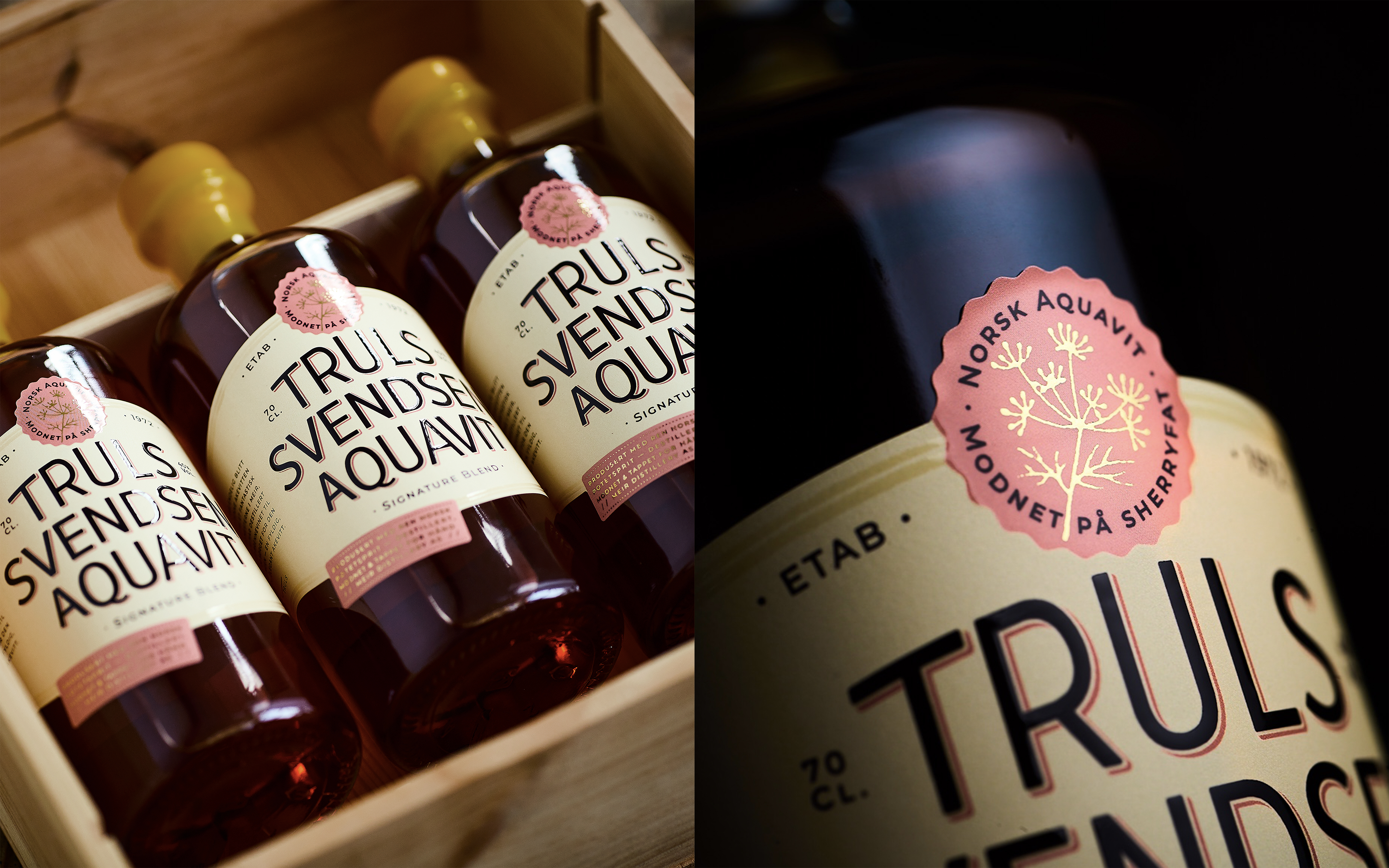
The label of the spirit is soft and rounded, the colour palette is warm and welcoming.

Meir Distilleries has collaborated with Norwegian comedian Truls Svendsen to create charming spirit Truls Svendsen Aquavit with labels in delicate feminine aesthetic and playful colors and foiling.
Thanks to smart design by Keep, the bright wax seal makes it easy to imagine artisans crafting these bottles one by one, delicately placing each gilded pink stickers on top of sleek sans serif labels. The end result is a charming vintage apothecary look with a warm, subtly feminine aesthetic.
Introducing Truls Svendsen Aquavit, the latest creation by Meir Distilleries. Born from a close collaboration between the beloved Norwegian personality, Truls Svendsen, and the brilliant Meir Distilleries team, led by Ivan and Rune. Mr. Svendsen, known for his showmanship, sense of humor, and culinary passion, played a pivotal role in shaping this aquavit.
The design approach aimed to capture the warmth and charisma embodied by Truls Svendsen, while also highlighting the fine quality of the product, ensured by the craftsmanship of the distillery. The design plays with the contrasts between Truls and Meir, the extroverted and introverted, the bold and subtle. The logotype is distinctive and extrovert to reflect Truls’ personality.
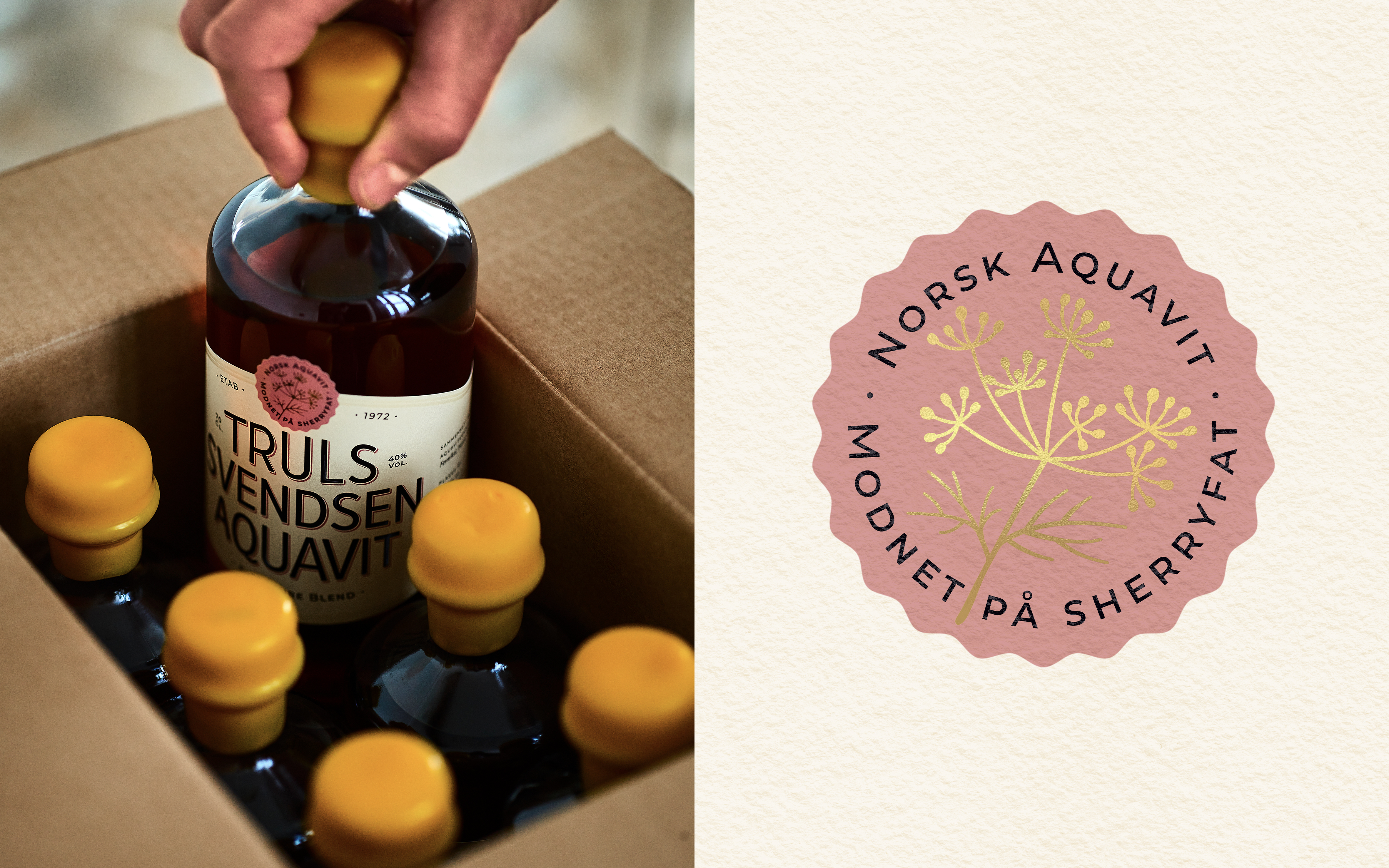
The label is soft and rounded, the colour palette is warm and welcoming. The vibrant yellow wax seal ensures visibility on the shelves of Norwegian spirit retailers. Complementing this warm visual atmosphere, the detailing reflects the high level of craftsmanship, the carefully chosen ingredients, and the passion poured into every aspect of this project. From the elegant bottle to the artisanal wax seal, the typographic artistry, and lavish use of gold foil and lacquer. Nothing is left to chance to ensure a product of great quality and aesthetic appeal.
This article is sourced from the Dieline and published with permission.
Stay up to date
Subscribe to the free Label News newsletter and receive the latest content every week. We'll never share your email address.
