Best of the Best Awards 2019 announced
The L9 World Label Association has announced the winners of the Best of the Best awards, which were judged by an international panel of judges during Labelexpo Europe 2019.

The awards represent the best labels from the five main printing technologies such as flexography, letterpress, offset litho, combination printing and digital printing and are selected from the winning entries in the 2019 label competition.
The awards would be normally be presented to the winning companies during the Labelexpo Americas event in Chicago in September 2020. Because that event has been postponed until March 2021 it was decided that the awards would be presented by the appropriate local association. However, the award winners will still receive recognition during the postponed Labelexpo Americas.
The winning labels in the respective classes are listed below:
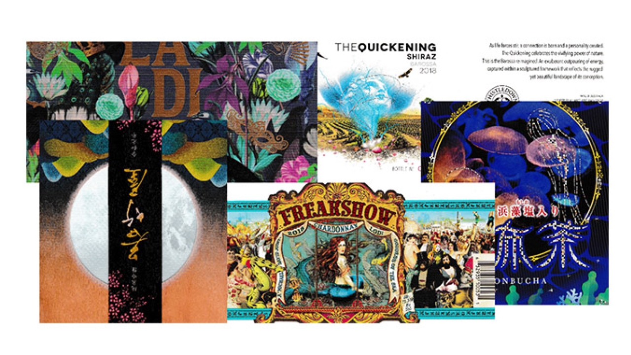
- Flexographic printing, submitted by TLMI (USA). The winner is Multi-Color Corporation North America Wine & Spirits, USA for Freakshow Chardonnay. This is an exceptionally busy label showing a whole range of characters that might have been found in a fairground many years ago. The combined use of gold ink and cold foiling creates a great framework for the central theme of the label
- Digital printing, submitted by FPLMA (Australia). The winner is Multi-Color Corporation, Australia for The Quickening. The design of this label encompasses the quickening which is associated with new life. In this case the blue life force spirit is seen emanating from the soil of the Barossa area in Australia with the ethereal lines highlighted using silver hot foil. The story is included in the design of the label which is printed on a slightly cream paper substrate which softens the impact of the landscape illustration.
- Offset litho printing, submitted by FPLMA (Australia). The winner is Jamesprint, Australia for La Di Da Malbec. There is the hint of a masked ball of yesteryear created by the gold chandelier, bow tie, face mask and fan highlighted using cold foiling. If you look hard you will see two peacocks highlighted using a gloss spot varnish. The plethora of different colored flowers all adds to the intricate design of this label.
- Letterpress printing, submitted by JFLP (Japan). The winner is Shinwa Label Printing Co, Japan for Konbucha. An underwater theme for this label is enhanced by the use of a deep blue surround punctuated with sea plants and a central illustration of life in an aquarium. The extensive use of silver foiling adds a high degree of interest to the overall design. A label designed to attract the interest of the viewer.
- Combination printing, submitted by JFLP (Japan). The winner is Maru-sin Co, Japan for Wakatakeya Brewery. This sake label commemorates the first year of the Reiwa era. The design shows the moon, which can be seen all over the world and by looking through the label the craters of the moon can be clearly seen. The hills in the foreground represent the current position from which the moon is being viewed. The whole label is printed on a wood simulated substrate. The concept of the label is that people who drink cold sake from the Wakatakeya Brewery and people watching the moon can expect to have a peaceful existence.
All winners will be featured on Labels & Labeling Instagram account. Click here to follow us.
Stay up to date
Subscribe to the free Label News newsletter and receive the latest content every week. We'll never share your email address.

