Redesign amps up energy water brand

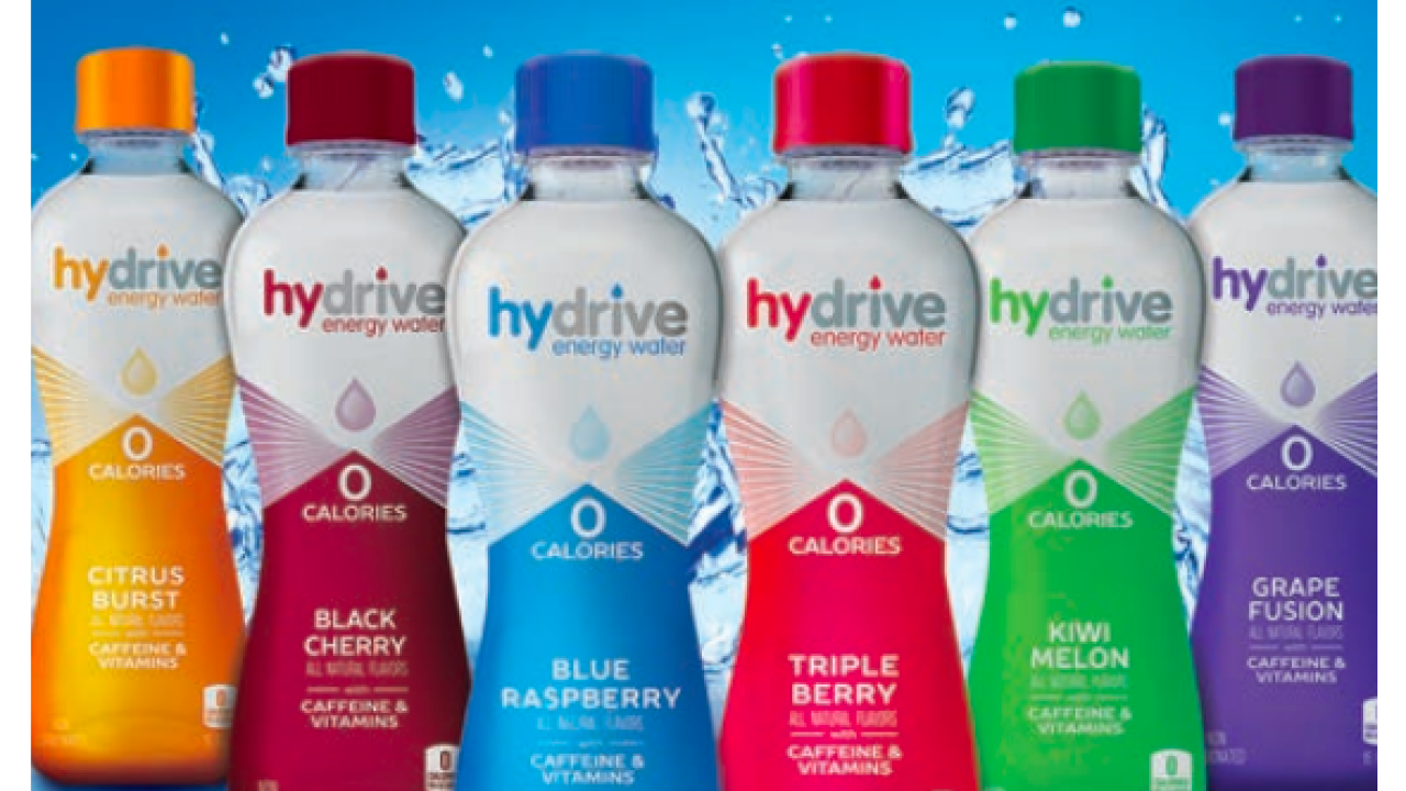
Austin, Texas-based Big Red Group knows the space well. Bid Red owns and markets Hydrive Energy Water, a calorie-free drink with B vitamins and 160mg of caffeine. The brand attracts people seeking rehydration, flavor and energy, a message that was increasingly difficult to communicate on busy retail shelves. ‘The original label color was lost on the shelf and in the cold vault,’ says Jesse Coulter, Hydrive marketing manager. ‘We needed something much brighter, cleaner, and eye-catching. We also wanted Hydrive to look and feel upscale and convey the healthier energy message.’
Big Red’s solution was to revamp the Hydrive brand with new flavors, new bottles, and new shrink sleeve labels. ‘What consumers want from an enhanced water is great flavor, zero calories, and an energy boost to suit their busy, on-the-go lifestyle,’ says Thomas Oh, SVP of marketing. ‘Hydrive Energy Water’s new formula provides health-conscious consumers with the flavor and function they want without the calories and sugar that they don’t.’
That brand promise was primarily communicated with redesigned packaging. ‘We wanted a bottle that was unique and modern, a departure from the generic bottle used in the old line,’ says Coulter. ‘The new bottle shape is very favorable with consumers and fits easily in one hand – it’s easy to grip. The shrink sleeve labels replaced roll-on labels and allowed us to make the packaging as sleek as possible with a clean finish.’
The updated packaging had to be clean, modern and unique to stand out. ‘The incorporation of a water drop into our logo and on the packaging further drove home to consumers that we are an enhanced water,’ says Coulter. ‘A pearlescent finish and bright colors make the label pop on any shelf, and is much more eye-catching.
Run combinations for print efficiency
To get the graphic impact it wanted, Hydrive partnered with Hammer Packaging, based in Rochester, New York. ‘The new label presented by Big Red was drastically changed to capture the consumer’s attention,’ says Lou Iovoli, vice president of strategic partnerships and marketing. ‘This design utilized the smooth clean lines of a newly designed bottle in concert with a full body shrink sleeve. Additionally, the team chose a pearlescent ink for the top bell of the label design to generate a premium look.’
Hammer Packaging worked with Big Red to utilize run combinations of flavors across the web, thus reducing make-readies and cost. This required closely communication with the design team to keep special colors common when possible and minimize exclusive colors to create a workable ink set which takes advantage of web offset.
Accommodating future brand expansion and flavor changes was essential. ‘Many brands launch a new design using alternative technologies such as gravure only to find out they have to invest a significant amount of capital every time they want to tweak the design due to the cost of cylinders which are unique to each color, and then each flavor,’ says Iovoli. ‘We made it easy to adapt. The beverage market in particular requires adaptability.’
The labels were printed on a variable sleeve offset press, which enabled plates to be custom made with every run. ‘We went through multiple evolutions of the graphic without any additional cost to Big Red,’ says Iovoli. ‘Additionally, as the product becomes more successful, we can match the item volumes in combination and quickly respond to market demand. This design and press technology are a great marriage.’
As the design evolved it was important to test the transition of the pearlized ink from low shrink to high shrink areas of the bottle. Hammer Packaging’s lab presented variations of full-body mock-ups until the desired effect was approved by Big Red. Hammer Packaging worked closely with Klöckner Pentaplast, based in Gordonsville, Virginia, to develop the high-gloss shrink sleeve film that allowed the pearlescent inks to shine through.
The relaunched Hydrive flavors and packaging made an immediate impression. ‘Consumers were very receptive to the new branding, and loved our new logo and sleek bottle,’ says Coulter. ‘They associated Hydrive as an energy enhanced water – water with function.’
Stay up to date
Subscribe to the free Label News newsletter and receive the latest content every week. We'll never share your email address.


