DG press reveals new corporate identity
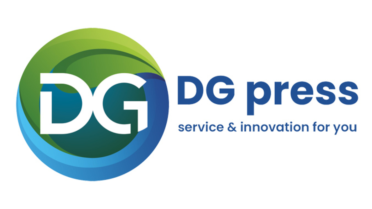
DG press, a manufacturer of hybrid web offset printing machines, has presented a new corporate identity reflecting the ‘organization’s evolution and continuous dedication to delivering high-quality and innovative printing machines’.

The company has maintained the same brand identity since its founding in 2009 when it succeeded Drent Goebel.
DG press's hybrid web offset printing presses are among the most environmentally friendly technologies in the printing industry. The new DG press logo incorporates and expresses sustainable and environmentally friendly production practices, aligning the company's image with its products' distinctive selling qualities.
The new DG press design is a simple round logo with a leaf integrated into it, representing sustainability and green printing. The round logo is shaped like a cylinder within a printing press, with the corporate letters DG centered in the design.
The white, blue, and red line that has been a part of DG press' identity for over 12 years has been replaced by the new colors blue and green. In the new logo, blue represents trust, wisdom, loyalty, self-assurance, belief, intelligence, truth, and heaven. Green is associated with life, renewal, nature, energy, growth, safety, the environment, and conformity.
DG press strives to demonstrate professionalism, trust, sustainability, growth, energy, innovation, and knowledge to our clients through our communications, services and machines - several keywords that have been incorporated into our new corporate identity style.
‘With this rebranding, we’re adapting our identity to the future requirements and market demands where DG press will continue to provide the same high-quality service that our customers have come to expect,’ commented Remko Koolbergen, director of DG press.
Stay up to date
Subscribe to the free Label News newsletter and receive the latest content every week. We'll never share your email address.

