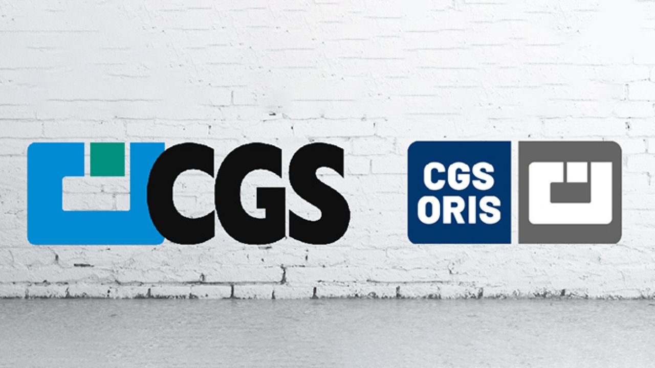
CGS introduces new corporate design
CGS Oris has launched a new corporate image to commemorate its 35th anniversary and consolidate its brand identity across several markets around the world.

‘After doing business for several decades in nearly every country in the world, we came to realize in some places our company was known as CGS, in others we were more commonly known as Oris,’ said Bernd Rückert, CEO of CGS Oris.
‘CGS is the abbreviated version of the company and Oris the product family name. We have now combined what has always belonged together to focus on a singular strong brand for the future. Making it much simpler to identify products with CGS Oris technology inside.’
The primary brand color has changed slightly with a darker appearance and the new gray shade replacing the green color used in the past.
‘The new colors fit us perfectly, our corporate identity and the new look and feel for 2020 and beyond. The colors are an ideal choice, even in combination with our existing product color palette that serves as a consistent part of the overall theme,’ added Isabel Bracker, manager of communications at CGS Oris.
‘Of course, the original concept was to celebrate our 35th jubilee at drupa and present the new branding launch at our booth with a large party and celebration planned. But nevertheless, we are very pleased with the results – and we still have many new announcements planned in the coming weeks ahead. Our software user interface will receive a fresh new look and there are many other creative advancements planned in the near future,’ concluded Bracker.
Stay up to date
Subscribe to the free Label News newsletter and receive the latest content every week. We'll never share your email address.

