"Pick me, pick me"

"Pick me, pick me" is what all the packaging we're exposed to every day is shouting, with graphics, colors and structural designs used to make a specific product the most appealing on the shelf.
Go into any store and the diversification of products (SKUs) through packaging is clear to see. And they all want you to pick them so they can emerge victorious at the "Moment of Truth".
The battle raging between products and their printed packaging is intensifying even further with the development of own-brand lines.
Every retailer has a range of products carrying their own logo and design, from the beauty and healthcare aisle to the freezers. One of those with a vast array of products and related packaging is Morrisons in the UK.
Retail strategy
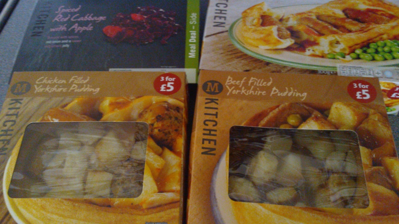
In autumn 2011, the company took the step to reshape its own-brand lines and launched the "M Kitchen" convenience range, which has been followed by thousands of new and improved own-brand products across its stores.
Morrisons said the "M Kitchen" launch aimed to provide a convenience range with "a quality to rival any on the high street, offering the consumer restaurant standard recipes, easily in their own home".
Morrisons adds that its refreshed own-brand products have evolved from the “good-better-best” model to reflect customers’ needs: the need to buy conveniently; the need to buy responsibly; the need to buy fresh food; and the need to buy to a budget.
Strategically this might be the case, but the packaging of its various lines shows that cartons and flexibles remain important in placing products at different price points, where Morrisons is challenging established brands and offering consumers a choice through its overhauled lines from "Savers" up to "M Kitchen Bistro".
The simpler "Savers" packaging uses few image enhancement tools or finishes, such as spot varnishing, but still carries graphics and text to illustrate the goods in a distinctive way, while “M Kitchen Bistro” packaging uses more finishes and processes to maximize appeal to the consumer.
Pizza

 In the case of frozen pizza, this helps convey a price difference of £1.90, with the 60p "M Savers" cheese and tomato pizza (pictured, right) using a minimal color palette and simple shapes to illustrate the product’s ingredients, while the £2.50 "M Kitchen Bistro" Italian woodfired parmigiana pizza box (pictured, far right) features high-quality images of the key ingredients and a slate effect across the material.
The bistro range is an extension of the "M Kitchen" range, with the "M Kitchen" spot varnished (pictured, below on another product from the range) to add further detail to the print, while a die-cut window gives consumers a view of the product itself.

 Such detail does not appear on the standard “M Kitchen” pizza packaging, although it is more complex than the "Savers" carton and helps create a perception of quality.
“M”
By packaging, “M Kitchen” can be categorized as second in the Morrisons line-up, behind the bistro range but sitting ahead of “M” and then “Savers”.


The “M” range is another line of Morrisons own-brand goods, with cartons for frozen fish products (pictured, above left) and flexible bags for frozen sausage rolls (pictured, above middle) replicating the product in their graphics to generate appeal and make the products desirable.
There’s also “M Mm Morrisons”, a range with packaging (pictured, above right) that utilizes high-end finishes and graphics similar to the bistro products to create a luxury, signature brand.
Such variety, and finishes, underlines the power printed packaging has to differentiate products on the shelf, and how it is being used by retailers to push their own brands as viable alternatives to established names.
Own-brand is a huge market, and by this evidence will only get bigger as retailers move to make consumers view their products in the same light as established brands. Printed packaging is a key tool in helping them achieve this.
Stay up to date
Subscribe to the free Label News newsletter and receive the latest content every week. We'll never share your email address.


