How these factors are managed and communicated, is a critical factor in ensuring that each print job meets the expectations of the final customer.
Paying attention to detail in the early stages will reduce the possibility of having to correct costly errors later in the production process.
In this article we will some of the factors that need to be understood and managed during these early stages of a label or a pack’s development.
WORKING WITH DESIGN AGENCIES
A high percentage of new designs emanate from design agencies. Whilst these agencies are very creative, there can be some technical shortcomings and many have limited knowledge of the processes involved in the production of self-adhesive labels.
The implication for any project therefore is that a partnership approach is advocated, which includes technical input from the printer.
A summary of typical design agency strengths and weaknesses are listed below.
Design agency strengths
-
Perceptive to global trends
-
Seek to push printing and conversion technologies to the limit
Design agency weaknesses
-
Unawareness of graphic limitations
-
Tendency to stray from the technical brief
-
Limited knowledge of artwork preparation, repro and print processes
THE INITIAL STAGES OF BRAND/DESIGN DEVELOPMENT
At the outset, design concepts are evolved that take into account a wide range of design and marketing factors.
Relevant information from the list below should be factored into a design brief, which will be used internally or by the appointed design agency.
A well prepared design brief will typically include the following;
-
Market brief/market overview/competition – Market profile data and assessment of the marketing/competitive landscape.
-
Product background – Essential background on the product, its characteristics and key objectives.
-
Brand guidelines – including guidance on logo/corporate colors etc.
-
Target consumer – consumer profile data and target audiences.
-
Mandatory elements – obligatory packaging elements including legal copy, barcode data, ingredients, warnings.
-
Production requirements – technical parameters such as web-widths etc. to be established.
-
Product aspirations – the positioning or required perception of the brand will impact on the label/pack design and should be communicated in the design brief.
-
Costings – budget parameters/guidance should be established.
-
Timings – details of critical dates should be provided e.g. market entry/launch date, production dates etc.
-
Die-lines/profile – usually an important start point for new designs, as it provides the boundary within which the design is established.
-
Maximum number of colors – there may be technical/cost reasons for establishing an upper limit on color usage.
-
Substrate specification – early specification of the material to be used may be critical for technical/design reasons.
All the above points must be considered in order to achieve the design objective.
Consultation between all parties, at all stages in a label project is vitally important in agreeing a detailed specification which contains all the relevant information relating to each part of the project.
The specification must be completely adhered to throughout the design to print process and brand owners must ensure that the specification is available to all parties when multi-site manufacturing is involved.
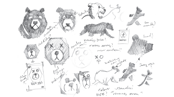
From the design brief the first stage in the design development process is the generation of initial design roughs/concepts (see Figure 2.1).

Figure 2.1 - Design roughs are evolved that seek to capture the marketing/design brief
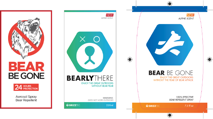
The second stage is to refine and create visual form either for internal discussion or for further market research (Figure 2.2).

Figure 2.2 - Examples of more fully worked up design visuals
AESTHETICS VERSUS PRACTICALITY
Often the aspect of aesthetic design is considered in isolation and sometimes overshadows the technical considerations which must be met to achieve an acceptable end result.
In many cases design creativity must be tempered by the more practical aspects such as cost, technical constraints of the printing process and the many mandatory requirements that need to be accommodated within the design.
Whilst the printer/converter may have little or no input at this stage, he should be consulted regarding the practical aspects of producing the job with his existing facilities, before the creative process gets underway.
THE CONCEPT OF TOTAL APPLIED COST (TAC)
It is important to note that the total cost of packaging or labeling may have an important impact on the design brief.
The concept of “total applied cost” will often influence the print specification and the decoration/packaging format selected.
The total cost of a label is not merely the cost of the material and its conversion; there are a much wider range of factors to consider.
In-mold and direct decoration, for example, often requires that the user stores large quantities of pre-labeled containers on-site in order to cope with the flows of demand across a number of variants. Storage, inventory and obsolescence are all part of the labeling cost and have to be considered at the very start, when decisions are being taken as to how a product will be produced, presented and marketed. Likewise the cost of application equipment, manning levels and labeling efficiencies are likely to be key components of the cost equation.
The concept of total applied cost encompasses all costs attributed to the labeling process from start to finish.
Evaluating different decoration methods using this wider definition of costing can dramatically influence the selection process. Some decoration formats may actually be ruled out on the results of a total cost calculation and this may therefore influence the design brief.
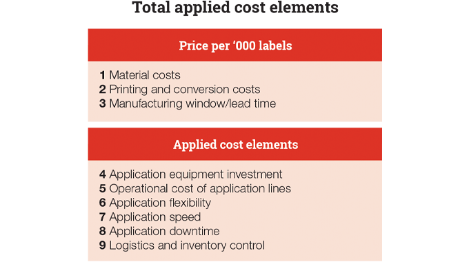
A costing model that takes a total applied cost approach offers a new perspective on the cost of decorating a pack. Total applied costing includes a host of factors such as the cost and efficiency of label application, investment in capital equipment and machinery change parts, logistics and inventory control.
Details of those factors that can be included in a total cost model are provided in Figure 2.3

Figure 2.3 - Total applied cost elements
FUNCTIONALITY
Functionality may have an important effect on how a label or pack is produced.
On a self-adhesive label, for example, the function will dictate, to some extent, the materials which will be used, in particular the face material and adhesive. This may limit the type of ink and even the printing process to be used.
An example is scratch-off or temperature sensitive images. These functionalities might be used on a wide variety of substrates, but they both have a specific ink requirement – i.e. they require a thick ink layer. This factor would then limit the choice of printing process to be used. The scratch-off ink (micro encapsulation) will require it to be printed on a press which controls the printed web without applying abrasive pressure to the printed ink film surface. The temperature responsive inks may restrict drying/curing facilities and the restriction of a maximum temperature in any section of the press. In addition the thickness of the ink deposit may limit type size, dot size and general detail which can be printed.
The most effective route to good design practice begins with a comprehensive understanding of the end-use or final function of the product, and then working back through all the converting, printing and origination procedures, in order to ensure that the desired result is going to be a practical and economic proposition.
A good designer will have at least a basic understanding of the effect of each of the components in the production of a label and how they will impact separately and in conjunction with each other. It is important to consult experts at each stage of production in order to ensure a first time, correct result.
PRINTING PROCESS CONSIDERATIONS
With the dramatic changes in printing technologies over the past few years, choosing the correct printing process to achieve a particular effect is becoming more difficult. The wider use of multi-process presses means that it is possible to combine the strongest attributes of each process in one machine pass to achieve a particular and maybe unique result in an economical way.
Offset lithography produces a clear image and fine detail; letterpress a strong color; water-based flexography, high speed and thin ink coverage; UV flexography, controllable ink film thickness and good color coverage; screen printing, high ink film weights and dense color with no show through.
Not to forget the now extensive use of electrophotographic and ink-jet digital technologies which add another dimension to the printing possibilities – including personalisation, adding sequential coding or numbering to the final job.
Finishing processes such as hot or cold foiling, which can produce a true metallic effect, or glossy or matt varnishing, which can add dramatic effects to the end result, should not be overlooked.
DESIGN EVOLUTION
As a project evolves the design visuals become more developed and can accommodate a wider range of factors including;
-
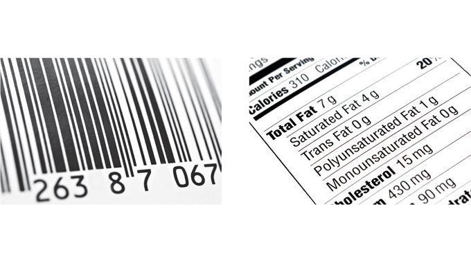
Mandatory elements e.g. warning messages, barcodes, ingredients etc. (see Figure 2.5)
-
Die-lines/profiles – will provide the boundary within which the design is to be created
-
Maximum number of colors – cost or manufacturing limitations may place an upper limit on the number of colors available to the designer
-
Packaging format - Choice of decoration can influence ability to reproduce a design. For example it may not be possible to include certain decorative effects on particular packaging/labeling formats e.g. hot foil stamping is unsuitable for use on shrink sleeve labeling
-
Substrates or materials – the choice of materials may impact on design options e.g. metallics
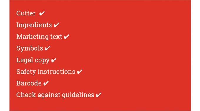
A checklist of critical elements in pack design is provided in Figure 2.4 and will now be explored in greater detail.

Figure 2.4 - Check list of critical elements in a pack design

Figure 2.5 - There are numerous legal and mandatory elements that have to be factored into a design such as barcodes and ingredients
MANDATORY ELEMENTS
Mandatory elements that should be factored into the artwork from the outset include – barcodes, ingredients, warning messages, symbols and legal copy.
Compulsory legislation information is the thorn in the side of the designer and can have a dramatic influence on design. More and more information is now mandatory on any type of packaging and labels and the designer is sometimes caught between two opposing requirements - the overall size of the label may be restricted by the size of the package to be labeled, yet legislation might impose a minimum size type to be used to provide certain information. A barcode for example, might have to be printed to certain minimum dimensions. Instructions must be clear and in the language (or languages) required in certain geographical consumer markets.
Hazardous products must be marked very clearly and recycling information is also important. The designer may have to work within exactly defined guidelines and yet must include most or all of these requirements, not forgetting the actual brand or product information, which is the main reason for producing the label in the first place.
Sometimes the sheer amount of information required may dictate that an additional label should be included in the final product labeling.
GUIDANCE ON BARCODES
Barcodes should be of high resolution requiring minimal re-scaling. It is important that the barcode printing is in a scannable color. Since most barcode scanners utilise infrared light, avoid using inks with red or orange pigments.
For best results, barcodes should appear on a white background with a no-print area to the left and right of the code.
If printing on filmics, the code must be positioned so that the bars run through the press in the same direction that the film runs through the press, in order to avoid potential image distortion.
COPYRIGHT
Brand images and the company logo may be protected by copyright. This is of concern to the designer and the product manufacturer, but the label printer also has to be aware. If the printer knowingly prints an image on a label that could reasonably be taken to be that of a competitive product, the printer could be held liable.
CUTTER PROFILE OR DIE-LINES
One of the most important considerations in the design brief for a label or pack is its unique shape.
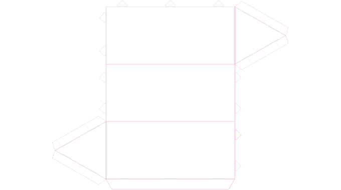
The graphics will be bounded by the outline and of course the design elements will need to be carefully placed within this boundary, for optimum visual impact (see Figure 2.6).

Figure 2.6 - Die-lines/profiles – will provide the critical boundary within which the design is to be created
In the creation of any artwork for packaging design it is vital to start with an accurate template, or cutter die-line.
The die-line clearly defines printable areas, as well as reflecting features such as tear strips, euro slots etc that may need to be taken into consideration when creating artwork. The orientation of text or distortion when a sleeve, for example, is shrunk onto a pack will need to be accommodated within the profile.
Without this information the designer may spend hours laying out the perfect design only to find that it needs to be rearranged to fit a layout with completely different parameters.
Die-lines are typically available from suppliers or can be created in programs such as Adobe® Illustrator.
The die-line may reflect existing cutter stocks available from the converter and will certainly conform to the manufacturing parameters of their equipment.
PRACTICAL CONSIDERATIONS RELATING TO DIE-CUTTING LABELS
The automatic application of the label will run much smoother and quicker if the label profile is kept simple.
There are certain label shapes which can affect the economic running of the press under production conditions.
A few are listed here;
-
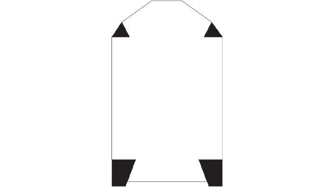
Acutely sharp corners, star points or any dramatic change to the direction of the cutting edge can cause die-cutting speeds to be reduced. (Figure 2.7)
-
Small or thin projections that create an uneven pull on the waste as it is eased away from the face material often tear and remain on the backing liner.
As with any design, aesthetics must be balanced against economic and efficient running of the press. The accuracy of the die and the die-cutting method must be reflected in the complexity of the outline of a label so that penetration of the silicone coating or backing does not occur.
The shaded areas indicate aspects of the label profile that could slow down the press due to difficult stripping.
Such areas could be printed to blend in with the container color.

Figure 2.7 - Difficult label profiles - The shaded areas indicate aspects of the label profile that could slow down the press due to difficult stripping. Such areas could be printed to blend in with the container color
DEVELOPMENTS IN LASER CUTTING AND FINISHING
With the increasing use of laser die-cutting more complex label profiles are now possible, along with more opportunities to create cut-out areas within the label design. The laser uses programs developed from the step-and-repeat function of label origination to guide the laser cutting head around each separate label profile.
Laser etching offers possibilities for personalisation, numbering and coding of labels whereby the images are physically etched into the surface of the material.
NUMBER OF COLORS
All designs should be kept to the maximum number of colors of the converter’s printing press that the job will be printed on, including white ink and varnishes.
It is recommended that a color legend is supplied with proofs generated and colors used in a design are best labeled clearly in files.
ECONOMICS
Cost is usually one of the most important factors to be considered in the production of a new label design. The aesthetics of the final design must be balanced against the most economic production method.
The number of colors to be used in the final design will have a huge impact on the cost of production. Many modern label presses, have up to ten color stations, which means that a four color process job can be run in addition to a house or corporate color, plus varnishing and finishing all in one pass.
The printing of very fine detail with small type faces and fine screen rulings can often slow down the running speed of the press and complex cutting, punching and perforating means more units for the press operator to supervise.
Designs incorporating accurate grips between colors or with very fine key lines will also have a negative impact on press speed.
Attention to the detail mentioned here could reduce production costs and if managed correctly may not detract from the overall design.
ARTWORK
The term artwork is defined as the original design, drawings, pictures and text produced by the designer or artist. It comprises all elements of design from which the black-and-white origination and printing plates are made.
The process involves the production of finished material suitable for reproduction by any printing method or media. This may be presented as a black and white art sheet, with color overlays, or in disk or CD format, or even transmitted electronically for computer printout.
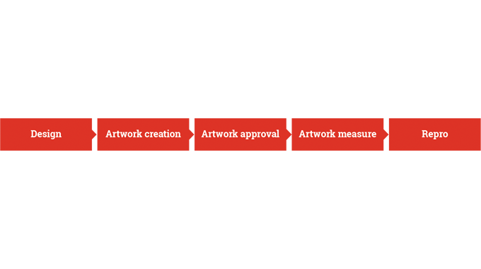
Once a design has been conceived and created it progresses to finished artwork and may be further amended before final approval is sought. It is also important that the artwork is subject to rigorous checks to ensure that it conforms to specification before proceeding (See Figure 2.8).

Figure 2.8 - Summary of the artwork process steps from design to repro
FINALISING ARTWORK AND GRAPHIC CONTENT
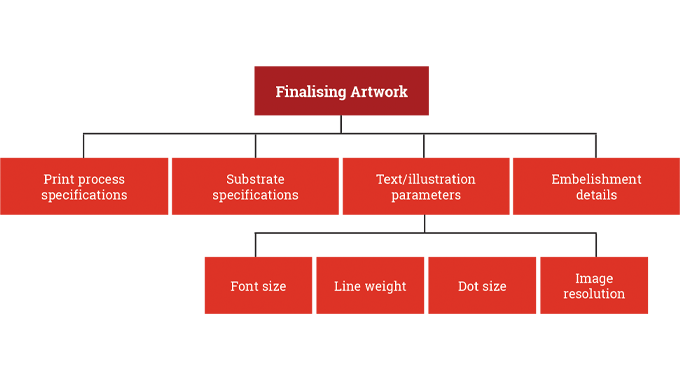
Following on from the design brief other information is generally required to finalise the artwork. This information will typically include the following components; See Figure 2.9.

Figure 2.9 - Components Required to Finalise Artwork
PRINT PROCESS SPECIFICATIONS
At this stage the print processes to be used in the final job are specified. In some cases a combination of printing processes may be required to achieve the desired result.
USING SPOT COLORS
Using CMYK can have its limitations when it comes to color reproduction. If more vibrant colors or an exact color match is required (e.g. for consistent company branding) then spot colors/PMS colors should be identified in the artwork.
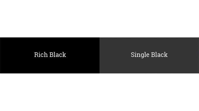
USING BLACKS - BLACK VERSUS RICH BLACK
When printing with black color, there are two types of black that can be used.
Black – 100 K: can be used for body copy and barcodes
Rich black – 40 C 40 M 40 Y 100 K: is recommended when printing blocks of black.
Rich black specifications may differ from printer to printer, so it is important to consult with your printer for their advice.
Telling the difference when preparing files on a monitor screen can be difficult since PC screens show richer colors in RGB (red,green and blue).
Therefore, it is recommended to get a press proof when printing blocks of black.
The difference between rich black and black is illustrated in Figure 2.10.

Figure 2.10 - The visual difference of a single Black versus Rich Black created from CMYK
SUBSTRATE SPECIFICATION
At this stage the exact material to be used will be specified along with the supplier details, material grammage/caliper* and the adhesive.
*Caliper or thickness of a paper or film, measured by a dead weight dial micrometer, usually expressed in thousandths of an inch (mils or thou) in the USA, or in one millionth of a meter (microns) in countries using the metric system.
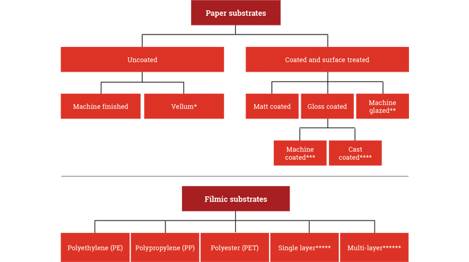
In label printing there is a wide choice of materials available. The more commonly used materials are listed in Figure 2.11;
Vellum* - A strong, tough paper with a high quality appearance, originally made to imitate the fine smooth finish of parchment made from animal skin. No longer noted for its strength, Vellum has become the generic term for very smooth uncoated wood-free paper utilised by label manufacturers for line and solid printing or thermal transfer overprinting.
Machine glazed** – smooth surface achieved using a highly polished steam heated cylinder (not very common)
Machine coated*** – paper coated on the paper making machine
Cast coated ****– clay coating with a high gloss finish
FILMICS
There is an increasing demand for label characteristics that are outside the scope of paper substrates.
Self-adhesive labeling can utilise a wide range of lightweight filmic (plastic) facestocks as shown above in Figure 2.11.

Figure 2.11 - The most commonly used materials
Single layer film***** - mono-layer film
Multi-layer film****** - Films of more than one layer produced extruded with difference performance characteristics in each layer eg printability, dispensability, flexibility, squeezability, stiffness etc
In addition to these filmic materials there is a wide range of other speciality facestocks available including paper/foil laminates, metallised papers/films, synthetic papers.
EMBELLISHMENT DETAILS
Details of surface embellishments for the label or pack are required at this stage and the decoration areas should be specified within the artwork.
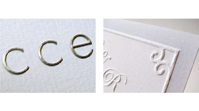
Typical decorative effects that can be used include;
-
Embossing - The process of raising a design or image above the label surface, often through the use of a set of matched male and female dies.
-
Varnishes - A thin, clear, transparent ink that contains no coloring pigments or dyes. When printed or coated over the top of a substrate and/or printed matter, the varnish provides a protective finish that enhances appearance and increases durability. Varnishes may be glossy or matt.
If a varnish is to be used, the image or text that requires varnishing should be identified in the artwork. Typically a spot color named "varnish/spot" is created within the design file.
-
Lamination - A clear plastic film applied to a sheet or web of labels by heat or adhesive to provide and enhanced, glossy or matt, appearance or for protection.
-
Foil stamping - Lacquered aluminium foil placed adhesive down on substrate. A heated patterned die is pressed onto the foil to activate adhesive and transfer the image.

Figure 2.12 - Typical embellishments used in label printing (foil stamping and embossing)
If a varnish, foil or emboss is to be used, the image or text that requires the embellishment should be identified within the artwork. Typically a spot color created within the design file and labeled with the appropriate embellishment description can be used for this purpose.
CUTTER PROFILES
As discussed earlier cutter profiles are typically established at the early stages of design development and provide the boundary within which the design is created.
PARAMETERS ON FONTS AND TEXT
There are a number of factors to be considered when finalising fonts and type as follows;
POSITIVE TEXT SIZING
Minimum type size for positive text is generally 4 point. Type below this point size may not be legible when printed. For best results, small text should be created from one solid color. Screened text can be difficult to read, and slight mis-register on press can affect the legibility of text that is created using more than one color.
Minimum type sizes for particular applications (food or drug labels) are commonly found in the relevant labeling regulations.
REVERSE TEXT
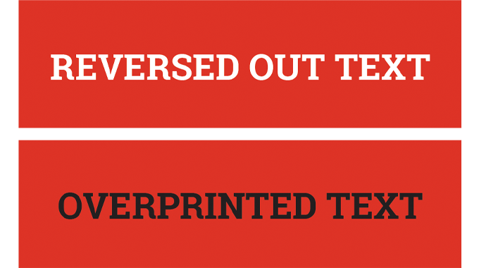
Minimum type size for light-colored text that reverses out of a dark-colored background is 6 point. Type below this point size may fill in and not be legible when printed. Light-style fonts or serifed fonts for reversed-out text are not recommended, as the thinner elements of the letters will have a tendency to fill in.
Type should never reverse out of more than one color and it is recommended that a solid, single-color keyline is used to outline light-colored text.
Printing reversed out text should be avoided below 6 point and the text should be printed directly onto the color (ie not reversed out). See Figure 2.13.

Figure 2.13 - Very small text and fine lines need to overprint if they are in a darker color than their background
DROP SHADOWS
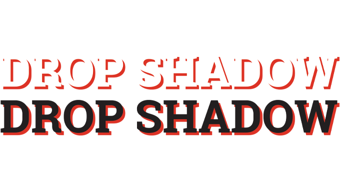
The use of drop shadows, particularly on small reverse text, is not recommended (Figure 2.14).

Figure 2.14 - Drop shadow illustrated
The use of a drop shadow introduces an extra color to the background which would have to be printed in perfect register in order to replicate the shape of the letters.
TEXT CREATION IN DESIGN SOFTWARE
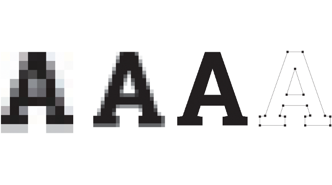
Text should always be created in a vector format in design packages. Text created in Adobe® Photoshop® for example, or any other raster-based program, will have jagged, rastered edges, making smaller text particularly difficult to read. Vector based graphics and text will have smooth edges and create a more pleasing result. See Figure 2.15.
RASTER VERSUS VECTOR FORMATS EXPLAINED
Like a photograph raster images are made up of pixels with each piece of visual information represented as a small dot that is set in a specific color.
Vector images on the other hand are not made up of dots at all - they are drawings of lines that are represented in the file as mathematical descriptions.

Figure 2.15 - Rasterized characters from very low resolution to high resolution, compared to a vectorised character
Common file formats for raster images are TIFF, JPG, or GIF.
Common vector file formats are EPS (Encapsulated PostScript), PNG (portable network graphic) and WMF (Windows Meta File).
SUMMARY OF KEY LABEL DESIGN ELEMENTS
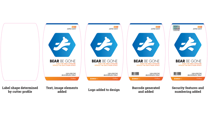
Figure 2.16 summarises how all the design elements involved in the origination of a label come to together.

Figure 2.16 - Key label design elements.png
APPROVAL PROCESS
Throughout the development of a pack or label design there are a number of reasons why changes to artwork may take place.
Potential factors resulting in artwork changes can be summarised as follows;
-
Change to product specification – re-definitions to the product specification.
-
Formulation changes - changes to the product formulation or ingredients.
-
Language interpretation – translation errors or clarifications.
-
Non-adherence to approval process – issues and errors caused when agreed procedures are bypassed.
-
QC checks to artwork content that uncover earlier errors.
-
Checks against artwork checklists that identify elements that are missing or incorrect.
-
Outstanding information not considered earlier may need to be added now.
Artwork approval by technical, legal, marketing departments or perhaps by the supplier may result in further amendments being required.
After changes to artwork are made, the artwork approval process will need to be conducted again.
PROOFING
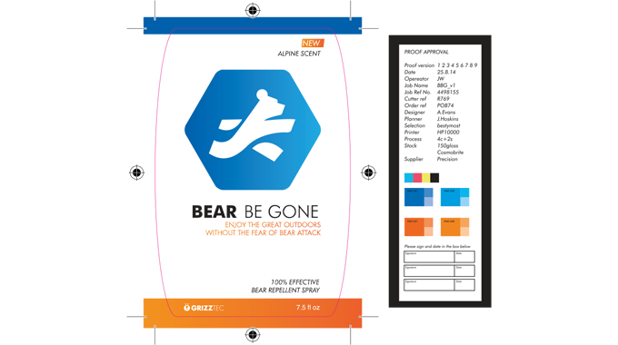
Figure 2.17 - Proofs are typically required by technical, legal, marketing and supplier. At this stage they are used to check copy and layout (but not color)
Design data
CAD driven
Laser/resin
Container/mold
Substrate
Decoration
Digital engine
Embellishments
Digital laser
die-cutting
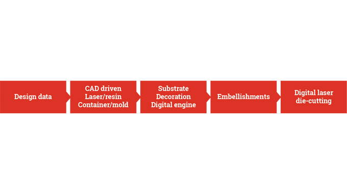
Figure 2.18 - Rapid prototyping described
At the artwork approval stage a soft proof or hard copy digital proof is sufficient to allow interested parties to visualise and make alterations to artwork.
Both these types of proof are termed off-press proofs and are a cost-effective way of providing a visual copy without the expense of creating an actual press proof.
Approved and signed off artwork is now ready to proceed to repro.

Figure 2.17 - Proofs are typically required by technical, legal, marketing and supplier. At this stage they are used to check copy and layout (but not color)

Figure 2.18 - Rapid prototyping described
PROTOTYPING
Prototyping is important to the packaging market as it allows for the visualisation of products in 3D.
Prototypes are invaluable for retail visualisation and they permit limited-scale test marketing prior to full-scale production.
In the packaging sector short-run prototypes have typically been produced using the same equipment that is used for full-scale production. This however, is an expensive process and it cannot accommodate multiple versions or last minute design changes.
There are a number of prototyping formats on offer.
VIRTUAL PROTOTYPING
A number of suppliers from the pre-press environment have launched systems and services that use digital technology that permits the 3D visualisation of packaging in a virtual retail environment. See Figure 2.19.

Figure 2.19 - A realistic 3D mock-up of a label design on screen. Source- Esko
PHYSICAL PROTOTYPING
There are many instances where physical examples of a pack are required, perhaps for test marketing. The main requirement for a physical prototype is that it should look and feel like a professionally produced pack.
The emergence of digital printing has delivered significant benefits to the prototyping process as it eliminates the up-front plate production and make-ready costs.
Color management systems are now available that enable color accurate mock-ups on production substrates to be created.
Inkjet technology is commonly used for the printing of prototypes allowing a finished mock-up to be created within a few hours, without stopping a press.
RAPID PROTOTYPING
The term rapid prototyping (RP) refers to a class of technologies that can automatically construct physical models from Computer-Aided Design (CAD) data.
RAPID PROTOTYPING EXPLAINED
Modern rapid prototyping systems for packaging visualisation take design data in order to recreate a 3D model. The digital printing systems generate graphics which are then applied to the object to complete the prototype.
SUBTRACTIVE 3D PROTOTYPING
Systems that use modelling software linked to a CNC (computer numerical control) milling machine is a method often used to create physical prototypes. The process is called subtractive, in that material is removed (subtracted) from a block to create the final model (Figure 2.18).
Compared to a 3D printer, subtractive rapid prototyping machines deliver smooth surface finishes without needing post finishing.
A CAD model is simply exported to drive the milling machine.
3D PRINTING
The introduction of 3D printing, perhaps more correctly called ‘additive’ printing is the latest technology that is enabling packaging designers to take 2D designs and extend them to a three-dimensional format. This method of prototyping is called additive in that material is added to construct the 3D model.
3D printing is based on traditional inkjet printing with shapes constructed layer by layer, in fine droplets using liquid photopolymers and then cured by UV light. Packaging design concepts can be brought to life in a matter of hours, but post finishing maybe required to the model.
Labels can be a cost-effective and convenient way to get graphics onto many different packaging formats. Digital printing in particular, is a low cost way to add branding to a physical prototype which can then be used for consumer feedback and test marketing.